Grab Deal : Flat 30% off on live classes + 2 free self-paced courses - SCHEDULE CALL
A graphical or visual representation of data is known as data visualization. It aids in bringing to light the most valuable insights from a dataset, making it simpler to recognise patterns, outliers, and associations. Picture yourself staring at a massive spreadsheet with columns upon columns of information. You'll need to go deep into the data to figure it out, and it's doubtful that you'll notice any patterns or trends with a first inspection. Now picture this same set of information shown as a bar chart, or even on a color-coded map. If you have the data in front of you, you can more easily see what it's saying you?
The whole aim of data visualization is to do this. It renders hidden meanings plain to view, allowing even the most visually impaired to grasp the situation. Data visualization is most effective when it is used to convey a narrative. The ability to tell a compelling story with your data is vital for making it useful. Having a large amount of data is very different from knowing how to utilise it to guide actions and choices, and this is where data visualization comes in.
In Data science, both exploring and explaining data may be accomplished through visualizing data . All right, let's check those out right now.
To begin, it's crucial to distinguish between exploratory and explanatory data visualization. We'll look at particular forms of data visualization later. Explanatory data visualization aids in communicating findings, whereas exploratory data visualization aids in discovering patterns and trends in data. While exploration occurs early on in the data analysis process, explanation occurs later, when the results are ready to be shared.
One of the first things you'll do when given a new dataset is do an exploratory analysis. The purpose of this step is to learn about the dataset and highlight its most important characteristics so that further analysis may be conducted. At this juncture, visualization can assist you in understanding your dataset and identifying interesting patterns or outliers. Ultimately, you are gaining your bearings and beginning to uncover hints as to what the data may be attempting to tell you.
After doing your study and drawing conclusions, you'll want to disseminate your findings to important business stakeholders who can act on the data or general audiences with an interest in your issue. You can better convey this tale by using explanatory data visualizations, and it is up to you to decide which visualization will be most useful in doing so. In the next part, we'll present many popular methods of data visualization and discuss why each is best appropriate.
Data visualization is one of the important skills in data science. However, for productive data visualization, it's necessary to have other data science skills like statistical analysis, data cleaning, large data sets processing, data mining, and much more. Data scientists with all these skills are in great demand and can earn lucrative salaries. The Data science salary guide will give you a complete idea. Effective data visualization stems from the significance of data analytics as a whole. There will be around 44 zettabytes of data in the digital cosmos by the year 2020. Consider that one zettabyte is about equivalent to a trillion gigabytes. On average, 463 exabytes of new data will be generated every 24 hours throughout the world by 2025. There are a billion gigabytes in an exabyte. Simply put, we create mountains of data constantly.
Thanks to data analytics, we can now make sense of all that information. From a corporate standpoint, this allows for the incorporation of lessons learned from the past into future strategies. It has the potential to enhance patient care and treatment in sectors such as healthcare. It's useful for gauging risk and thwarting fraud in the banking and insurance industries. Data analytics are essential for making good choices, and data visualization plays a vital role in this process. By displaying information in a visual format that is understandable by a wide variety of people (not just data professionals), data visualization aids in our ability to draw conclusions from it. It's the key to connecting your knowledge as a data analyst or data scientist with the individuals who can put your findings into action.
The Advantages and Benefits of Effective Data Visualization at a Glance
Using data visualization, you can do the following:
Now that we've covered what data visualization is and why it's important, let's look at some of the situations in which it would be useful.

Data visualization is often the last stage of the analytical process, however there are exceptions such as exploratory data visualization. Following is a brief summary of the steps taken during data analysis:
Step 1: Pinpoint the issue at hand by articulating precisely what it is you hope to fix.
Step 2: Gather information by figuring out what specific data is required and where to go for it.
Step 3: Clean your data by getting rid of any mistakes, duplicates, outliers, or extraneous information.
Step 4: Examine the information to figure out what kind of analysis has to be performed so that the desired results may be attained.
Step 5: Create visual representations of your most important findings (using tools like graphs, charts, or heatmaps) and share them with the appropriate people (s).
When you want to quickly communicate a summary of your results with others, or draw attention to a few key points, data visualization is an excellent tool to use. This being the case, let's think about the sorts of information that may be communicated using data visualization. Therefore, there are numerous ways a data scientist can present their resume if they are looking to make their career in data visualization. Here's our data scientist resume sample writing guide for you to transform your career.
Different types of data visualization and visualizing data techniques your data can be represented in a wide variety of ways. The data you're dealing with and your intended message will determine the visualization approach you use. Your data's intricacy and the number of variables you're working with are other crucial factors to think about. It's crucial to select an appropriate approach, as not all forms of data visualization are suited to extensive or sophisticated depictions.
Let's start with an overview of the five primary forms of data visualization before diving into the most prevalent ones.
When considering the different types of data viz, it helps to be aware of the different categories that these visualizations may fall into:

Data Science Training
We'll cover some of the most important data visualization techniques here. In addition, we will direct your attention to our more in-depth guide, where you may find information on and examples of utilising several other data visualization techniques.
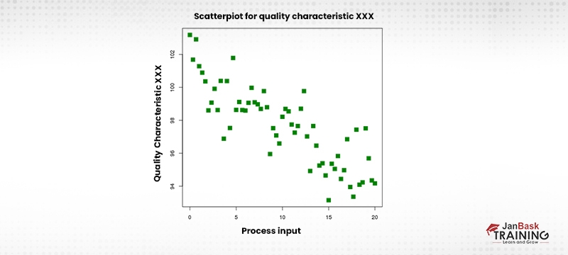
Scatterplots, also known as scatter graphs, are used to graphically depict the correlation between two variables. Each data point is represented by a single "dot" or item on the graph, and the x-axis and y-axis correspond to the independent and dependent variables, respectively. Scattering occurs because of this impact.
When there is no need to consider temporal context, huge datasets are ideal for usage in scatterplots. Using a scatterplot, one may quickly see the correlation between two variables, such as height and weight, or between a diamond's carat weight and its market worth. Remember that scatterplots only show the association between two variables, and not the cause and effect.
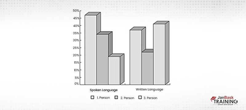
Categorical information may be plotted against discrete values using bar charts. The term "categorical data" is used to express information that is not quantitative in nature, such as descriptions of attributes. Categorical information includes items like age range and degree of education (e.g., high school, college, graduate school) (e.g. under 30, under 40, under 50, or 50 and over). There are no "half measures" or "grey zones" with discrete values; only a small set of possible values can be used. There is no such thing as "half a sale" or "half an event attendance," therefore the amount of persons that showed up to an event or bought something within a certain time period are both examples of discrete variables.
In a bar chart, the x-axis represents categories, while the y-axis represents discrete numbers. You may quickly compare data by looking at the relative sizes of the bars, which are proportionate to the values they indicate.
Both bar charts and pie charts may be used to show data broken down into discrete groups. In contrast to bar charts, which display a small number of categories, pie charts are ideal for displaying the distribution of a single variable across several categories. A pie chart divides up a complete circle into smaller "slices," the sizes of which show how significant those "slices" are in relation to the whole. Given a numerical value for each part of the whole "pie," the size of the individual pieces indicates their relative significance.
Imagine there are 30 students in your class and you want to put them into groups based on the colour of their t-shirts. You may divide your class into four different coloured "slices," or groups, with red representing 40%, green 30%, blue 25%, and yellow 5%. The yellow section is substantially smaller (at 5%) than the red section (at 40%) in a pie chart. The optimal number of categories for a pie chart is five or six.
Unfortunately, not all information can be conveniently summarised using a bar or pie chart. Network graphs are only one of several more sophisticated data visualization tools available for use with larger, more complicated datasets. Each entity or element in a network is represented as a node in a network graph, which demonstrates the relationships between these nodes. These vertices, or "nodes," are linked to others in the network by means of lines.
Clusters within a big data network may be easily identified and shown using network diagrams. Let's say you have a massive client database and you want to organise them into useful groups for advertising. All of your clients or client categories might be plotted out on a network diagram for easy comparison and analysis. Hopefully, patterns and clusters will develop, providing you with a sensible way to divide your target demographic.
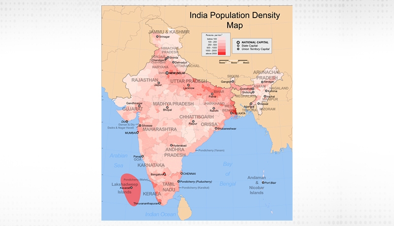
When looking at data spread out over a certain region, geo maps can help you see it in a visual form. If you wanted to show how the world's natural oil reserves were spread, for instance, or how each state voted in a recent election, you might use a color-coded map. There are few data visualizations as flexible as maps, which make them ideal for conveying any sort of location-based information. Dot distribution maps (which are like scatterplots on a map) and cartograms, which distort the size of geographical areas to proportionately reflect a specific variable, are also used in data visualization (population density, for example).
There are several options available to help you create engaging visuals that convey important information. Some tools will require coding knowledge, while others are more suited to non-technical users, so it's important to think about your own needs in terms of the visualization you want to create before making a final decision.
Some of the most well-known methods for representing data will be introduced here. This comprehensive comparison of seven top data visualization tools will help you make an informed decision when shopping for a new viz tool. Here are the top three data visualization tools we recommend learning immediately:
It's crucial to select an appropriate approach, as not all forms of data visualization are suited to extensive or sophisticated depictions. When considering the different types of data viz, it helps to be aware of the different categories that visualizations may fall into. At JanBask, we offer various data science courses that will help you build your career in data science and will help you learn all the aspects of data visualization.

Basic Statistical Descriptions of Data in Data Mining
 May 11, 2023
  10.5k
10.5k Mar 03, 2023 10.1k

Rule-Based Classification in Data Mining
Mar 27, 2023 10k
Cyber Security

QA

Salesforce

Business Analyst

MS SQL Server

Data Science

DevOps

Hadoop

Python

Artificial Intelligence

Machine Learning

Tableau
Download Syllabus
Get Complete Course Syllabus
Enroll For Demo Class
It will take less than a minute
Tutorials
Interviews
You must be logged in to post a comment