Grab Deal : Flat 30% off on live classes + 2 free self-paced courses - SCHEDULE CALL
When it comes to successful planning, having a complete grasp of your data is essential, including a statistical description of data. Some fundamental statistical reports may be used to determine the data's characteristics and the numbers that should be ignored since they are either noise or outliers.
In this section, we will go through the fundamentals of describing three different statistical categories in data science. First, we use measures based on the central tendency to examine the middle of the data distribution. Where do most possible values for a specific attribute appear to fall intuitively? Discussion often centers on a number's mode, mode range, median, average, and other similar measures.
Descriptive statistics are like a translator for data that helps provide the patterns and trends of data. Descriptive statistics use various tools, such as measures of central tendency and variability and graphical representations, to present data in a meaningful and accessible way. Central tendency measures the typical value of a dataset, while variability measures show how well the spread-out data is. Graphical representations add a visual element, making it easier to spot patterns and trends. Descriptive statistics are essential for analyzing and understanding data, providing a foundation for complex statistical analysis in various fields, including business, healthcare, and social sciences.
Bar graphs, pie charts, and line graphs may be found in most statistical or graphical data presentation software programs. Quantile plots, quantile-quantile plots, histograms, and scatter plots are more common methods for displaying data summaries and distributions.
The data science tutorial will help you further studies in statistical data mining.
Descriptive Statistics can be divided in terms of data types, patterns, or characteristics- Distribution(or frequency distribution), Centra Tendency, and Variability(or Dispersion)
The number of times a specific value appears in the data is its frequency (f). A variable's distribution is its frequency pattern or the collection of all conceivable values and the frequencies corresponding to those values. Frequency tables or charts are used to represent frequency distributions.Both categorical and numerical variables can be employed using frequency distribution tables. Only class intervals, which will be detailed momentarily, should be used with continuous variables.Bar graphs, pie charts, and line graphs may be found in most statistical or graphical data presentation software programs. Quantile plots, quantile-quantile plots, histograms, and scatter plots are more common methods for displaying data summaries and distributions.
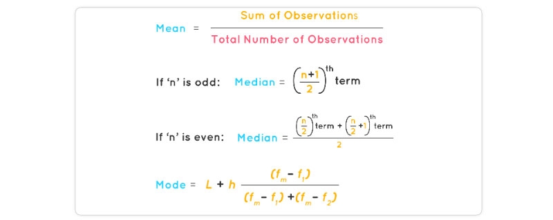
Central Tendency Indicators: Mean, Median, and Mode
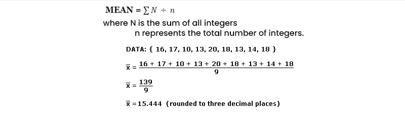
It describes how to calculate the average of a set of data using various methods. Let's imagine that we have a database that stores object with values for attributes such as salary, and let's also pretend that we have access to this database.
Consequently, the N observations that we have of X are represented as follows: x1, x2,... xN. Within the scope of this discussion, the compilation of numerical information is typically referred to as the "data set" (for X). On what part of the scatter plot would the majority of the salary data points be located? Because of this, we are able to gain a sense of the general pattern of the data.
Indicators of central tendency include the mean, median, mode, and even the data's midpoint.
The (arithmetic) mean is the most common and trustworthy numerical measure of the "center" of a data set. It is also one of the most often used measures of central tendency. Let's assume that X is a numeric property and that x1, x2,..., and xN are the N values or observations. The sum total of these numbers is equal to
While there is no more descriptive statistic than the mean, it is not necessarily the most accurate approach to locating the data center. The mean's extreme value (or outlier) sensitivity is a serious flaw. Even a handful of outliers can skew the median. For instance, some companies may have one or two exceptionally well-paid managers who drive up the average income for everyone else. The same holds true for test results: a small number of students with extremely poor marks can significantly lower the class average. The trimmed mean, which is the mean found by cutting off the values at the high and low ends, can be used to reduce the effect of a tiny number of extreme values. In order to find the average income, for instance, we may filter the data and discard the highest and lowest numbers. Avoiding a 20% snip at each end might save us from losing some crucial details.
The median, the middle value in a set of ordered data values, is a more appropriate measure of the center of data when the data are skewed (asymmetric). It's the threshold that divides the top half from the bottom half of a dataset.
While the median is typically used with numerical data in probability and statistics, applying the notion to ordinal data is also possible. For the sake of argument, let's say that N values for attribute X have been sorted ascendingly in a given data collection. The median of an ordered collection is the middle value if N is odd. In the case where N is an even number, the median is not a discrete value but rather the midpoint between the two extremes.
The median is calculated as the mean of the middle two values of a numerical attribute X.
The mode, in addition to the mean, can be utilized in calculating the average. The mode is the statistic representing the value that occurs the most frequently in a set of numbers.
As a consequence of this, it is possible to compute both its qualitative and quantitative features of it. It is possible for there to be a variety of modes since the frequency with the highest value might have a number of different values. Data sets can be classified as unimodal, bimodal, or trimodal, depending on the number of modes they include. When talking about multimodal data sets, it is usual practice to refer to them as having two or more modes. On the other hand, if each data value only appears once, there will be no mode.
To know why and how to pursue a career in data science, refer to the data science career path.
The following empirical connection holds for unimodal frequency distributions that are somewhat asymmetrical:
Mean−Mode = 3×(Mean−Median)

As a result, when the mean and median are available, calculating the mode of a unimodal frequency distribution that is only slightly skewed is a piece of cake.
As shown in the Figure above, the mean, median, and mode are all centered on the same value in a unimodal frequency curve exhibiting perfect symmetry in the data. Unfortunately, though, the facts in most practical contexts are asymmetric. It's also possible for them to be positively skewed, with the mode below the median, or negatively skewed, with the mode above the median.
The central tendency of data collection may also be evaluated using the midrange. It is calculated by averaging the greatest and lowest numbers in the set. SQL's max() and min() aggregate methods make it simple to calculate this algebraic metric ().
A lot of people are confused about the role of a Data Scientist and a Data Analyst; even though both deal with “Data,” there are still a good number of significant differences between them. Do you want to know the clear difference between a data scientist and a data analyst, click here.
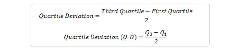
Before diving into further measures of data dispersion, let's first examine the range, quantiles, quartiles, percentiles, and interquartile range.
Let X be a numerical attribute, and let x1, x2,..., xN be a series of observations for X. The set's range is calculated by taking the absolute value of the difference between the greatest and smallest values in the set (max()-min()).

Let's pretend that we have a set of numbers ordered from largest to smallest for attribute X. Imagine we could select particular data points to partition the data distribution equally. Quartiles are a statistical description of data measures based on these values. The quartiles of distribution are discrete numbers chosen at predetermined intervals to create groups of data that are roughly equivalent in size. (We say "basically" because there might not be values of X that divide the data into precisely equal-sized sections. For the sake of clarity, let's assume they're on par. For a given distribution of data, the kth q-quartile is the number x such that no more than k/q of the data values are fewer than x, and no more than (q k)/q of the data values are higher than x, where k is an integer such that 0 k q. Each of the q-quartiles has a probability of q-1.
The 2-quartile is the midpoint between a data set's minimum and maximum values. You may think of it as the middle number. The three data points known as the "4-quartiles" that divide the distribution into four equal parts, with each portion representing one-fourth of the whole, provide the basis for this analysis. Most people will refer to them as "quartiles" instead. The median, the quartiles, and the percentiles are the most often used quartiles, whereas the 100-quartiles are more usually known as percentiles; they divide the data distribution into 100 equal-sized sequential groupings.
The quartiles can be used to determine a distribution's shape, size, and central tendency. Q1 represents the 25th percentile or the first quartile. It discards the bottom 25% of the records.
In this case, Q3 represents the 75th percentile, which eliminates the bottom 75% (or top 25%) of the data. The 50th percentile is the middle quartile. The median represents the midpoint of a set of data.

A straightforward measure of dispersion, the gap between the first and third quartiles reveals the span of values occupied by the middle 50% of the data. The IQR formula is IQR = Q3 Q1, where Q3 and Q1 are the third and first quartiles.
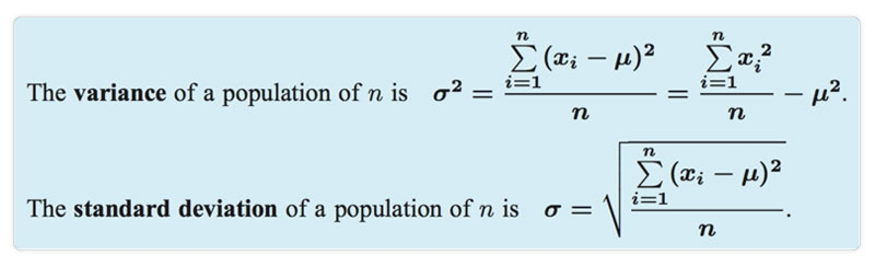
Distributive metrics of data include variance and standard deviation. They show how dispersed a data set is. When the standard deviation is small, the data points cluster tightly around the mean, but when it's big, the data points are dispersed over a wide range of values.
The variance of N observations, x1,x2,...,xN, for a numeric attribute X
The quantiles of one univariate distribution are shown against the quantiles of another distribution in a q-q graphic. It's an effective mental imagery method since it permits the user to see whether there is a change while switching distributions.
Let's pretend we have data from two branches with respect to the attribute or variable unit price. For simplicity, we will refer to the first branch's data as x1,...,xN and the second branch's data as y1,...,yM, with both sets of data being arranged from most recent to least recent. In the case where M = N (i.e., the number of points in both sets is equal), we may plot yi versus xi, where yi and xi are the I 0.5)/N quantiles of the two sets of data.
Only M points will fit on the q-q plot if M N (the second branch contains fewer data than the first). The quantile of the y distribution at index I, expressed as yi, is given by I 0.5)/M.
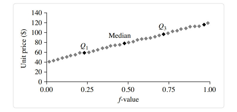
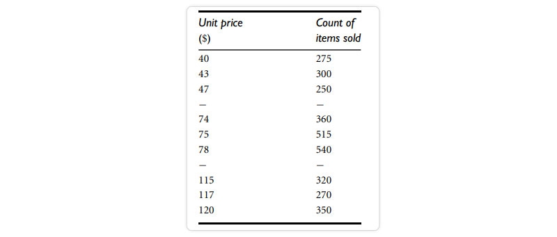
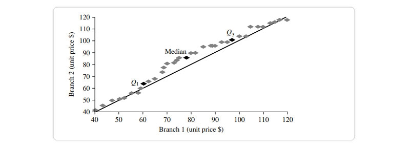
Distribution of the quantiles vs the quantiles. Plots unit pricing data on a quantile-quantile retail sales chart at two AllElectronics locations during a specific time frame. For each data set, each dot represents a quantile, and the unit prices at branch 1 are shown against those at branch 2 at that quantile. (The straight line is meant to be compared to when the unit price is the same at all branches for a particular quantile.The darker data points represent information from Quarter 1, the median, and Quarter 3.For example, we can observe that in the first quarter of this year, the unit price of things sold at branch 1 was somewhat lower than that at branch 2. So, 25% of sales at Store 1 were for products that cost less than equivalent to $60, but at Branch 2, only 25% of things sold were $60 or less. Half of the things sold at Branch 1 were less than $78 (the median, see Q2), and half sold at Branch 2 were less than $85 (the 25th percentile). Generally, we see that the unit prices of goods sold at branch 1 are lower than those sold at branch 2, indicating a change in distribution.
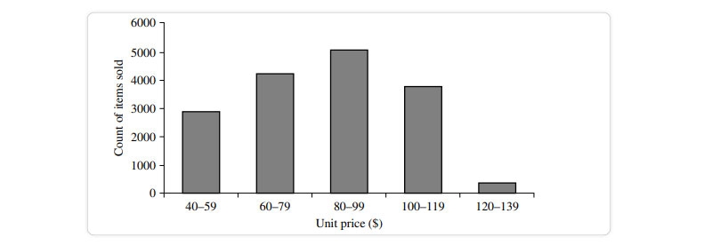
The histogram, sometimes known as a frequency histogram, has been used for at least a century. The word "histogram" comes from the Greek words for "pole" and "gramme," therefore, a histogram is literally a chart of poles. Histograms are a graphical representation for summing up the distribution of an individual value of an attribute X. For each known value, a pole or vertical bar is drawn if X is nominal, like a car model or item category. Each bar's height represents the number of times that particular X value occurred. This type of chart is most generally referred to as a bar chart.
Histogram is the recommended phrase if X is a numerical variable. Separate, sequential subranges of X values have been established. The subranges represent separate segments of X's data distribution, sometimes known as buckets or bins. A bucket's breadth refers to its reach.In most cases, each bucket has the same width as the others. A price characteristic with values from $1 (rounded up to the closest dollar) to $200 (also rounded up to the nearest dollar) can be divided into the subranges 1-20, 21-40, 42-60, etc.
Each subrange is represented by a bar whose height is proportional to the number of data points that fall within that subrange.
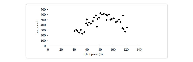
In order to determine if there is a correlation between two variables, a scatter plot is a useful graphical tool.Apparent connection, pattern, or development between the two quantitative features. Each pair of values is interpreted as an algebraic pair of coordinates and represented as a point on the graph paper. The data in Figure are plotted as a scatter diagram. Table
The scatter plot is an effective tool for quickly seeing patterns in bivariate data, identifying outliers, and investigating possible correlations.
When one characteristic (X) implies the other (Y), we say the two characteristics are correlated. A correlation can be either positive or negative or even nonexistent (uncorrelated). Examples of positive and negative relationships between the two characteristics are displayed in the figure. When a pattern of points is plotted, a slope is indicated if the points. Since X is increasing while Y is increasing, a positive correlation may be inferred from the data (Figure). Given a plotted pattern,
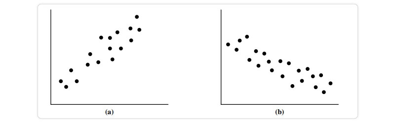
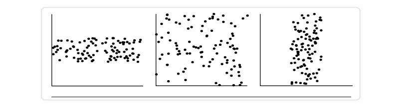
Slopes from left to right, indicating a negative association between X and Y; X values rise as Y values fall (Figure). A line of best fit can be drawn to investigate the link between the variables. You may find information about correlation tests using statistics. In the data sets depicted in each figure, there are three instances in which a correlation exists between the two qualities.
You may get helpful insight into your data's overall behavior by using fundamental data descriptions (such as measures of central tendency and dispersion) and graphical statistical presentations (such as quantile plots, histograms, and scatter plots). They are beneficial for data cleansing since they allow for detecting noise and outliers.Now that we've covered the material, we know data cleansing is crucial to data science. It employs statistical description of data in data mining that measures mean, median, and mode, along with many other methodologies, to make sense of and differentiate across massive datasets. The concepts of variance and standard deviation were introduced afterward.Are you still undecided about whether to pursue a Data Science career and what exactly does a data scientist do? Or are you looking for more detailed Data science career advice? Schedule a free Data science career counseling with us.

Data Science Training

 Mar 03, 2023
  10.1k
10.1k

Rule-Based Classification in Data Mining
Mar 27, 2023 10k
Introduction to Data Objects in Data Mining
Mar 06, 2023 9.9k
Cyber Security

QA

Salesforce

Business Analyst

MS SQL Server

Data Science

DevOps

Hadoop

Python

Artificial Intelligence

Machine Learning

Tableau
Download Syllabus
Get Complete Course Syllabus
Enroll For Demo Class
It will take less than a minute
Tutorials
Interviews
You must be logged in to post a comment