Just a moment...
/* ============================================================== Template name : Bootsnav - Multi Purpose Header Categorie : Bootstrap Menu in CSS Author : adamnurdin01 Version : v.1.2 Created : 2016-06-02 Last update : 2016-10-19 ============================================================== */ /* MEGAMENU STYLE =================================*/ nav.bootsnav .dropdown.megamenu-fw { position: static; } nav.bootsnav .container { position: relative; } nav.bootsnav .megamenu-fw .dropdown-menu { left: auto; } nav.bootsnav .megamenu-content { padding: 15px; width: 100% !important; } nav.bootsnav .megamenu-content .title{ margin-top: 0; } nav.bootsnav .dropdown.megamenu-fw .dropdown-menu { left: 0; right: 0; } /* Navbar =================================*/ nav.navbar.bootsnav{ margin-bottom: 0; -moz-border-radius: 0px; -webkit-border-radius: 0px; -o-border-radius: 0px; border-radius: 0px; background-color:transparent; border: none; /* border-bottom: solid 1px #e0e0e0;*/ z-index: 9; } .sticky{ background-color:#fff !important; padding:5px 0 !important ;border-bottom: solid 1px #e0e0e0;box-shadow: 0 0 4px #e2e2e2; } .navbar-left > li > a{ color: #444 !important; background-color: transparent; outline: none; margin-bottom: -2px; } nav.navbar.bootsnav ul.nav > li > a{ color: #fff; background-color: transparent; outline: none; margin-bottom: -2px; } nav.navbar.bootsnav ul.nav li.megamenu-fw > a:hover, nav.navbar.bootsnav ul.nav li.megamenu-fw > a:focus, nav.navbar.bootsnav ul.nav li.active > a:hover, nav.navbar.bootsnav ul.nav li.active > a:focus, nav.navbar.bootsnav ul.nav li.active > a{ background-color: transparent; } nav.navbar.bootsnav .navbar-toggle{ background-color: #fff; border: none; padding: 0; font-size: 18px; position: relative; top: 5px; } nav.navbar.bootsnav ul.nav .dropdown-menu .dropdown-menu{ top: 0; left: 100%; } nav.navbar.bootsnav ul.nav ul.dropdown-menu > li > a{ white-space:normal; } ul.menu-col{ padding: 0; margin: 0; list-style: none; } ul.menu-col li a{ color: #6f6f6f; } ul.menu-col li a:hover, ul.menu-col li a:focus{ text-decoration: none; } /* Navbar Full =================================*/ nav.bootsnav.navbar-full{ padding-bottom: 10px; padding-top: 10px; } nav.bootsnav.navbar-full .navbar-header{ display: block; width: 100%; } nav.bootsnav.navbar-full .navbar-toggle{ display: inline-block; margin-right: 0; position: relative; top: 0; font-size: 30px; -webkit-transition: all 1s ease-in-out; -moz-transition: all 1s ease-in-out; -o-transition: all 1s ease-in-out; -ms-transition: all 1s ease-in-out; transition: all 1s ease-in-out; } nav.bootsnav.navbar-full .navbar-collapse{ position: fixed; width: 100%; height: 100% !important; top: 0; left: 0; padding: 0; display: none !important; z-index: 9; } nav.bootsnav.navbar-full .navbar-collapse.in{ display: block !important; } nav.bootsnav.navbar-full .navbar-collapse .nav-full{ overflow: auto; } nav.bootsnav.navbar-full .navbar-collapse .wrap-full-menu{ display: table-cell; vertical-align: middle; background-color: #fff; overflow: auto; } nav.bootsnav.navbar-full .navbar-collapse .nav-full::-webkit-scrollbar { width: 0; } nav.bootsnav.navbar-full .navbar-collapse .nav-full::-moz-scrollbar { width: 0; } nav.bootsnav.navbar-full .navbar-collapse .nav-full::-ms-scrollbar { width: 0; } nav.bootsnav.navbar-full .navbar-collapse .nav-full::-o-scrollbar { width: 0; } nav.bootsnav.navbar-full .navbar-collapse ul.nav{ display: block; width: 100%; overflow: auto; } nav.bootsnav.navbar-full .navbar-collapse ul.nav a:hover, nav.bootsnav.navbar-full .navbar-collapse ul.nav a:focus, nav.bootsnav.navbar-full .navbar-collapse ul.nav a{ background-color: transparent; } nav.bootsnav.navbar-full .navbar-collapse ul.nav > li{ float: none; display: block; text-align: center; } nav.bootsnav.navbar-full .navbar-collapse ul.nav > li > a{ display: table; margin: auto; text-transform: uppercase; font-weight: bold; letter-spacing: 2px; font-size: 24px; padding: 10px 15px; } li.close-full-menu > a{ padding-top: 0px; padding-bottom: 0px; } li.close-full-menu{ padding-top: 30px; padding-bottom: 30px; } /* Atribute Navigation =================================*/ .attr-nav{ float: right; display: inline-block; margin-left: 13px; margin-right: -15px; } .attr-nav > ul{ padding: 0; margin: 0 0 -7px 0; list-style: none; display: inline-block; } .attr-nav > ul > li{ float: left; display: block; } .attr-nav > ul > li > a{ color: #6f6f6f; display: block; padding: 28px 15px; position: relative; } .attr-nav > ul > li > a span.badge{ position: absolute; top: 50%; margin-top: -15px; right: 5px; font-size: 10px; padding: 0; width: 15px; height: 15px; padding-top: 2px; } .attr-nav > ul > li.dropdown ul.dropdown-menu{ -moz-border-radius: 0px; -webkit-border-radius: 0px; -o-border-radius: 0px; border-radius: 0px; -moz-box-shadow: 0px 0px 0px; -webkit-box-shadow: 0px 0px 0px; -o-box-shadow: 0px 0px 0px; box-shadow: 0px 0px 0px; border: solid 1px #e0e0e0; } ul.cart-list{ padding: 0 !important; width: 250px !important; } ul.cart-list > li{ position: relative; border-bottom: solid 1px #efefef; padding: 15px 15px 23px 15px !important; } ul.cart-list > li > a.photo{ padding: 0 !important; margin-right: 15px; float: left; display: block; width: 50px; height: 50px; left: 15px; top: 15px; } ul.cart-list > li img{ width: 50px; height: 50px; border: solid 1px #efefef; } ul.cart-list > li > h6{ margin: 0; } ul.cart-list > li > h6 > a.photo{ padding: 0 !important; display: block; } ul.cart-list > li > p{ margin-bottom: 0; } ul.cart-list > li.total{ background-color: #f5f5f5; padding-bottom: 15px !important; } ul.cart-list > li.total > .btn{ display: inline-block; border-bottom: solid 1px #efefef; } ul.cart-list > li .price{ font-weight: bold; } ul.cart-list > li.total > span{ padding-top: 8px; } /* Top Search =================================*/ .top-search{ background-color:#fff; position:absolute; width:100%; z-index:99999 !important;box-shadow: 0 0 4px #e2e2e2; padding: 3px 0; display: none; } .clsdeskmenu{ float:right;} .clsdeskmenu i{ font-size: 27px; color: #444; padding: 25px 10px;} .top-search input.form-control{ background-color: transparent; border: none; -moz-box-shadow: 0px 0px 0px; -webkit-box-shadow: 0px 0px 0px; -o-box-shadow: 0px 0px 0px; box-shadow: 0px 0px 0px; color: #fff; height: 40px; padding: 0 15px; } .top-search .input-group-addon{ background-color: transparent; border: none; color: #fff; padding-left: 0; padding-right: 0; } .top-search .input-group-addon.close-search{ cursor: pointer; } /* Side Menu =================================*/ body{ -webkit-transition: all 0.3s ease-in-out; -moz-transition: all 0.3s ease-in-out; -o-transition: all 0.3s ease-in-out; -ms-transition: all 0.3s ease-in-out; transition: all 0.3s ease-in-out; } body.on-side{ margin-left: -280px; } .side{ position: fixed; overflow-y: auto; top: 0; right: -280px; width: 280px; padding: 25px 30px; height: 100%; display: block; background-color: #333; -webkit-transition: all 0.3s ease-in-out; -moz-transition: all 0.3s ease-in-out; -o-transition: all 0.3s ease-in-out; -ms-transition: all 0.3s ease-in-out; transition: all 0.3s ease-in-out; z-index: 9; } .side.on{ right: 0; } .side .close-side{ float: right; color: #fff; position: relative; z-index: 2; font-size: 16px; } .side .widget{ position: relative; z-index: 1; margin-bottom: 25px; } .side .widget .title{ color: #fff; margin-bottom: 15px; } .side .widget ul.link{ padding: 0; margin: 0; list-style: none; } .side .widget ul.link li a{ color: #9f9f9f; letter-spacing: 1px; } .side .widget ul.link li a:focus, .side .widget ul.link li a:hover{ color: #fff; text-decoration: none; } /* Share =================================*/ nav.navbar.bootsnav .share{ padding: 0 30px; margin-bottom: 30px; } nav.navbar.bootsnav .share ul{ display: inline-block; padding: 0; margin: 0 0 -7px 0; list-style: none; } nav.navbar.bootsnav .share ul > li{ float: left; display: block; margin-right: 5px; } nav.navbar.bootsnav .share ul > li > a{ display: table-cell; vertical-align: middle; text-align: center; width: 35px; height: 35px; -moz-border-radius: 50%; -webkit-border-radius: 50%; -o-border-radius: 50%; border-radius: 50%; background-color: #cfcfcf; color: #fff; } /* Transparent =================================*/ nav.navbar.bootsnav.navbar-fixed{ position: fixed; display: block; width: 100%; } nav.navbar.bootsnav.no-background{ -webkit-transition: all 1s ease-in-out; -moz-transition: all 1s ease-in-out; -o-transition: all 1s ease-in-out; -ms-transition: all 1s ease-in-out; transition: all 1s ease-in-out; } /* Navbar Sticky =================================*/ .wrap-sticky{ position: relative; -webkit-transition: all 0.3s ease-in-out; -moz-transition: all 0.3s ease-in-out; -o-transition: all 0.3s ease-in-out; -ms-transition: all 0.3s ease-in-out; transition: all 0.3s ease-in-out; } .wrap-sticky nav.navbar.bootsnav{ position: absolute; width: 100%; left: 0; top: 0; } .wrap-sticky nav.navbar.bootsnav.sticked{ position: fixed; -webkit-transition: all 0.2s ease-in-out; -moz-transition: all 0.2s ease-in-out; -o-transition: all 0.2s ease-in-out; -ms-transition: all 0.2s ease-in-out; transition: all 0.2s ease-in-out; } body.on-side .wrap-sticky nav.navbar.bootsnav.sticked{ left: -280px; } /* Navbar Responsive =================================*/ @media (min-width: 1024px) and (max-width:1400px) { body.wrap-nav-sidebar .wrapper .container{ width: 100%; padding-left: 30px; padding-right: 30px; } } @media (min-width: 1024px) { #navbar-menu2{ display:none !important;} /* General Navbar =================================*/ nav.navbar.bootsnav ul.nav .dropdown-menu .dropdown-menu{ margin-top: -2px; } nav.navbar.bootsnav ul.nav.navbar-right .dropdown-menu .dropdown-menu{ left: -200px; } nav.navbar.bootsnav ul.nav > li > a{ padding: 30px 15px; font-weight: 600; } nav.navbar.bootsnav ul.nav > li.dropdown > a.dropdown-toggle:after{ content: '▼'; font-size:16px; margin-left: 5px; margin-top: 2px; } nav.navbar.bootsnav li.dropdown ul.dropdown-menu{ -moz-box-shadow: 0px 0px 0px; -webkit-box-shadow: 0px 0px 0px; -o-box-shadow: 0px 0px 0px; box-shadow: 0px 0px 0px; -moz-border-radius: 0px; -webkit-border-radius: 0px; -o-border-radius: 0px; border-radius: 0px; padding: 0; width: auto !important; background: #fff; border: solid 1px #e0e0e0; border-top: solid 5px; } nav.navbar.bootsnav li.dropdown ul.dropdown-menu > li{ width:250px;} nav.navbar.bootsnav li.dropdown ul.megamenu-content > li{ width:auto !important;} nav.navbar.bootsnav li.dropdown ul.dropdown-menu > li a:hover, nav.navbar.bootsnav li.dropdown ul.dropdown-menu > li a:hover{ background-color: transparent; } nav.navbar.bootsnav li.dropdown ul.dropdown-menu > li > a{ padding: 10px 15px; border-bottom: solid 1px #eee; color: #6f6f6f; } nav.navbar.bootsnav li.dropdown ul.dropdown-menu > li:last-child > a{ border-bottom: none; } nav.navbar.bootsnav ul.navbar-right li.dropdown ul.dropdown-menu li a{ text-align: right; } nav.navbar.bootsnav li.dropdown ul.dropdown-menu li.dropdown > a.dropdown-toggle:before{ float: right; content: '►'; margin-top: 0; } nav.navbar.bootsnav ul.navbar-right li.dropdown ul.dropdown-menu li.dropdown > a.dropdown-toggle:before{ float: left; content: '►'; margin-top: 0; } nav.navbar.bootsnav li.dropdown ul.dropdown-menu ul.dropdown-menu{ top: -3px; } nav.navbar.bootsnav ul.dropdown-menu.megamenu-content{ padding: 0 15px !important; } nav.navbar.bootsnav ul.dropdown-menu.megamenu-content > li{ padding: 25px 0 20px; } nav.navbar.bootsnav ul.dropdown-menu.megamenu-content.tabbed{ padding: 0; } nav.navbar.bootsnav ul.dropdown-menu.megamenu-content.tabbed > li{ padding: 0; } nav.navbar.bootsnav ul.dropdown-menu.megamenu-content .col-menu{ padding: 0 30px; margin: 0 -0.5px; border-left: solid 1px #f0f0f0; border-right: solid 1px #f0f0f0; } nav.navbar.bootsnav ul.dropdown-menu.megamenu-content .col-menu:first-child{ border-left: none; } nav.navbar.bootsnav ul.dropdown-menu.megamenu-content .col-menu:last-child{ border-left: none; border-right: none; } nav.navbar.bootsnav ul.dropdown-menu.megamenu-content .content{ display: none; } nav.navbar.bootsnav ul.dropdown-menu.megamenu-content .content ul.menu-col li a{ text-align: left; padding: 5px 0; display: block; width: 100%; margin-bottom: 0; border-bottom: none; color: #6f6f6f; } nav.navbar.bootsnav.on ul.dropdown-menu.megamenu-content .content{ display: block !important; height: auto !important; } /* Navbar Transparent =================================*/ nav.navbar.bootsnav.no-background{ background-color: transparent; border: none; } nav.navbar.bootsnav.navbar-transparent .attr-nav{ padding-left: 15px; margin-left: 30px; } nav.navbar.bootsnav.navbar-transparent.white{ background-color: rgba(255,255,255,0.3); border-bottom: solid 1px #bbb; } nav.navbar.navbar-inverse.bootsnav.navbar-transparent.dark, nav.navbar.bootsnav.navbar-transparent.dark{ background-color: rgba(0,0,0,0.3); border-bottom: solid 1px #555; } nav.navbar.bootsnav.navbar-transparent.white .attr-nav{ border-left: solid 1px #bbb; } nav.navbar.navbar-inverse.bootsnav.navbar-transparent.dark .attr-nav, nav.navbar.bootsnav.navbar-transparent.dark .attr-nav{ border-left: solid 1px #555; } nav.navbar.bootsnav.no-background.white .attr-nav > ul > li > a, nav.navbar.bootsnav.navbar-transparent.white .attr-nav > ul > li > a, nav.navbar.bootsnav.navbar-transparent.white ul.nav > li > a, nav.navbar.bootsnav.no-background.white ul.nav > li > a{ color: #fff; } nav.navbar.bootsnav.navbar-transparent.dark .attr-nav > ul > li > a, nav.navbar.bootsnav.navbar-transparent.dark ul.nav > li > a{ color: #eee; } nav.navbar.bootsnav.navbar-fixed.navbar-transparent .logo-scrolled, nav.navbar.bootsnav.navbar-fixed.no-background .logo-scrolled{ display: none; } nav.navbar.bootsnav.navbar-fixed.navbar-transparent .logo-display, nav.navbar.bootsnav.navbar-fixed.no-background .logo-display{ display: block; } nav.navbar.bootsnav.navbar-fixed .logo-display{ display: none; } nav.navbar.bootsnav.navbar-fixed .logo-scrolled{ display: block; } /* Atribute Navigation =================================*/ .attr-nav > ul > li.dropdown ul.dropdown-menu{ margin-top: 0; margin-left: 55px; width: 250px; left: -250px; } /* Menu Center =================================*/ nav.navbar.bootsnav.menu-center .container{ position: relative; } nav.navbar.bootsnav.menu-center ul.nav.navbar-center{ float:none; margin: 0 auto; display: table; table-layout: fixed; } nav.navbar.bootsnav.menu-center .navbar-header, nav.navbar.bootsnav.menu-center .attr-nav{ position: absolute; } nav.navbar.bootsnav.menu-center .attr-nav{ right: 15px; } /* Navbar Brand top =================================*/ nav.bootsnav.navbar-brand-top .navbar-header{ display: block; width: 100%; text-align: center; background:#fff; border-radius:5px; } nav.bootsnav.navbar-brand-top ul.nav > li.dropdown > ul.dropdown-menu{ margin-top: 2px; } nav.bootsnav.navbar-brand-top ul.nav > li.dropdown.megamenu-fw > ul.dropdown-menu{ margin-top: 0; } nav.bootsnav.navbar-brand-top .navbar-header .navbar-brand{ display: inline-block; float: none; margin: 0; } nav.bootsnav.navbar-brand-top .navbar-collapse{ text-align: center; } nav.bootsnav.navbar-brand-top ul.nav{ display: inline-block; float: none; margin: 0 0 -5px 0; } /* Navbar Center =================================*/ nav.bootsnav.brand-center .navbar-header{ display: block; width: 100%; position: absolute; text-align: center; top: 0; left: 0; } nav.bootsnav.brand-center .navbar-brand{ display: inline-block; float: none; } nav.bootsnav.brand-center .navbar-collapse{ text-align: center; display: inline-block; padding-left: 0; padding-right: 0; } nav.bootsnav.brand-center ul.nav > li.dropdown > ul.dropdown-menu{ margin-top: 2px; } nav.bootsnav.brand-center ul.nav > li.dropdown.megamenu-fw > ul.dropdown-menu{ margin-top: 0; } nav.bootsnav.brand-center .navbar-collapse .col-half{ width: 50%; float: left; display: block; } nav.bootsnav.brand-center .navbar-collapse .col-half.left{ text-align: right; padding-right: 100px; } nav.bootsnav.brand-center .navbar-collapse .col-half.right{ text-align: left; padding-left: 100px; } nav.bootsnav.brand-center ul.nav{ float: none !important; margin-bottom: -5px !important; display: inline-block !important; } nav.bootsnav.brand-center ul.nav.navbar-right{ margin: 0; } nav.bootsnav.brand-center.center-side .navbar-collapse .col-half.left{ text-align: left; padding-right: 100px; } nav.bootsnav.brand-center.center-side .navbar-collapse .col-half.right{ text-align: right; padding-left: 100px; } /* Navbar Sidebar =================================*/ body.wrap-nav-sidebar .wrapper{ padding-left: 260px; overflow-x: hidden; } nav.bootsnav.navbar-sidebar{ position: fixed; width: 260px; overflow: hidden; left: 0; padding: 0 0 0 0 !important; background: #fff; border-right: solid 1px #dfdfdf; } nav.bootsnav.navbar-sidebar .scroller{ width: 280px; overflow-y:auto; overflow-x: hidden; } nav.bootsnav.navbar-sidebar .container-fluid, nav.bootsnav.navbar-sidebar .container{ padding: 0 !important; } nav.bootsnav.navbar-sidebar .navbar-header{ float: none; display: block; width: 260px; padding: 10px 15px; margin: 10px 0 0 0 !important; } nav.bootsnav.navbar-sidebar .navbar-collapse{ padding: 0 !important; width: 260px; } nav.bootsnav.navbar-sidebar ul.nav{ float: none; display: block; width: 100%; padding: 0 15px !important; margin: 0 0 30px 0; } nav.bootsnav.navbar-sidebar ul.nav li{ float: none !important; } nav.bootsnav.navbar-sidebar ul.nav > li > a{ padding: 10px 15px; font-weight: bold; } nav.bootsnav.navbar-sidebar ul.nav > li.dropdown > a:after{ float: right; } nav.bootsnav.navbar-sidebar ul.nav li.dropdown ul.dropdown-menu{ left: 100%; top: 0; position: relative !important; left: 0 !important; width: 100% !important; height: auto !important; background-color: transparent; border: none !important; padding: 0; -moz-box-shadow: 0px 0px 0px; -webkit-box-shadow: 0px 0px 0px; -o-box-shadow: 0px 0px 0px; box-shadow: 0px 0px 0px; } nav.bootsnav.navbar-sidebar ul.nav .megamenu-content .col-menu{ border: none !important; } nav.bootsnav.navbar-sidebar ul.nav > li.dropdown > ul.dropdown-menu{ margin-bottom: 15px; } nav.bootsnav.navbar-sidebar ul.nav li.dropdown ul.dropdown-menu{ padding-left: 0; float: none; margin-bottom: 0; } nav.bootsnav.navbar-sidebar ul.nav li.dropdown ul.dropdown-menu li a{ padding: 5px 15px; color: #6f6f6f; border: none; } nav.bootsnav.navbar-sidebar ul.nav li.dropdown ul.dropdown-menu ul.dropdown-menu{ padding-left: 15px; margin-top: 0; } nav.bootsnav.navbar-sidebar ul.nav li.dropdown ul.dropdown-menu li.dropdown > a:before{ font-family: 'FontAwesome'; content: "\f105"; float: right; } nav.bootsnav.navbar-sidebar ul.nav li.dropdown.on ul.dropdown-menu li.dropdown.on > a:before{ content: "\f107"; } nav.bootsnav.navbar-sidebar ul.dropdown-menu.megamenu-content > li{ padding: 0 !important; } nav.bootsnav.navbar-sidebar .dropdown .megamenu-content .col-menu{ display: block; float: none !important; padding: 0; margin: 0; width: 100%; } nav.bootsnav.navbar-sidebar .dropdown .megamenu-content .col-menu .title{ padding: 7px 0; text-transform: none; font-weight: 400; letter-spacing: 0px; margin-bottom: 0; cursor: pointer; color: #6f6f6f; } nav.bootsnav.navbar-sidebar .dropdown .megamenu-content .col-menu .title:before{ font-family: 'FontAwesome'; content: "\f105"; float: right; } nav.bootsnav.navbar-sidebar .dropdown .megamenu-content .col-menu.on .title:before{ content: "\f107"; } nav.bootsnav.navbar-sidebar .dropdown .megamenu-content .col-menu{ border: none; } nav.bootsnav.navbar-sidebar .dropdown .megamenu-content .col-menu .content{ padding: 0 0 0 15px; } nav.bootsnav.navbar-sidebar .dropdown .megamenu-content .col-menu ul.menu-col li a{ padding: 3px 0 !important; } } @media (max-width: 992px) { .attr-nav .search{ display:none !important;} /* Navbar Responsive =================================*/ nav.navbar.bootsnav .navbar-brand { display: inline-block; float: none !important; margin: 0 !important; } nav.navbar.bootsnav .navbar-header { float: none; display: block; text-align: center; padding-left: 30px; padding-right: 30px; } nav.navbar.bootsnav .navbar-toggle { display: inline-block; float: left; margin-right: -200px; margin-top: 10px; } nav.navbar.bootsnav .navbar-collapse { border: none; margin-bottom: 0; } nav.navbar.bootsnav.no-full .navbar-collapse{ max-height: 350px; overflow-y: auto !important; } nav.navbar.bootsnav .navbar-collapse.collapse { display: none !important; } nav.navbar.bootsnav .navbar-collapse.collapse.in { display: block !important; } nav.navbar.bootsnav .navbar-nav { float: none !important; padding-left: 30px; padding-right: 30px; margin: 0px -15px; } nav.navbar.bootsnav .navbar-nav > li { float: none; } nav.navbar.bootsnav li.dropdown a.dropdown-toggle:before{ content: '▼'; float: right; font-size: 16px; margin-left: 10px; } nav.navbar.bootsnav li.dropdown.on > a.dropdown-toggle:before{ content: '▼'; } nav.navbar.bootsnav .navbar-nav > li > a{ display: block; width: 100%; border-bottom: solid 1px #e0e0e0; padding: 10px 0; border-top: solid 1px #e0e0e0; margin-bottom: -1px; } nav.navbar.bootsnav .navbar-nav > li:first-child > a{ border-top: none; } nav.navbar.bootsnav ul.navbar-nav.navbar-left > li:last-child > ul.dropdown-menu{ border-bottom: solid 1px #e0e0e0; } nav.navbar.bootsnav ul.nav li.dropdown li a.dropdown-toggle{ float: none !important; position: relative; display: block; width: 100%; } nav.navbar.bootsnav ul.nav li.dropdown ul.dropdown-menu{ width: 100%; position: relative !important; background-color: transparent; float: none; border: none; padding: 0 0 0 15px !important; margin: 0 0 18px 0 !important; -moz-box-shadow: 0px 0px 0px; -webkit-box-shadow: 0px 0px 0px; -o-box-shadow: 0px 0px 0px; box-shadow: 0px 0px 0px; -moz-border-radius: 0px 0px 0px; -webkit-border-radius: 0px 0px 0px; -o-border-radius: 0px 0px 0px; border-radius: 0px 0px 0px; } nav.navbar.bootsnav ul.nav li.dropdown ul.dropdown-menu > li > a{ display: block; width: 100%; border-bottom: solid 1px #e0e0e0; padding: 10px 0; color: #6f6f6f; } nav.navbar.bootsnav ul.nav ul.dropdown-menu li a:hover, nav.navbar.bootsnav ul.nav ul.dropdown-menu li a:focus{ background-color: transparent; } nav.navbar.bootsnav ul.nav ul.dropdown-menu ul.dropdown-menu{ float: none !important; left: 0; padding: 0 0 0 15px; position: relative; background: transparent; width: 100%; } nav.navbar.bootsnav ul.nav ul.dropdown-menu li.dropdown.on > ul.dropdown-menu{ display: inline-block; margin-top: -10px; } nav.navbar.bootsnav li.dropdown ul.dropdown-menu li.dropdown > a.dropdown-toggle:after{ display: none; } nav.navbar.bootsnav .dropdown .megamenu-content .col-menu .title{ padding: 10px 15px 10px 0; line-height: 24px; text-transform: none; font-weight: 400; letter-spacing: 0px; margin-bottom: 0; cursor: pointer; border-bottom: solid 1px #e0e0e0; color: #6f6f6f; } nav.navbar.bootsnav .dropdown .megamenu-content .col-menu ul > li > a{ display: block; width: 100%; border-bottom: solid 1px #e0e0e0; padding: 8px 0; } nav.navbar.bootsnav .dropdown .megamenu-content .col-menu .title:before{ font-family: 'FontAwesome'; content: "\f105"; float: right; font-size: 16px; margin-left: 10px; position: relative; right: -15px; } nav.navbar.bootsnav .dropdown .megamenu-content .col-menu:last-child .title{ border-bottom: none; } nav.navbar.bootsnav .dropdown .megamenu-content .col-menu.on:last-child .title{ border-bottom: solid 1px #e0e0e0; } nav.navbar.bootsnav .dropdown .megamenu-content .col-menu:last-child ul.menu-col li:last-child a{ border-bottom: none; } nav.navbar.bootsnav .dropdown .megamenu-content .col-menu.on .title:before{ content: "\f107"; } nav.navbar.bootsnav .dropdown .megamenu-content .col-menu .content{ padding: 0 0 0 15px; } nav.bootsnav.brand-center .navbar-collapse{ display: block; } nav.bootsnav.brand-center ul.nav{ margin-bottom: 0px !important; } nav.bootsnav.brand-center .navbar-collapse .col-half{ width: 100%; float: none; display: block; } nav.bootsnav.brand-center .navbar-collapse .col-half.left{ margin-bottom: 0; } nav.bootsnav .megamenu-content{ padding: 0; } nav.bootsnav .megamenu-content .col-menu{ padding-bottom: 0; } nav.bootsnav .megamenu-content .title{ cursor: pointer; display: block; padding: 10px 15px; margin-bottom: 0; font-weight: normal; } nav.bootsnav .megamenu-content .content{ display: none; } .attr-nav{ position: absolute; right: 60px; } .attr-nav > ul{ padding: 0; margin: 0 -15px -7px 0; } .attr-nav > ul > li > a{ padding: 16px 15px 15px; } .attr-nav > ul > li.dropdown > a.dropdown-toggle:before{ display: none; } .attr-nav > ul > li.dropdown ul.dropdown-menu{ margin-top: 2px; margin-left: 55px; width: 250px; left: -250px; border-top: solid 5px; } .top-search .container{ padding: 0 45px; } /* Navbar full Responsive =================================*/ nav.bootsnav.navbar-full ul.nav{ margin-left: 0; } nav.bootsnav.navbar-full ul.nav > li > a{ border: none; } nav.bootsnav.navbar-full .navbar-brand { float: left !important; padding-left: 0; } nav.bootsnav.navbar-full .navbar-toggle { display: inline-block; float: right; margin-right: 0; margin-top: 10px; } nav.bootsnav.navbar-full .navbar-header { padding-left: 15px; padding-right: 15px; } /* Navbar Sidebar =================================*/ nav.navbar.bootsnav.navbar-sidebar .share{ padding: 30px 15px; margin-bottom: 0; } /* Tabs =================================*/ nav.navbar.bootsnav .megamenu-content.tabbed{ padding-left: 0 !mportant; } nav.navbar.bootsnav .tabbed > li{ padding: 25px 0; margin-left: -15px !important; } /* Mobile Navigation =================================*/ body > .wrapper{ -webkit-transition: all 0.3s ease-in-out; -moz-transition: all 0.3s ease-in-out; -o-transition: all 0.3s ease-in-out; -ms-transition: all 0.3s ease-in-out; transition: all 0.3s ease-in-out; } body.side-right > .wrapper{ margin-left: 280px; margin-right: -280px !important; } nav.navbar.bootsnav.navbar-mobile .navbar-collapse{ position: fixed; overflow-y: auto !important; overflow-x: hidden !important; display: block; background: #fff; z-index: 99; width: 280px; height: 100% !important; left: -280px; top: 0; padding: 0; -webkit-transition: all 0.3s ease-in-out; -moz-transition: all 0.3s ease-in-out; -o-transition: all 0.3s ease-in-out; -ms-transition: all 0.3s ease-in-out; transition: all 0.3s ease-in-out; } nav.navbar.bootsnav.navbar-mobile .navbar-collapse.in{ left: 0; } nav.navbar.bootsnav.navbar-mobile ul.nav{ width: 293px; padding-right: 0; padding-left: 15px; } nav.navbar.bootsnav.navbar-mobile ul.nav > li > a{ padding: 15px 15px; } nav.navbar.bootsnav.navbar-mobile ul.nav ul.dropdown-menu > li > a{ padding-right: 15px !important; padding-top: 15px !important; padding-bottom: 15px !important; } nav.navbar.bootsnav.navbar-mobile ul.nav ul.dropdown-menu .col-menu .title{ padding-right: 30px !important; padding-top: 13px !important; padding-bottom: 13px !important; } nav.navbar.bootsnav.navbar-mobile ul.nav ul.dropdown-menu .col-menu ul.menu-col li a{ padding-top: 13px !important; padding-bottom: 13px !important; } nav.navbar.bootsnav.navbar-mobile .navbar-collapse [class*=' col-'] { width: 100%; } nav.navbar.bootsnav.navbar-fixed .logo-scrolled{ display: block !important; } nav.navbar.bootsnav.navbar-fixed .logo-display{ display: none !important; } nav.navbar.bootsnav.navbar-mobile .tab-menu, nav.navbar.bootsnav.navbar-mobile .tab-content{ width: 100%; display: block; } } @media (max-width: 767px) { nav.navbar.bootsnav .navbar-header { padding-left: 15px; padding-right: 15px; } nav.navbar.bootsnav .navbar-nav { padding-left: 15px; padding-right: 15px; } .attr-nav{ right: 30px; } .attr-nav > ul{ margin-right: -10px; } .attr-nav > ul > li > a{ padding: 16px 10px 15px; padding-left: 0 !important; } .attr-nav > ul > li.dropdown ul.dropdown-menu{ left: -275px; } .top-search .container{ padding: 0 15px; } nav.bootsnav.navbar-full .navbar-collapse{ left: 15px; } nav.bootsnav.navbar-full .navbar-header{ padding-right: 0; } nav.bootsnav.navbar-full .navbar-toggle { margin-right: -15px; } nav.bootsnav.navbar-full ul.nav > li > a{ font-size: 18px !important; line-height: 24px !important; padding: 5px 10px !important; } /* Navbar Sidebar =================================*/ nav.navbar.bootsnav.navbar-sidebar .share{ padding: 30px 15px !important; } /* Navbar Sidebar =================================*/ nav.navbar.bootsnav.navbar-sidebar .share{ padding: 30px 0 !important; margin-bottom: 0; } nav.navbar.bootsnav.navbar-mobile.navbar-sidebar .share{ padding: 30px 15px !important; margin-bottom: 0; } /* Mobile Navigation =================================*/ body.side-right > .wrapper{ margin-left: 280px; margin-right: -280px !important; } nav.navbar.bootsnav.navbar-mobile .navbar-collapse{ margin-left: 0; } nav.navbar.bootsnav.navbar-mobile ul.nav{ margin-left: -15px; } nav.navbar.bootsnav.navbar-mobile ul.nav{ border-top: solid 1px #fff; } li.close-full-menu{ padding-top: 15px !important; padding-bottom: 15px !important; } } @media (min-width: 480px) and (max-width: 640px) { nav.bootsnav.navbar-full ul.nav{ padding-top: 30px; padding-bottom: 30px; } } Just a moment...
/*Responsive Media Queries Max 320px */ @media screen and (max-width: 320px) { .sed { width: 38px !important; height: 38px !important; font-size: 22px !important; line-height: 44px !important; } ul.mega-menulist li { padding: 4px 8px !important; } .td-txt .col-xs-7 { width: 78%; } #Course p.slider-cont.blue { font-size: 13px !important; } .mobilescreen span.cont { font-size: 15px !important; } .cert { font-size: 17px !important; padding-left: 0px; } .getcall-box button.buttonctadarkbtn.btn.btn-lg { width: 86% !important; } .callto { width: 48% !important; top: 16px !important; } nav.navbar .navbar-brand { left: -68px !important; top: 10px !important; } nav.navbar .navbar-brand img.logo { width: 60px !important; } .rgt-icon p.cont2.mb0 { line-height: 48px; font-size: 14px; } .jobsare p.slider-text.white { font-size: 33px !important; } .whtlogo { margin: 70px 0 5px -26px; } .half img { width: 274px; margin: 0 auto 10px auto; } .counter .col-xs-10, .counter .col-xs-9 { padding-left: 8px !important; } .headbutton { font-size: 10px !important; width: 154px !important; } .headbutton1 { font-size: 10px; } .select2-container { margin-right: 2px !important; } nav.navbar.bootsnav { margin-bottom: 0; -moz-border-radius: 0px; -webkit-border-radius: 0px; -o-border-radius: 0px; border-radius: 0px; background-color: #fff !important; border: none; border-bottom: solid 1px #e0e0e0; z-index: 9; } .modal-content { -webkit-box-shadow: 0 5px 15px rgba(0, 0, 0, 0.5); background-image: -webkit-gradient( linear, left top, right bottom, from(#02b3e4), to(#02ccba) ); background-image: linear-gradient(to bottom right, #02b3e4, #02ccba); box-shadow: 0 5px 15px rgba(0, 0, 0, 0.5); } .modal-header { border-bottom: none; color: #fff; padding-bottom: 0px; } .modal-title { color: #fff; } } /*Responsive Media Queries Max 480px */ @media screen and (max-width: 480px) { /*Blogs*/ .blogttl { font-size: 15px; padding: 10px; box-shadow: 0 5px 20px 2px rgba(0, 0, 0, 0.12); font-weight: bold; margin-bottom: 10px; } .rght.sticky { display: none; } .blogdtlright h2 { font-size: 1.2em; font-weight: 700; line-height: 26px; margin-top: 20px; margin-bottom: 8px; } .crsbox2 { box-shadow: 0 5px 20px 2px rgba(0, 0, 0, 0.12); margin-bottom: 12px; } .crsbox2 p { position: absolute; bottom: 0; right: 12%; color: #fff; font-size: 18px; text-align: center; } /*Blogs*/ /**** JT Css *****/ nav#heder { z-index: 111111 !important; } nav.navbar.bootsnav.no-full .navbar-collapse { max-height: 227px; } .navbar-brand { float: left; height: 46px !important; } nav#heder { position: fixed !important; } .btn-store, .btn-store2 { font-size: 11px !important; line-height: 15px; width: 86px; text-align: center; padding: 3px 0px !important; } .cert { font-size: 21px; padding-left: 0px; } .select2-container { margin-right: 9px; } .mobilescreen span.cont { color: #fff; font-size: 17px; margin-bottom: 16px; display: block; } .mobilescreen button { border: 2px solid #ffffff !important; color: #fff !important; } .mobilescreen button a.dark.notxtdec { color: #fff !important; } .modal-body { position: relative; padding: 6px; } #myModal3 .modal-dialog, #myModal4 .modal-dialog, #myModal5 .modal-dialog, #myModal6 .modal-dialog { width: 100% !important; top: -20px !important; } #myModal3 .modal-content, #myModal4 .modal-content, #myModal5 .modal-content, #myModal6 .modal-content { width: 96% !important; margin: 0 auto; float: none !important; } #myModal .modal-content { width: 98% !important; background: url(https://www.janbasktraining.com/assets/demo2019/img/popup-mob.webp) top center !important; background-size: cover !important; background-repeat: no-repeat !important; padding-bottom: 61px; } #myModal .modal-dialog { width: 92% !important; } #myModal2 .modal-dialog { width: 92% !important; } #myModal2 .modal-content { width: 98% !important; background: url(https://www.janbasktraining.com/assets/demo2019//img/popup-bg3.webp) top center !important; background-size: cover !important; background-repeat: no-repeat !important; } div#myModal2 .modal-body { padding-top: 144px; } nav.navbar { padding-top: 0px !important; } nav.navbar .navbar-brand { left: -80px; top: 8px; } nav.navbar.bootsnav ul.nav > li > a { padding: 10px 15px; font-size: 15px; border-bottom: 1px solid #eee !important; } ul.phone-strip { width: 64%; background: #fff; float: none; margin: 0 auto; } ul.phone-strip li { list-style: none; float: left; padding: 8px 20px; color: #000; display: table; width: 100%; text-align: center; border: 1px solid #ab2927; margin-bottom: 20px; } ul.phone-strip li:nth-child(2) { background: #ab2927; } ul.phone-strip li:nth-child(2) a { color: #fff; } .callto { width: 40%; float: right; position: absolute; right: 0px; top: 21px; } li.signline:after { content: none; } li.mob-btn { display: none; } ul.mega-menulist li { padding: 4px 12px; font-size: 13px; border-bottom: 1px solid #eee; margin-left: -14px; background: #f7f7f7; } ul.dropdown-menu.mega-menu { min-width: 100% !important; left: 0px; transform: none; background: #fff !important; background-size: contain !important; border-bottom: 4px solid #ab2927 !important; float: left !important; position: initial !important; margin: 0 auto !important; } .lead3:after { width: 3px; height: 20px; } p.course:after { width: 3px; height: 20px; } .percentage .counter p.slider-text { font-size: 28px; margin-top: 10px; color: #414a53; } .counter .col-xs-10, .counter .col-xs-9 { padding-left: 0px; } .counter .col-xs-2 { padding-right: 0px; width: 14%; } .counter .col-xs-3 { padding-right: 0px; width: 18%; } .million .counter p.slider-text.white { font-size: 26px; } .counter p.slider-text { font-size: 26px !important; margin-top: 20px !important; } .percentage img { width: 150px; } .whtlogo img { margin-left: 20px; margin-top: 0px; } .instr-bx.inst2 p.cont2.mb0 { text-align: left; padding-left: 20px; } .padding0 { padding-left: 0px; padding-right: 0px; } .container { width: 100% !important; } .mobilescreen p.form-head.mb0 { position: absolute; background: #eeb617; } .dat { font-size: 14px; font-weight: 700; margin-bottom: 0px; } .est { font-size: 10px; margin-bottom: 0px; } .week { margin-bottom: 0px; } .getcall-box button.buttonctadarkbtn.btn.btn-lg { box-shadow: 5px 4px 3px #bbb0b0; width: 61%; margin-top: 20px; font-size: 14px; } .lineon:before { position: absolute; top: 48px; background: #777; width: 1px; height: 110px; right: 14px; content: none; } #Corporate button.buttonctadarkbtn.btn.btn-lg { padding: 6px 10px; font-size: 12px; margin-bottom: 10px; width: 138px; } .still button.buttonctadarkbtn.btn.btn-lg { padding: 6px 10px; font-size: 12px; width: 138px; } .still img { width: 120px; margin: 0 auto; display: table; } .maria img { width: 120px; margin: 0 auto; float: none !important; } .still { width: 100%; text-align: center; } .tab-pane { margin-bottom: 20px; } #accordion3 .panel-title > a { font-size: 14px !important; line-height: 20px; padding: 10px; } #accordion3 .panel.panel-default { border-radius: 0px; } #accordion3 a.collapsed { border-right: 3px solid #ab2927; border-radius: 0px; } #accordion3 a.collapsed { border-right: 3px solid #ab2927; border-radius: 0px; padding: 10px; } #accordion3 .panel.panel-default { border-radius: 0px; margin-bottom: 24px; } div#accordion3:after { background: #ab2927; position: absolute; top: 0px; content: ""; width: 3px; height: 250px; left: 40px; z-index: -1; } .star-rating-review { text-align: left; } li.fb-icon { margin-right: 0px; } div#accordion3 { position: relative; } #Course p.slider-cont.blue { margin-bottom: 20px; } .fullscreen { display: none; } .mobilescreen { display: block; } #accordion2 .panel-body span { font-size: 13px !important; line-height: 18px !important; display: block; } #accordion2 .panel-body { padding: 10px; } i.fa.fa-sort-down.pull-right { font-size: 20px; line-height: 20px; color: #3598c1; } i.fa.fa-sort-down.pull-right { line-height: 14px; } #accordion2 .panel.panel-default { border-radius: 8px; } .faq-acor #accordion1 .panel-heading .panel-title > a { font-size: 13px !important; } .panel-title > a { font-size: 14px !important; line-height: 20px; } .lead3 { font-size: 16px; line-height: 18px; } .lead2 { font-size: 18px; font-weight: 700; } .wehave { margin: 14px 0 0 0px; padding: 14px 22px; } p { margin-bottom: 10px; } .section { padding: 20px 0; } .getcall-box p.cont2.dark { font-size: 13px; text-align: left; } .getcall-box h3.slider-text2.dark { margin-bottom: 4px; } .cont2 { font-size: 15px; line-height: 20px; } .getcall-box h3.slider-text2 { font-size: 16px; padding-left: 14px; } .getcall-box h3.slider-text2:after { width: 3px; height: 20px; } .instr-bx.inst2 { margin-top: 0px; padding-left: 20px; padding-top: 10px; padding-bottom: 10px; } #Course p.course.red { font-size: 18px; padding-left: 14px; text-align: left; line-height: 20px; } div.bhoechie-tab-content { box-shadow: none; padding: 10px 0px; background: #fff; } .bhoechie-tab { background: #fff; box-shadow: 1px 1px 8px 1px #c5bdbd75; padding: 0px 10px; margin-bottom: 40px; } .instr-bx i { float: left; margin-right: 8px; line-height: 24px; display: block; font-size: 14px; color: #ffc107; } .register p.lead3 { font-size: 16px; line-height: 24px; } .tab-bx:after, .register:after { position: fixed; z-index: -1; } .asper { margin: 10px 0px; } .asper p.cont.white.mb0 { margin: 0px 0px; line-height: 18px; } .jobsare p.slider-text.white { font-size: 44px; } .doyou button.buttonctadarkbtn.btn.btn-md { margin-top: 10px; font-size: 13px; } .doyou p { font-size: 18px; line-height: 24px; } .counter { padding: 0px 0px; border-radius: 5px; } .crm, .million { height: auto; padding: 24px 0px; } .million p.slider-text.white { font-size: 22px; margin-bottom: 4px; } .crm p.slider-text.white { font-size: 22px; margin-bottom: 4px; } .lead1:after { width: 3px; height: 20px; } .lead1 { font-size: 20px; padding-left: 16px; } .headbutton1 { padding: 6px 10px; border: 2px solid #ffffff; font-size: 11px; margin-bottom: 10px; width: 104px; } .headbutton { padding: 6px 10px; border: 2px solid #ffffff; font-size: 11px; margin-bottom: 10px; width: 158px; } .bannerhome p.slider-text.white:after { bottom: -104px; } .kln { } .kln p.cont.white { margin-top: 44px !important; font-size: 13px; } .slider-text { font-size: 18px; line-height: 22px; } .slider-cont { font-size: 12px; line-height: 17px; text-align: justify; } section.sticky-nav-tabs { display: none; } select.custom-select.form-control { margin-right: 14px; } .instr-bx .col-xs-12 { border-bottom: 0px; border-right: 0px !important; padding-bottom: 4px; } .instr-bx p.cont2.mb0 { padding: 4px 0px; text-align: center; } .instr-bx { position: initial; text-align: left; border-radius: 0px; width: 100%; margin: 0 auto; display: table; float: none; box-shadow: none; background: transparent; color: #fff; margin-top: -32px; } .getcall-box { width: 100%; margin-top: 0px; padding: 16px; border-radius: 6px; } /**** JT Css End *****/ .modal-content { -webkit-box-shadow: 0 5px 15px rgba(0, 0, 0, 0.5); background-image: -webkit-gradient( linear, left top, right bottom, from(#02b3e4), to(#02ccba) ); background-image: linear-gradient(to bottom right, #02b3e4, #02ccba); box-shadow: 0 5px 15px rgba(0, 0, 0, 0.5); } .modal-header { border-bottom: none; color: #fff; padding-bottom: 0px; } .modal-title { color: #fff; } .mtpm { margin-top: -40px; } .contactleft { margin-bottom: 40px; } nav.navbar.bootsnav { margin-bottom: 0; -moz-border-radius: 0px; -webkit-border-radius: 0px; -o-border-radius: 0px; border-radius: 0px; background-color: #fff !important; border: none; border-bottom: solid 1px #e0e0e0; z-index: 9; } .fancy2 span:before, .fancy span:before { width: 72px; right: 102%; margin-right: 15px; top: 16px !important; } .fancy2, .fancy { margin-left: 94px; } .nav-justified > li { float: left; width: 25%; } #nav-tabs > li > a { padding: 10px 2px !important; float: none !important; } .events-timeline .timeline-block .content-column .event-date2 { bottom: -84px; } } @media (min-width: 600px) and (max-width: 600px) { img.img-responsive.lazy.img-rounded.kln { width: 114px; } nav.navbar.bootsnav { margin-bottom: 0; -moz-border-radius: 0px; -webkit-border-radius: 0px; -o-border-radius: 0px; border-radius: 0px; background-color: #fff !important; border: none; border-bottom: solid 1px #e0e0e0; z-index: 9; } .fancy2 span:before, .fancy span:before { top: 10px !important; } .events-timeline .timeline-block .content-column .content-box { margin-bottom: 30px; } } /*Responsive Media Queries Max 767px */ @media screen and (max-width: 767px) { div#mySidenav .temp-2-custom-bx .affix { top: 210px !important; } #body-interview .breadcrumb li a { font-size: 12px; } .section.section1.bannerhome.postDetailsBg { margin-top: 56px; } #body-interview #topfiltrbtn button.buttonctadarkbtn.btn, #body-interview #topfiltrbtn a.buttonctadarkbtn.btn { height: 40px; } #body-interview select#subcatefory, #body-interview select#filtercategory { height: 40px; } #body-interview .spa-manage { padding: 28px 0px 0!important; } #body-interview .media { padding: 10px 6px; } #body-interview .section.section1.bannerhome.tpl, .section.section1.bannerhome.salesforceHome { margin-top: 54px; padding-bottom: 30px!important; } .temp-2-custom-bx .affix { position: fixed!important; } #arrow-sidebarMob, .closebtnMob { display: block; } span#arrow-sidebarMob { position: fixed!important; right: -20px; background: #ab2927; padding: 2px 11px; border-radius: 4px; color: #fff; top: 4px; z-index: 11; cursor: pointer; font-size: 15px!important; right: initial!important; top: 208px!important; border-radius: 0px 4px 4px 0px!important; left: 0px!important; } a.closebtnMob { z-index: 11; color: #fff; font-size: 32px; right: -40px; top: 4px; display: none; background: #ab2927; padding: 4px 14px; border-radius: 4px; } .sidenav { margin-left: -298px; } div#rightarea { margin-left: 0; transition: 0.3s; } #arrow-sidebarMob{ display: block;; } #arrow-sidebar{ display: none;; } .closebtnMob { position: fixed!important; font-size: 30px!important; right: initial!important; top: 198px!important; border-radius: 0px 4px 4px 0px!important; left: 0px!important; } .blogdtlright ul, ol { margin-top: 10px; padding: 0 18px!important; } .blogdtlright h4 { font-size: 17px!important; line-height: 22px!important; } .pageheading { font-size: 20px; font-weight: 700; padding: 20px 10px 8px 10px; margin-bottom: 0px; } span#arrow-sidebar { right: -8px!important; top: 25px!important; } .blogdtlright blockquote { padding: 8px 10px; margin: 20px 0!important; font-size: 15px; border-left: 5px solid #eee; text-align: left; line-height: 17px; } .blogdtlright.new-blog-ak h4 { text-align: left; } div#contentboxdetail { padding: 40px 6px!important; } .temp-2-custom-bx .affix { top: 154px !important; } .section.section1.bannerhome.postDetails { top: 0px; } .blogttl p { min-height: auto!important; } .textinfoleft.blogtrnd ul.Real li { font-size: 11px; line-height: 12px; font-weight: 500; padding-bottom: 2px; } .course-blog button.slick-next.slick-arrow, .trend-course button.slick-next.slick-arrow { background: #eee url(https://www.janbasktraining.com/interview-questions/assets/images/right-arrow.png) no-repeat center!important; background-size: 12px!important; width: 28px!important; height: 28px!important; top: -37px!important; } .course-blog button.slick-prev.slick-arrow, .trend-course button.slick-prev.slick-arrow { right: 60px!important; background: #eee url(https://www.janbasktraining.com/interview-questions/assets/images/left-arrow.png) no-repeat center!important; background-size: 12px!important; width: 28px!important; height: 28px!important; top: -37px!important; } .search-course .slick-track { width: initial!important; } #body-interview .textinfoleft.blogtrnd .cont { font-size: 14px!important; line-height: 18px!important; padding-bottom: 6px; } #body-interview .kln { margin-top: -18px; } nav#heder { top: 0px; } #body-interview .blogttll p { margin-bottom: 6px; height: 48px; } .section.section5.latest_post .media { margin-bottom: 20px; flex-direction: column; border: 1px solid #eee; } .newsImg img{ width: 100%!important; } #body-interview .media { margin-bottom: 20px; padding: 4px 4px; } .newsImg { width: 100%!important; margin-bottom: 8px; } .blogttll p a { border-bottom: none; color: #23527c; font-size: .94em; line-height: 1.1em!important; display: block; } #body-interview span.category_name { font-size: .8em; } /* div#bannerform{ display: none; } */ .section.section5.latest_post .media { margin-bottom: 20px; flex-direction: column; } .section.section5.latest_post .media-body { width: 100%; } #body-interview .blogttll { margin: 0px!important; font-size: 1em!important; } #body-interview nav.navbar .navbar-brand img.logo { margin: 2px 0 0; width: 100px!important; } #body-interview .bannerhome { padding: 38px 0px 11px 0px; background: #edf2f5 !important; } .btnw1 img.img-responsive { width: 18px; float: left; vertical-align: middle; margin: 0px auto 0px auto; margin-right: 4px; } .btnw1 { color: #000 !important; background: #ffcc00; font-weight: 600; margin-top: 8px; padding: 4px 18px !important; border: 0; font-size: 11px !important; line-height: 20px; width: auto; border-radius: 28px; float: left; margin-right: 10px; margin-bottom: 20px; } /* .btnw1 img.img-responsive { width: 18px; float: left; vertical-align: middle; margin: 0px auto 0px auto; margin-right: 4px; } .btnw1 { color: #000 !important; background: #ffcc00; font-weight: 600; margin-top: 8px; padding: 5px 15px; border: 0; font-size: 11px; line-height: 20px; width: auto; border-radius: 28px; float: left; margin-right: 10px; margin-bottom: 20px; }*/ span.enrollbtn { border: 1px dashed #fff; padding: 0px 16px; font-size: 12px; display: block; width: 128px; line-height: 18px; margin-bottom: 10px; } .section.section1.bannerhome.auth { padding-top: 70px; } .rnewyear { display: none; } .content .kln p.cont.white.llt { margin: 0px !important; } .content .blogdtlright img { max-width: 100%; height: auto !important; } .sed { width: 48px; height: 48px; text-align: center; font-size: 22px; line-height: 54px; } .comment_dtl ul, .comment_dtl ol { padding-left: 0px; } .getcall-box.panel-default.cmtt { padding: 16px 0px; } li.bcp { display: none; } .viewall-bx { display: none; } .blogdtlright img { display: table; } #myModal6 .modal-content { width: 98% !important; background: url(https://www.janbasktraining.com/assets/demo2019//img/popup-5.webp) top center !important; background-size: cover !important; background-repeat: no-repeat !important; } div#myModal6 .modal-body { padding-top: 144px; } #myModal5 .modal-content { width: 98% !important; background: url(https://www.janbasktraining.com/assets/demo2019//img/popup-4.webp) top center !important; background-size: cover !important; background-repeat: no-repeat !important; } div#myModal5 .modal-body { padding-top: 144px; } .modal-body button { margin-top: 16px !important; } #myModal4 .modal-content { background: url(https://www.janbasktraining.com/assets/demo2019//img/popup-talk.webp) top center !important; background-size: cover !important; } div#myModal4 .modal-body { padding-top: 144px; } #layout62 .wehave { margin: 26px 0 0 0px; } .form-group { margin-bottom: 15px; float: left; width: 100%; } .section18 p.lead3.white { line-height: 22px; } .hlf { margin-top: 90px; color: #000 !important; } .section18 { margin-top: 30px; } .rgt-icon { width: 76%; margin: 12px auto; } .inst2 .col-xs-12 { border-right: none !important; } nav#heder { z-index: 111111 !important; } nav.navbar.bootsnav.no-full .navbar-collapse { max-height: 100%; overflow-y: auto !important; box-shadow: 1px 1px 8px 0px #eee; } .btn-store, .btn-store2 { font-size: 11px !important; line-height: 15px; width: 86px; text-align: center; padding: 3px 0px !important; } .cert { font-size: 21px; padding-left: 0px; } .select2-container { margin-right: 9px; } .mobilescreen span.cont { color: #fff; font-size: 17px; margin-bottom: 16px; display: block; } .mobilescreen button { border: 2px solid #ffffff !important; color: #fff !important; } .mobilescreen button a.dark.notxtdec { color: #fff !important; } .modal-body { position: relative; padding: 6px; } #myModal3 .modal-dialog { width: 100% !important; top: -20px !important; } #myModal3 .modal-content { width: 98% !important; } #myModal .modal-content { width: 98% !important; background: url(https://www.janbasktraining.com/assets/demo2019/img/popup-mob.webp) !important; background-size: cover !important; background-repeat: no-repeat !important; padding-bottom: 61px; } #myModal .modal-dialog { width: 92% !important; } #myModal2 .modal-dialog { width: 92% !important; } nav.navbar { padding-top: 0px !important; } nav.navbar .navbar-brand { left: -80px; top: 8px; } nav.navbar.bootsnav ul.nav > li > a { padding: 10px 15px; font-size: 15px; border-bottom: 1px solid #eee !important; } ul.phone-strip { } li.mob-btn { display: none; } ul.mega-menulist li { padding: 4px 12px; font-size: 13px; border-bottom: 1px solid #eee; margin-left: -14px; background: #f7f7f7; } ul.dropdown-menu.mega-menu { min-width: 100% !important; left: 0px; transform: none; background: #fff !important; background-size: contain !important; border-bottom: none !important; float: left !important; position: initial !important; margin: 0 auto !important; height: 300px; overflow: scroll; } .lead3:after { width: 3px; height: 20px; } p.course:after { width: 3px; height: 20px; } .percentage .counter p.slider-text { font-size: 28px; margin-top: 10px; color: #414a53; } .counter .col-xs-10, .counter .col-xs-9 { padding-left: 0px; } .counter .col-xs-2 { padding-right: 0px; width: 14%; } .counter .col-xs-3 { padding-right: 0px; width: 18%; } .million .counter p.slider-text.white { font-size: 26px; } .counter p.slider-text { font-size: 26px !important; margin-top: 20px !important; } .percentage img { width: 150px; } .whtlogo img { margin-left: 20px; margin-top: 0px; } .instr-bx.inst2 p.cont2.mb0 { text-align: left; padding-left: 20px; } .padding0 { padding-left: 0px; padding-right: 0px; } .container { width: 100% !important; } .mobilescreen p.form-head.mb0 { position: absolute; background: #eeb617; } .dat { font-size: 14px; font-weight: 700; margin-bottom: 0px; } .est { font-size: 10px; margin-bottom: 0px; } .week { margin-bottom: 0px; } .getcall-box button.buttonctadarkbtn.btn.btn-lg { box-shadow: 5px 4px 3px #bbb0b0; width: 61%; margin-top: 20px; font-size: 14px; } .lineon:before { position: absolute; top: 48px; background: #777; width: 1px; height: 110px; right: 14px; content: none; } #Corporate button.buttonctadarkbtn.btn.btn-lg { padding: 6px 10px; font-size: 12px; margin-bottom: 10px; width: 138px; } .still button.buttonctadarkbtn.btn.btn-lg { padding: 6px 10px; font-size: 12px; width: 138px; } .still img { width: 120px; margin: 0 auto; display: table; } .maria img { width: 120px; margin: 0 auto; float: none !important; } .still { width: 100%; text-align: center; float: left; } .tab-pane { margin-bottom: 20px; } #accordion3 .panel-title > a { font-size: 14px !important; line-height: 20px; padding: 10px; } #accordion3 .panel.panel-default { border-radius: 0px; } #accordion3 a.collapsed { border-right: 3px solid #ab2927; border-radius: 0px; } #accordion3 a.collapsed { border-right: 3px solid #ab2927; border-radius: 0px; padding: 10px; } #accordion3 .panel.panel-default { border-radius: 0px; margin-bottom: 24px; } div#accordion3:after { background: #ab2927; position: absolute; top: 0px; content: ""; width: 3px; height: 250px; left: 40px; z-index: -1; } .star-rating-review { text-align: left; } li.fb-icon { margin-right: 0px; } div#accordion3 { position: relative; } #Course p.slider-cont.blue { margin-bottom: 20px; } .fullscreen { display: none; } .mobilescreen { display: block; } #accordion2 .panel-body span { font-size: 13px !important; line-height: 18px !important; display: block; } #accordion2 .panel-body { padding: 10px; } i.fa.fa-sort-down.pull-right { font-size: 20px; line-height: 20px; color: #3598c1; } i.fa.fa-sort-down.pull-right { line-height: 14px; } #accordion2 .panel.panel-default { border-radius: 8px; } .faq-acor #accordion1 .panel-heading .panel-title > a { font-size: 13px !important; } .panel-title > a { font-size: 14px !important; line-height: 20px; } .lead3 { font-size: 16px; line-height: 18px; } .lead2 { font-size: 18px; font-weight: 700; } .wehave { margin: 14px 0 0 0px; padding: 14px 22px; } p { margin-bottom: 10px; } .section { padding: 20px 0; } .getcall-box p.cont2.dark { font-size: 13px; text-align: left; } .getcall-box h3.slider-text2.dark { margin-bottom: 4px; } .cont2 { font-size: 15px; line-height: 20px; } .getcall-box h3.slider-text2 { font-size: 16px; padding-left: 14px; } .getcall-box h3.slider-text2:after { width: 3px; height: 20px; } .instr-bx.inst2 { margin-top: 0px; padding-left: 20px; padding-top: 10px; padding-bottom: 10px; } .register { padding-bottom: 0px; background-size: cover !important; } #Course p.course.red { font-size: 18px; padding-left: 14px; text-align: left; line-height: 20px; } div.bhoechie-tab-content { box-shadow: none; padding: 10px 0px; background: #fff; } .bhoechie-tab { background: #fff; box-shadow: 1px 1px 8px 1px #c5bdbd75; padding: 0px 10px; margin-bottom: 40px; } .instr-bx i { float: left; margin-right: 8px; line-height: 24px; display: block; font-size: 14px; color: #ffc107; } .register p.lead3 { font-size: 16px; line-height: 24px; } .tab-bx:after, .register:after { position: fixed; z-index: -1; } .asper { margin: 10px 0px; } .asper p.cont.white.mb0 { margin: 0px 0px; line-height: 18px; } .jobsare p.slider-text.white { font-size: 44px; } .doyou button.buttonctadarkbtn.btn.btn-md { margin-top: 10px; font-size: 13px; } .doyou p { font-size: 18px; line-height: 24px; } .counter { padding: 0px 0px; border-radius: 5px; } .crm, .million { height: auto; padding: 24px 0px; } .million p.slider-text.white { font-size: 22px; margin-bottom: 4px; } .crm p.slider-text.white { font-size: 22px; margin-bottom: 4px; } .lead1:after { width: 3px; height: 20px; } .lead1 { font-size: 20px!important; padding-left: 14px!important; } .headbutton1 { padding: 6px 10px; border: 2px solid #ffffff; font-size: 11px; margin-bottom: 10px; width: 104px; } .headbutton { padding: 6px 10px; border: 2px solid #ffffff; font-size: 11px; margin-bottom: 10px; width: 158px; } .bannerhome p.slider-text.white:after { bottom: -104px; } .kln { margin-top: 70px; } .kln p.cont.white { margin-top: 44px !important; font-size: 13px; } .slider-text { font-size: 18px; line-height: 22px; } .slider-cont { font-size: 12px; line-height: 17px; text-align: justify; } section.sticky-nav-tabs { display: none; } select.custom-select.form-control { margin-right: 14px; } .instr-bx .col-xs-12 { border-bottom: 0px; border-right: 0px !important; padding-bottom: 4px; } .instr-bx p.cont2.mb0 { padding: 4px 0px; text-align: center; } .instr-bx { position: initial; text-align: left; border-radius: 0px; width: 100%; margin: 0 auto; display: table; float: none; box-shadow: none; background: transparent; color: #fff; margin-top: -32px; } .section.section1.bannerhome { background: linear-gradient( 135deg, rgba(82, 62, 232, 0.92), rgba(0, 220, 175, 0.92) ) !important; } .getcall-box { width: 100%; margin-top: 0px; padding: 16px; border-radius: 6px; } /**** JT Css End *****/ .modal-content { -webkit-box-shadow: 0 5px 15px rgba(0, 0, 0, 0.5); background-image: -webkit-gradient( linear, left top, right bottom, from(#02b3e4), to(#02ccba) ); background-image: linear-gradient(to bottom right, #02b3e4, #02ccba); box-shadow: 0 5px 15px rgba(0, 0, 0, 0.5); } .modal-header { border-bottom: none; color: #fff; padding-bottom: 0px; } .modal-title { color: #fff; } .mtpm { margin-top: -40px; } .contactleft { margin-bottom: 40px; } nav.navbar.bootsnav { margin-bottom: 0; -moz-border-radius: 0px; -webkit-border-radius: 0px; -o-border-radius: 0px; border-radius: 0px; background-color: #fff !important; border: none; border-bottom: solid 1px #e0e0e0; z-index: 9; } .fancy2 span:before, .fancy span:before { width: 72px; right: 102%; margin-right: 15px; top: 16px !important; } .fancy2, .fancy { margin-left: 94px; } .nav-justified > li { float: left; width: 25%; } #nav-tabs > li > a { padding: 10px 2px !important; float: none !important; } .events-timeline .timeline-block .content-column .event-date2 { bottom: -84px; } .fullscreen { display: none; } .mobilescreen { display: block; } .nav-justified > li { float: left; width: 25%; } #nav-tabs > li > a { padding: 10px 2px !important; float: none !important; } } /*Responsive Media Queries Only for 800px to 800px */ @media (min-width: 800px) and (max-width: 800px) { } /*Responsive Media Queries 768px to 991px */ @media (min-width: 768px) and (max-width: 991px) { .nav.nav-pills.nav-stacked.sidebarbg.affix { margin-top: -70px!important; } .closebtnMob, a.closebtn { position: fixed!important; font-size: 30px!important; right: initial!important; top: 198px!important; border-radius: 0 4px 4px 0!important; left: 0!important; } span#arrow-sidebarMob { top: 208px!important; } .section.section1.bannerhome.postDetailsBg { margin-top: 56px; } #body-interview div#indepe { top: -28px!important; } #body-interview .section.section1.bannerhome.tpl, #body-interview .section.section1.bannerhome.salesforceHome { margin-top: 54px; } .course-blog button.slick-next.slick-arrow, .trend-course button.slick-next.slick-arrow { background: #eee url(https://www.janbasktraining.com/interview-questions/assets/images/right-arrow.png) no-repeat center!important; background-size: 12px!important; width: 28px!important; height: 28px!important; top: -37px!important; } .course-blog button.slick-prev.slick-arrow, .trend-course button.slick-prev.slick-arrow { right: 60px!important; background: #eee url(https://www.janbasktraining.com/interview-questions/assets/images/left-arrow.png) no-repeat center!important; background-size: 12px!important; width: 28px!important; height: 28px!important; top: -37px!important; } #body-interview .media { margin-bottom: 16px!important; } #body-interview .card-hover { min-height: 148px; } #body-interview .blog-img-width, #body-interview .feat img { width: 100%; height: auto; } #body-interview .media { display: flex; margin-bottom: 10px; padding: 10px 0px; } #body-interview .fixedstripbg.fixed-form-banner{ top: 58px!important; } #body-interview #bannerform.fixed-form-banner .getcall-box.panel.panel-default { padding: 0px!important; margin: 0px!important; } div#bannerform form#search_validate fieldset { display: flex; } #body-interview .textinfoleft.blogtrnd .cont { font-size: 14px!important; line-height: 18px!important; padding-bottom: 6px; } #body-interview .kln { margin-top: -18px; } #body-interview nav.navbar .navbar-brand img.logo { width: 106px!important; } nav#heder { top: 0px!important; } #body-interview .blogttll p { margin-bottom: 6px; height: 48px; } #body-interview .bannerhome { padding: 38px 0px 11px 0px; background: #edf2f5 !important; } .section.section1.bannerhome.auth { padding-top: 110px; } .heder2 { top: 28px !important; } .comment_dtl ul, ol { padding-left: 0px; } .getcall-box.panel-default.cmtt { padding: 16px 0px; } nav.navbar.bootsnav ul.nav > li > a { padding: 12px 15px; } nav.navbar.bootsnav .navbar-nav > li { border-top: 1px solid #eee; } ul.dropdown-menu.mega-menu { background: #f7f7f7 !important; background-size: contain !important; border-bottom: 4px solid #ab2927 !important; float: left !important; } li.mob-btn, li.bcp { display: none; } .blogttl { margin-bottom: 18px; } .section.section1.bannerhome { background: linear-gradient( 135deg, rgba(82, 62, 232, 0.92), rgba(0, 220, 175, 0.92) ) !important; } .blogdtlright img { margin: 0 auto 10px auto; display: table; max-width: 100%; } .rght.sticky { display: none; } .rght { width: 100%; } nav.navbar.bootsnav .navbar-nav > li { width: 100%; } .crsbox2 { box-shadow: 0 5px 20px 2px rgba(0, 0, 0, 0.12); margin-bottom: 12px; } .crsbox2 p { position: absolute; bottom: 0; right: 12%; color: #fff; font-size: 18px; text-align: center; } #layout62 .wehave { margin: 26px 0 0 0px; } doyou button.buttonctadarkbtn.btn.btn-md { margin-top: 8px; } .doyou { padding: 14px 10px; } #layout62 .crm, #layout62 .million { height: 170px; } #layout62 .instr-bx { bottom: -79px; } .getcall-box input.form-control.mo-pt { width: 62% !important; } .select2-container { width: 30% !important; margin-right: 12px !important; } .inst2 i.fa { float: none; } .rgt-icon { width: 100%; margin: 0 auto; } nav#heder { z-index: 111111 !important; position: fixed !important; background: #fff; } nav.navbar.bootsnav .navbar-header { padding-left: 0px; padding-right: 0px; } nav.navbar .navbar-brand { left: -196px; } .callto { width: 40%; float: right; position: absolute; right: 0px; top: 21px; } #myModal3 .modal-content .close, #myModal4 .modal-content .close { margin-top: -30px !important; } .grace img { border-radius: 50%; box-shadow: 1px 1px 8px 1px #afafaf; width: 74px; height: 74px; } #Course p.slider-cont.blue { margin-bottom: 24px; } #myModal .modal-dialog { width: 94% !important; margin: 0px auto !important; display: table; } #myModal2 .modal-dialog, #myModal3 .modal-dialog, #myModal4 .modal-dialog, #myModal5 .modal-dialog, #myModal6 .modal-dialog { width: 74% !important; margin: 0px auto !important; display: table; } .modal { z-index: 1111111 !important; } .grace-bx { margin-top: 0px; } p.nophone { font-size: 24px; margin-top: 14px; } .still.maria p.slider-text.dark { margin-bottom: 0px; } .still img { width: 72px; } .still { width: 48%; float: left; margin-right: 12px; } .wehave { padding: 23px 40px; width: 100%; margin: -23px auto 0 auto; float: none; display: table; } #Course { padding-bottom: 0px; } .tab-img { width: 60%; } #accordion3 .panel-title > a { font-size: 14px !important; line-height: 20px; padding: 10px; } #accordion3 .panel.panel-default { border-radius: 0px; } #accordion3 a.collapsed { border-right: 3px solid #ab2927; border-radius: 0px; } #accordion3 a.collapsed { border-right: 3px solid #ab2927; border-radius: 0px; padding: 10px; } #accordion3 .panel.panel-default { border-radius: 0px; margin-bottom: 28px; } div#accordion3:after { background: #ab2927; position: absolute; top: 100px; content: ""; width: 3px; height: 350px; left: 40px; z-index: -1; } .form-head { margin-top: -25px; width: 114px; background: #eeb617; } #Course .row.fullscreen { display: none; } #Course .row.mobilescreen { display: block; } #Course p.course.red { font-size: 22px; padding-left: 20px; } p.course:after { height: 24px; } .register .instr-bx.inst2 { bottom: -70px !important; } .fullscreen { margin-bottom: 20px; } .register { background-size: cover !important; } .cert { font-size: 28px; line-height: 38px; } .asper p.cont.white.mb0 { margin: 0px 0px 18px 0px; line-height: 22px; padding: 0 0 21px 0; } .jobsare img { width: 73px; } .doyou p { font-size: 17px; line-height: 23px; } .opt { width: 334px; height: 394px; } .crm, .million { height: auto; } .padding0 { padding-left: 0px; padding-right: 0px; } .lead1:after { width: 4px; height: 22px; } .lead1 { font-size: 22px; padding-left: 20px; } section.sticky-nav-tabs { display: none; } .headbutton { width: 258px; } .headbutton1 { width: 258px; margin-top: 14px; } .instr-bx p.cont3.mb0 { font-size: 13px; line-height: 20px; } .instr-bx { width: 684px; float: left; border-radius: 44px; padding: 18px 0px; bottom: -78px; } .bannerhome p.slider-text.white:after { bottom: -108px; } .kln p.cont.white { margin-top: 32px !important; } select.custom-select.form-control { margin-right: 12px; } .getcall-box h3.slider-text2 { margin-bottom: 0px; } .getcall-box h3.slider-text2:after { width: 4px; height: 20px; } .getcall-box { width: 100%; float: right; padding: 16px; margin-top: 14px; } .getcall-box p.cont2.dark { font-size: 13px; text-align: left; } .slider-text { font-size: 22px; font-weight: 700; line-height: 24px; } .slider-cont { font-size: 14px; line-height: 20px; } } /*Responsive Media Queries 992px to 1024px */ @media (min-width: 992px) and (max-width: 1024px) { .section.section1.bannerhome.postDetailsBg { margin-top: 98px; } #body-interview .section.section1.bannerhome.tpl, #body-interview .section.section1.bannerhome.salesforceHome { margin-top: 94px; } #body-interview .media { margin-bottom: 16px!important; } #body-interview .card-hover { min-height: 148px; } #body-interview .blog-img-width, #body-interview .feat img { width: 100%; height: auto!important; } #body-interview nav.navbar .navbar-brand img.logo { margin: 2px 0 0; width: 118px; } #body-interview .bannerhome { background: #edf2f5 url(https://www.janbasktraining.com/interview-questions/assets/images/sfBg.png) no-repeat top right!important; background-size: contain!important; } .temp-2-custom-bx .affix { width: 300px !important; } .temp-2-custom-bx .affix { width: 146.66px; } .heder2 { top: 28px !important; } .section.section1.bannerhome.auth .kln { padding: 20px; } .section.section1.bannerhome.auth { background-size: cover !important; padding-top: 50px !important; padding-bottom: 0px !important; background-position: bottom center !important; } .whtlogo img { margin-top: 20px; width: 108px; } .rght.sticky { width: 200px !important; } .blogttl { font-size: 12px; padding: 10px; line-height: 18px; box-shadow: 0 5px 20px 2px rgba(0, 0, 0, 0.12); font-weight: bold; } .tpl { padding-bottom: 0px !important; } .getcall-box.panel.panel-default .form-group { margin-bottom: 0px !important; } #layout63 .jobsare { padding: 21px 0px; } #layout63 .asper p.cont.white.mb0 { margin: 0px 0px; line-height: 18px; font-size: 12px; } #layout63 .jobsare p.slider-text.white { font-size: 22px; } #layout63 img.img-responsive.opt { height: 298px; } #layout63 .counter { padding: 0px 0; } #layout63 .crm { height: 145px; } #layout63 .million { height: 144px; } .sticky-nav-tab h2 { color: #000; font-size: 12px; font-weight: 700; line-height: 20px; display: flex; -webkit-box-pack: center; -ms-flex-pack: center; justify-content: center; -webkit-box-align: center; -ms-flex-align: center; align-items: center; -webkit-box-flex: 1; -ms-flex: 1; padding: 0px; margin: 0px; letter-spacing: 0px; } #layout62 .wehave p.slider-text.dark { font-size: 22px; font-weight: 700; line-height: 28px; } .asper p.cont.white.mb0 { margin: 0px 0px; line-height: 22px; } .tab-content .lead3 { font-size: 16px; padding-left: 12px; } #layout62 .instr-bx { bottom: -116px; } .half { padding: 76px 0px; } .half img { width: 254px; } .doyou { padding: 10px 10px; } nav.navbar.bootsnav ul.nav > li > a { padding: 18px 10px; font-size: 16px; } li.fb-icon { margin-right: 0px; } button.buttonctadarkbtn.btn { font-size: 16px; } .still button.buttonctadarkbtn.btn.btn-lg { padding: 8px 20px; } .list-group p.cont2.mb0 { font-size: 14px; } #Course p.course.red { font-size: 20px; padding-left: 18px; } div#Corporate { padding-top: 0px; } .wehave { margin: 18px 0 0 -50px; padding: 24px; } div.bhoechie-tab-content li.cont3 { font-size: 12px; line-height: 20px; } #Course p.slider-cont.blue { margin-bottom: 20px; font-size: 11.8px; margin-top: -8px; } div.bhoechie-tab-content p.lead2.dark { font-size: 18px; margin-bottom: 4px; } .register .instr-bx.inst2 { width: 100%; } .rgt-icon { width: 86%; margin: 0 auto; } .lead1 { font-size: 20px; padding-left: 20px; } .sticky-nav-tab { font-size: 13px !important; font-weight: 700; } .counter p.slider-text { margin-bottom: 4px; } img.img-responsive.opt { height: 315px; } .percentage .counter p.slider-text { font-size: 54px !important; margin-top: 0px !important; color: #414a53; } .crm p.slider-text.white, .million p.slider-text.white { margin-bottom: 0px; } .crm { padding: 14px 10px; height: auto; } .million { padding: 14px 10px; height: auto; } .jobsare { padding: 24px 0px; } .asper p.cont.white.mb0 { font-size: 16px; } .jobsare p.slider-text.white { font-size: 25px; text-align: left; } .jobsare img { width: 74px; margin-left: -12px; } .sticky-nav-tabs { height: 11vh !important; } .instr-bx { width: 718px; bottom: -102px; } .kln { margin-top: 54px; } .getcall-box { width: 100%; margin-top: 0px; } .container { width: 94%; } input.form-control.sidemob { width: 58% !important; } span.select2.select2-container.select2-container--default { width: 58px !important; } .getcall-box input.form-control { font-size: 12px; } } /*Responsive Media Queries 992px to 1024px */ @media (min-width: 1025px) and (max-width: 1200px) { #body-interview .blog-img-width, #body-interview .feat img { width: 100%; height: auto!important; } #body-interview nav.navbar .navbar-brand img.logo { margin: 2px 0 0; width: 118px; } .section.section1.bannerhome.postDetailsBg { margin-top: 98px; } #body-interview .section.section1.bannerhome.tpl, #body-interview .section.section1.bannerhome.salesforceHome { margin-top: 94px; } #body-interview .media { margin-bottom: 16px!important; } .course-blog button.slick-next.slick-arrow, .trend-course button.slick-next.slick-arrow { background: #eee url(https://www.janbasktraining.com/interview-questions/assets/images/right-arrow.png) no-repeat center!important; background-size: 16px!important; width: 32px!important; height: 32px!important; top: -37px!important; } .course-blog button.slick-prev.slick-arrow, .trend-course button.slick-prev.slick-arrow { right: 60px!important; background: #eee url(https://www.janbasktraining.com/interview-questions/assets/images/left-arrow.png) no-repeat center!important; background-size: 16px!important; width: 32px!important; height:32px!important; top: -37px!important; } #body-interview .media { margin-bottom: 16px!important; } #body-interview .card-hover { min-height: 140px!important; } #body-interview .textinfoleft.blogtrnd .cont { font-size: 16px!important; } .tpl { padding-bottom: 0px !important; } .rght.sticky { width: 200px !important; } .rght .getcall-box.panel-default { margin-top: 0px !important; } .sticky-nav-tab h2 { color: #000; font-size: 12px; font-weight: 700; line-height: 20px; display: flex; -webkit-box-pack: center; -ms-flex-pack: center; justify-content: center; -webkit-box-align: center; -ms-flex-align: center; align-items: center; -webkit-box-flex: 1; -ms-flex: 1; padding: 0px; margin: 0px; letter-spacing: 0px; } li.fb-icon { margin-right: 0px; } button.buttonctadarkbtn.btn { font-size: 16px; } .still button.buttonctadarkbtn.btn.btn-lg { padding: 8px 20px; } .list-group p.cont2.mb0 { font-size: 14px; } #Course p.course.red { font-size: 24px; padding-left: 24px; } div#Corporate { padding-top: 0px; } .wehave { margin: 18px 0 0 -50px; padding: 24px; } div.bhoechie-tab-content li.cont3 { font-size: 12px; line-height: 20px; } #Course p.slider-cont.blue { margin-bottom: 20px; } div.bhoechie-tab-content p.lead2.dark { font-size: 18px; margin-bottom: 4px; } .register .instr-bx.inst2 { width: 100%; } .rgt-icon { width: 82%; margin: 0 auto; } .lead1 { font-size: 24px; padding-left: 20px; } .sticky-nav-tab { font-size: 13px !important; font-weight: 700; } .counter p.slider-text { margin-bottom: 4px; } img.img-responsive.opt { height: 315px; } .percentage .counter p.slider-text { font-size: 54px !important; margin-top: 0px !important; color: #414a53; } .crm p.slider-text.white, .million p.slider-text.white { margin-bottom: 0px; } .crm { padding: 14px 10px; height: auto; } .million { padding: 14px 10px; height: auto; } .jobsare { padding-top: 26px; } .asper p.cont.white.mb0 { font-size: 16px; } .jobsare p.slider-text.white { font-size: 28px; } .jobsare img { width: 106px; margin-left: -12px; } .sticky-nav-tabs { height: 11vh !important; } .instr-bx { width: 718px; } .getcall-box { width: 100%; } } @media (min-width: 1201px) and (max-width: 1280px) { #body-interview .getcall-box .card-hover { min-height: 100px!important; } .pre23.nav.nav-pills.nav-stacked.affix { width: 249.73px !important; } button.buttonctadarkbtn.btn { background: #ab2927; font-size: 12px; } .new-blog-ak p { margin-bottom: 10px; } .browsecate ul li { font-size: 12px; } .trend-course .courseinfo ul.Real { margin: 0px; padding: 0px 14px; min-height: 56px; } .rghtsideblg p { margin-bottom: 0 !important; } .temp-2-custom-bx .rght { padding: 10px 14px; } .affix .rght-new-x2, .affix .rght-new-x3 { display: none; } .rghtsideblg-new-x { background: transparent !important; display: block; float: left; padding: 0 !important; border: 1px solid #e8e8e8; /* border-bottom: 4px solid #1289ee; */ overflow: auto; margin-bottom: 10px; height: 189px; } .rghtsideblg-new-x { background: transparent !important; display: block; float: left; padding: 0 !important; border: 1px solid #e8e8e8; /* border-bottom: 4px solid #1289ee; */ overflow: auto; margin-bottom: 10px; height: 190px; } .scroll-x li a { padding: 8px 5px; font-size: 12px; line-height: 17px; } .rght-new-x .lead1 { font-size: 0.99em; padding: 8px 15px; } .temp-2-custom-bx .rght .lead5 span { font-size: 0.99em; padding: 8px 15px; } .rghtsideblg-new-x p a { padding: 8px 5px; font-size: 12px; line-height: 17px; display: block; } .temp-2-custom-bx .affix { position: fixed; width: 298px !important; } .rght-new-x.sticky { width:298px !important; } .pre1 h4 { position: absolute; left: 40%; top: -18px; font-size: 17px; } .scroll-x { height: 70vh; overflow: auto; } .select2-container--default .select2-selection--single .select2-selection__arrow b { margin-left: 9px !important; margin-top: -3px !important; } .getcall-box.panel.panel-default .form-group { } #layout63 .counter { padding: 4px 0; } #layout63 .percentage .counter p.slider-text { font-size: 70px !important; margin-top: 20px; color: #414a53; } #layout63 h4.lead3.white.hlf { font-size: 17px; } #layout63 .asper p.cont.white.mb0 { margin: 4px 0px; line-height: 20px; font-size: 14px; } .jobsare img { width: 88px; } .sticky-nav-tab h2 { color: #000; font-size: 16px; font-weight: normal; line-height: 20px; display: flex; -webkit-box-pack: center; -ms-flex-pack: center; justify-content: center; -webkit-box-align: center; -ms-flex-align: center; align-items: center; -webkit-box-flex: 1; -ms-flex: 1; padding: 0px; margin: 0px; letter-spacing: 0px; } #layout63 .instr-bx { width: 773px; } #layout62 .instr-bx { bottom: -122px; } #Course p.course.red { padding-left: 18px; } .sticky-nav-tabs-container { bottom: -22px !important; } .getcall-box { width: 100%; margin: 0 auto; float: left; } #Corporate { padding-top: 0px; } .wehave { margin: 26px 0 0 -50px; } .tab-img { padding: 36px 0; } div.bhoechie-tab-content::-webkit-scrollbar { width: 4px; height: 8px; } div.bhoechie-tab-content { height: 428px; overflow: scroll; } div.bhoechie-tab-content::-webkit-scrollbar-thumb { border-radius: 0px; background-color: rgb(171, 41, 39); } #Course p.slider-cont.blue { font-size: 15px; } .half button { margin-top: 28px !important; } .half { padding-bottom: 20px; } .best p.lead3 { font-size: 18px; } .rgt-icon { width: 70%; } .instr-bx.inst2 { width: 100%; } .doyou p { font-size: 18px; } .counter { padding: 18px 0; } section.sticky-nav-tabs { height: 16vh; } .headbutton { padding: 8px 13px; } .instr-bx { width: 758px; } .million, .crm { height: 180px; } } @media screen and (min-width: 1200px) { } @media (min-width: 1200px) and (max-width: 1299px) { .blogdtlright h2 { font-size: 23px; font-weight: 700; } .slider-text { font-size: 25px; font-weight: 700; line-height: 34px; } .scroll-now1 { overflow-y: scroll; max-height: 474px; } .bannerhome.postDetailsBg { padding: 20px 34px; } div#contentboxdetail { padding: 0px 34px; } .temp-2-custom-bx .affix { top:104px !important; } span#arrow-sidebarMob { position: fixed!important; right: -20px; background: #ab2927; padding: 2px 11px; border-radius: 4px; color: #fff; top: 4px; z-index: 11; cursor: pointer; font-size: 15px!important; right: initial!important; top: 208px!important; border-radius: 0px 4px 4px 0px!important; left: 0px!important; } .closebtn { position: fixed!important; font-size: 30px!important; right: initial!important; top: 198px!important; border-radius: 0px 4px 4px 0px!important; left: 0px!important; } .section.section1.bannerhome.postDetailsBg { margin-top: 98px; } #body-interview .section.section1.bannerhome.tpl, #body-interview .section.section1.bannerhome.salesforceHome { margin-top: 94px; } #body-interview nav.navbar .navbar-brand img.logo { width: 124px; } #body-interview .media { margin-bottom: 16px!important; } #body-interview .card-hover { min-height: 140px!important; } #body-interview .textinfoleft.blogtrnd .cont { font-size: 15px; } .sedtxt h3 { font-size: 16px; line-height: 24px; margin-bottom: 4px; text-transform: capitalize; } .sedtxt p { font-size: 12px; line-height: 20px; color: #656565; } } @media (min-width: 1300px) and (max-width: 1399px) { .blogdtlright h2 { font-size: 24px; font-weight: 700; } .slider-text { font-size: 26px; font-weight: 700; line-height: 34px; } .bannerhome.postDetailsBg { padding: 20px 34px; } div#contentboxdetail { padding: 0px 34px; } .scroll-now1 { overflow-y: scroll; max-height: 530px; } span#arrow-sidebarMob { position: fixed!important; right: -20px; background: #ab2927; padding: 2px 11px; border-radius: 4px; color: #fff; top: 4px; z-index: 11; cursor: pointer; font-size: 15px!important; right: initial!important; top: 208px!important; border-radius: 0px 4px 4px 0px!important; left: 0px!important; } .closebtn { position: fixed!important; font-size: 30px!important; right: initial!important; top: 198px!important; border-radius: 0px 4px 4px 0px!important; left: 0px!important; } .section.section1.bannerhome.postDetailsBg { margin-top: 98px; } #body-interview .section.section1.bannerhome.tpl, #body-interview .section.section1.bannerhome.salesforceHome { margin-top: 94px; } #body-interview .getcall-box .card-hover { min-height: 100px!important; } #body-interview nav.navbar .navbar-brand img.logo { width: 124px; } #body-interview .media { margin-bottom: 16px!important; } #body-interview .card-hover { min-height: 140px!important; } .sedtxt h3 { font-size: 16px; line-height: 24px; margin-bottom: 4px; text-transform: capitalize; } .sedtxt p { font-size: 12px; line-height: 20px; color: #656565; } .pre23.nav.nav-pills.nav-stacked.affix { width: 249.73px !important; } .new-blog-ak p { margin-bottom: 10px; } .browsecate ul li { font-size: 12px; } .trend-course .courseinfo ul.Real { margin: 0px; padding: 0px 14px; min-height: 56px; } .rghtsideblg p { margin-bottom: 0 !important; } .rghtsideblg-new-x { background: transparent !important; display: block; float: left; padding: 0 !important; border: 1px solid #e8e8e8; /* border-bottom: 4px solid #1289ee; */ overflow: auto; margin-bottom: 10px; height: 270px; } .scroll-x li a { padding: 8px 5px; font-size: 12px; line-height: 17px; } .rght-new-x .lead1 { font-size: 0.99em; padding: 8px 15px; } .rghtsideblg-new-x p a { padding: 8px 5px; font-size: 12px; line-height: 17px; display: block; } .temp-2-custom-bx .affix { position: fixed; top: 104px !important; width: 298px !important; } .rght-new-x.sticky { width: 298px !important; } .pre1 h4 { position: absolute; left: 40%; top: -18px; font-size: 17px; } .scroll-x { height: 75vh; overflow: auto; } } /*Responsive Media Queries only for 1440px */ @media (min-width: 1400px) and (max-width: 1440px) { .blogdtlright h2 { font-size: 24px; font-weight: 700; } .slider-text { font-size: 26px; font-weight: 700; line-height: 34px; } .bannerhome.postDetailsBg { padding: 20px 34px; } div#contentboxdetail { padding: 0px 34px; } .scroll-now1 { overflow-y: scroll; max-height: 620px; } #body-interview .temp-2-custom-bx .affix { top: 108px; } span#arrow-sidebarMob { position: fixed!important; right: -20px; background: #ab2927; padding: 2px 11px; border-radius: 4px; color: #fff; top: 4px; z-index: 11; cursor: pointer; font-size: 15px!important; right: initial!important; top: 208px!important; border-radius: 0px 4px 4px 0px!important; left: 0px!important; } .closebtn { position: fixed!important; font-size: 30px!important; right: initial!important; top: 198px!important; border-radius: 0px 4px 4px 0px!important; left: 0px!important; } .section.section1.bannerhome.postDetailsBg { margin-top: 98px; } #body-interview .section.section1.bannerhome.tpl, #body-interview .section.section1.bannerhome.salesforceHome { margin-top: 94px; } #body-interview nav.navbar .navbar-brand img.logo { width: 124px; } .pre23.nav.nav-pills.nav-stacked.affix { position: fixed !important; top: 110px !important; width: 233.73px !important; margin: 0; box-shadow: none !important; } .rght-new-x.sticky { width: 298px !important; } .temp-2-custom-bx .affix { position: fixed; width: 298px !important; } .pre1 h4 { position: absolute; left: 40%; top: -18px; font-size: 17px; } .scroll-x { height: 75vh; overflow: auto; } .rght { background: #f7f7f7; display: inline-block; padding: 20px 14px; box-shadow: 3px 3px 0px #00000024; } .sticky-nav-tabs-container { bottom: -22px !important; } .affix .rght-new-x2, .affix .rght-new-x3, .affix .rght-new-x4 { display: none !important; } } @media (min-width: 1600px) and (max-width: 1678px) { #body-interview .lead1 { font-size: 1.7em; padding-left: 28px; } .sedtxt .comment-para { font-size: 15px !important; line-height: 22px !important; color: #656565; } .sedtxt a { font-size: 21px !important; font-weight: 400 !important; } div#style-2 ul li p { font-size: 15px; } .temp-2-custom-bx .affix { top: 120px !important; } .rght-new-x.sticky { width: 298px !important; } .temp-2-custom-bx .affix { position: fixed; width: 298px !important; } .pre1 h4 { position: absolute; left: 40%; top: -18px; font-size: 17px; } .scroll-x { height: 80vh; overflow: auto; } .rght.sticky { min-width: 325px !important; } .blogttl { font-size: 15px; padding: 10px; box-shadow: 0 5px 20px 2px rgba(0, 0, 0, 0.12); font-weight: bold; min-height: 125px !important; } div#batches { background-size: cover !important; } div.bhoechie-tab-content { box-shadow: 1px 1px 8px 1px #eee; padding: 16px 20px; height: 460px; overflow: scroll; } div.bhoechie-tab-content li.cont3 { font-size: 18px; } div.bhoechie-tab-menu div.list-group > a p.cont2.mb0 { font-size: 17px; line-height: 22px; } .sticky-nav-tabs-container { bottom: -22px !important; } .bannerhome p.slider-text.white:after { bottom: -98px; } .instr-bx { bottom: -95px; } .counter { padding: 20px 0 4px 0px; } .sticky-nav-tabs, .spa-slide { height: 14vh !important; } img.img-responsive.opt { height: 394px; width: 100%; } .tab-img { padding: 0px 0px 20px 0; } } @media (min-width: 1679px) and (max-width: 1680px) { .sedtxt .comment-para { font-size: 15px !important; line-height: 22px !important; color: #656565; } .sedtxt a { font-size: 22px !important; font-weight: 400 !important; } div#style-2 ul li p { font-size: 14px !important; line-height: 22px; } div#mainNav .temp-2-custom-bx .affix { position: fixed; width: 318.98px !important; } div#style-2 ul li p { font-size: 15px; } .rght-new-x.sticky { width: 249.98px !important; } .temp-2-custom-bx .affix { position: fixed; width: 249.98px !important; } .pre1 h4 { position: absolute; left: 40%; top: -18px; font-size: 17px; } .scroll-x { height: 80vh; overflow: auto; } .blog-img-width, .feat img { width: 100%; height: auto!important; } a.crtfdbutton { line-height: 30px !important; margin-top: 22px; } .blogttl { font-size: 18px; } .rghtsideblg p { line-height: 24px; } .rght { margin-top: 10px; } a.crtfdbutton { margin: 22px 0px 22px 14px; padding: 6px 14px !important; font-size: 19px !important; border-radius: 48px; } a.crtfdbutton:hover { margin: 22px 0px 22px 14px; padding: 6px 14px !important; font-size: 19px !important; border-radius: 48px; } .rght.sticky { width: 319px !important; } #layout63 .instr-bx { width: 998px; padding: 28px 0px; } div#why-Salesforce .padding0 { padding-left: 15px; padding-right: 15px; } .tab-img img { width: 95%; } .tab-img { height: 581px; } div.bhoechie-tab-content { box-shadow: 1px 1px 8px 1px #eee; padding: 16px 20px; height: 582px; overflow: scroll; } div.bhoechie-tab-content li.cont3 { font-size: 18px; } div.bhoechie-tab-menu div.list-group > a p.cont2.mb0 { font-size: 17px; line-height: 22px; } .sticky-nav-tabs-container { bottom: -22px !important; } .bannerhome p.slider-text.white:after { width: 170px; bottom: -172px; } div#Corporate { padding-top: 0px; } .rgt-icon { width: 77%; margin: 0 auto; } .instr-bx.inst2 { width: 100%; bottom: -108px !important; } img.img-responsive.opt { height: 454px; width: 328px; margin: 0 auto; } .instr-bx { background: #f7f7f7; width: 940px; bottom: -122px !important; } .getcall-box { border: 0px; border-radius: 0px; text-align: center; padding: 26px 23px; width: 100%; float: right; margin-top: 0px; } .kln .col-sm-12.col-lg-4 { width: 34%; } .tab-img { padding: 14px 0px 80px 0; } div#batches { background-size: cover !important; } } @media screen and (min-width: 1601px) { .blogdtlright h3 { font-size: 24px; padding: 20px 0 0 0; } body { font-family: 'Urbanist', sans-serif; /* font-family: 'Open Sans', sans-serif;*/ position: relative; font-size: 18px; line-height: 26px; color: #222; } a { color: #222; } a, a:active, a:focus, a:hover { outline: none; -webkit-transition: all 0.3s ease-in-out; -moz-transition: all 0.3s ease-in-out; -o-transition: all 0.3s ease-in-out; -ms-transition: all 0.3s ease-in-out; transition: all 0.3s ease-in-out; } a:hover { text-decoration: none; } .container { width: 84% !important; } ul.survive li { font-size: 18px; } .blogdtlright h1 { font-size: 1.6em; } .blogdtlright h2 { font-size: 30px; } .blogdtlright h3 { font-size: 24px; } .blogdtlright h4 { font-size: 20px; } .blogdtlright h6 { font-size: 16px; } .blogdtlright h5 { font-size: 13px; } .cont2 { font-size: 22px; line-height: 30px; } .cont3 { font-size: 18px; line-height: 24px; } .dropdown-menu { font-size: 18px; } .slider-text { font-size: 30px; font-weight: 700; line-height: 36px; } .slider-cont { font-size: 22px; line-height: 34px; } .section { padding: 70px 0px; } .slider-text2 { font-size: 34px; color: #1b87cb; letter-spacing: 0; line-height: 44px; } .slider-texthome { font-size: 42px; color: #1b87cb; letter-spacing: 0; line-height: 54px; } .lead1 { font-size: 1.3em; padding-left: 28px; } .lead2 { font-size: 24px; } .getcall-box h3.slider-text2 { font-size: 34px; font-weight: bold; } .getcall-box p.cont2.dark { font-size: 20px; text-align: left; } .headbutton { font-size: 17px; font-weight: normal; } .instr-bx p.cont3.mb0 { font-size: 18px; } .blogdtlright pre { font-size: 18px; } .form-control { font-size: 17px; } .sticky-nav-tabs-container { height: 88px; } .sticky-nav-tab { font-size: 24px !important; height: 7vh !important; } .sticky-nav-tabs { height: 14vh !important; } ul.mega-menulist li { padding: 4px 12px; font-size: 16px; } div#why-Salesforce { padding-top: 88px; padding-bottom: 70px !important; } .crm p.slider-text.white, .million .counter p.slider-text.white { font-size: 44px; } .cont { font-size: 20px; line-height: 28px; } .crm, .million { height: 222px; } .padding0 { padding-left: 0px; padding-right: 0px; } .doyou p { font-size: 25px; line-height: 28px; } .counter .col-lg-4 { width: 23%; } .counter .col-lg-3 { width: 20%; } .crm p.slider-text.white, .million p.slider-text.white { font-size: 48px; } .doyou { background: #f7f7f7; color: #360d0e; padding: 22px 10px; box-shadow: 1px 1px 8px 1px #c5bdbd75; width: 100%; float: left; } .td-start { font-size: 20px !important; padding: 20px 0px; } .td-txt { font-size: 20px; } .dat { font-size: 17px; } .kln { margin-top: 0px; } .est { font-size: 14px; margin-bottom: 0px; } .btn-store, .btn-store2 { font-size: 15px !important; padding: 6px 14px; } .btn-store1 { padding: 6px 16px !important; } .headbutton1 { font-size: 17px; } .percentage { height: 453px; } .asper p.cont.white.mb0 { line-height: 28px; font-size: 21px; } .jobsare { padding: 8px 10px; } .cert { font-size: 40px; text-align: center; font-weight: 700; } .td-txt { padding: 16px 0px; } .half img { width: 406px; margin: 20px auto 10px auto; } .lead3 { font-size: 27px; padding-bottom: 20px; } .inst2 i.fa { font-size: 20px; } div#batches { background-size: cover !important; } #Course p.course.red { font-size: 34px; } div.bhoechie-tab-menu div.list-group > a.active p.form-head { background: #eda900; font-weight: bold; color: #000; font-size: 16px; } div.bhoechie-tab-menu div.list-group > a.active, div.bhoechie-tab-menu div.list-group > a.active .glyphicon, div.bhoechie-tab-menu div.list-group > a.active .fa { padding: 20px 10px; } div.bhoechie-tab-menu div.list-group > a { padding: 20px 10px; } .lead2 { font-size: 28px; } div.bhoechie-tab-content ul li { font-size: 21px; line-height: 32px; } div.bhoechie-tab-content::-webkit-scrollbar { width: 4px; height: 8px; } div.bhoechie-tab-content::-webkit-scrollbar-thumb { border-radius: 0px; background-color: rgb(171, 41, 39); } .tab-img img { width: 79%; margin: 14px auto 14px auto; } .tab-img { padding: 20px 0; } #Corporate img { width: 872px; } .wehave p.lead3.red { line-height: 34px; font-size: 30px; } .wehave .lead3:after { top: 32%; } .wehave { margin: 54px 0 0 -160px; padding: 54px 70px; } .wehave .slider-text { font-size: 48px; line-height: 58px; } .grace p.lead2.dark { font-size: 26px; margin-bottom: 8px; } .faq-acor .panel-title > a { padding: 12px 15px; font-size: 20px; } .still p.slider-text.dark { font-size: 34px; } .still.maria p.slider-text.dark { font-size: 36px; font-weight: normal; } .still.maria span.red { font-size: 30px; font-weight: bold; } p.nophone { font-size: 34px; margin-top: 0px; } .grace p.lead4.red.mb0 { line-height: 54px; font-size: 28px; } .lineon { position: relative; line-height: 46px; font-size: 21px; } .footlnk li a { font-size: 16px; line-height: 20px; } .lead3:after { top: 32%; } #resp-tab1 span.cont { font-size: 24px; line-height: 28px; } nav.navbar .navbar-brand img.logo { margin: 6px 0 0; width: auto; } nav.navbar.bootsnav ul.nav > li > a { padding: 33px 20px; font-size: 22px; } ul.phone-strip { padding: 26px 0px; font-size: 22px; } li.mob-btn { border-radius: 48px; line-height: 40px; width: 194px; margin: 22px 0px 22px 14px; } nav.navbar .navbar-brand img.logo { margin-top: 14px; } .modal { z-index: 1111111 !important; } .half { padding: 46px 0px; } .grace-bx { height: 440px; } .blogdtlright td { padding: 5px 14px; font-size: 16px; } } @media (min-width: 1900px) and (max-width: 1920px) { .sidenav { width: 322.73px; } .temp-2-custom-bx .affix { width: 322.73px; } input#myInput::placeholder { font-size: 14px; } li.third-child-menu-left a { font-size: 15px!important; font-weight: 500; line-height: 18px; } .scroll-now1 { max-height: 682px; } .section.section4.postbx { margin-top: 128px; } .section.section1.bannerhome.postDetailsBg { margin-top: 126px; } #body-interview .lead1 { font-size: 1.7em; padding-left: 28px; } /* InterView Question CSS */ #body-interview .blogttll { margin: 0px 0px 0px 15px; font-size: 16px; font-weight: bold; margin-bottom: 10px; line-height: 20px; } #body-interview .blogttll p { margin-bottom: 6px; height: 78px; } /* InterView Question CSS End */ .sedtxt .comment-para { font-size: 15px !important; line-height: 22px !important; color: #656565; } .sedtxt a { font-size: 22px !important; font-weight: 400 !important; } div#mainNav .temp-2-custom-bx .affix { width: 306.16px !important; } .scroll-x li { border-bottom: 0px; padding: 2px 0px; } div#style-2 ul li p { font-size: 16px !important; } .scroll-x li a { padding: 10px 10px; color: #323232; font-size: 14px; line-height: 20px; } .rght-new-x.sticky { width: 287.16px !important; } .blogdtlright li { padding-bottom: 10px; font-size: .93em; line-height: 1em; text-align: justify; margin-bottom: 0px; } .blogdtlright p { font-size: .93em; line-height: 1.3em; text-align: justify; margin-bottom: 10px; font-weight: 500; } .temp-2-custom-bx .affix { position: fixed!important; top:134px!important; margin: 0; } nav.navbar .navbar-brand { padding: 11px 0; float: left; } .blog-img-width, .feat img { width: 100%; height: auto!important; } a.crtfdbutton { margin: 22px 0px 22px 14px; padding: 10px 14px !important; font-size: 19px !important; border-radius: 48px; } a.crtfdbutton:hover { margin: 22px 0px 22px 14px; padding: 10px 14px !important; font-size: 19px !important; border-radius: 48px; } .blogttl { font-size: 18px; } .rghtsideblg p { line-height: 24px; } .rght { margin-top: 10px; } a.crtfdbutton:hover .blogttl { font-size: 15px; padding: 10px; box-shadow: 0 5px 20px 2px rgba(0, 0, 0, 0.12); font-weight: bold; min-height: 130px; } .rght.sticky { width: 369px !important; background: #f7f7f7 !important; } div#batches { background-size: cover !important; } .sticky-nav-tabs-container { bottom: -22px !important; } .bannerhome p.slider-text.white:after { width: 170px; bottom: -172px; } img.img-responsive.opt { height: 454px; width: 392px; } .instr-bx { border-radius: 62px; padding: 30px 0px; font-size: 18px; bottom: -122px; } .getcall-box { padding: 28px 28px; width: 100%; } .headbutton { font-size: 17px; font-weight: normal; } .kln .col-sm-12.col-lg-4 { width: 30%; } img.img-responsive.opt { height: 454px; width: 377px; } .whtlogo { width: 100%; float: left; } .instr-bx.inst2 { position: initial; } .instr-bx.inst2 .cont2 { font-size: 21px; line-height: 30px; } div#why-Salesforce { padding-top: 88px; padding-bottom: 70px !important; } .iconav { width: 40px; height: 40px; } img.img-responsive.opt { height: 454px; width: 378px; } ul.phone-strip { padding: 30px 0px; font-size: 22px; } .sticky-nav-tab-slider { bottom: -1px !important; } .tab-img { padding: 50px 0px 80px 0; } .instr-bx p.cont3.mb0 { font-size: 18px !important; } div.bhoechie-tab-content { height: 608px; } .tab-img img { width: 79%; margin: 14px auto 14px auto; } .best p.lead3 { margin-bottom: 0px; font-size: 25px; } .best { margin-top: 0px; margin-bottom: 40px; font-size: 30px; } .panel-title > a { font-size: 22px !important; text-decoration: none; } } /*css*/ .content .header { display: none; } .blog-img-width, .feat img { width: 100%; } Just a moment...

Grab Deal : Upto 30% off on live classes + 2 free self-paced courses - SCHEDULE CALL

sddsfsf

What does a Database Administrator do? A Detailed Study


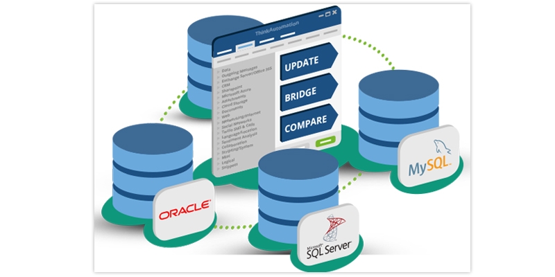
The database is the heart of any application. It contains tables, views, and other objects which store data. Maintaining the database requires an expert person to perform. We will learn about database administrators and the roles of different DBAs.Database administrators (DBAs) are primarily responsible for specific databases in the subsystem. Data is stored and organized by database administrators using specialized software. The duties could include backup and data recovery, capacity planning, installation, configuration, database design, migration, performance monitoring, security, and troubleshooting. These are some of the crucial database administrator responsibilities. If this piqued your interest and you want to be a professional, opt for data management courses online and pursue your dream. 

Role of DBA

You can check the database administrator roles and responsibilities.

The role of database administrator in DBMS is as mentioned below -

  • Creating and maintaining database standards and policies.
  • Supporting database design, creation, and testing activities.
  • Managing the database availability and performance, including incident and problem management.
  • Administering database objects to achieve optimum utilization
  • Defining and implementing event triggers that will alert potential database performance or integrity issues.
  • Performing database housekeeping, such as tuning, indexing, etc.
  • Monitoring usage, transaction volumes, response times, concurrency levels, etc.
  • Identifying reporting, and managing database security issues, audit trails, and forensics.
  • Designing database backup, archiving, and storage strategy.

Responsibilities of  DBA

Get in-depth knowledge of dba roles and responsibilities. Learn about the functions of Database Administrator as mentioned below-
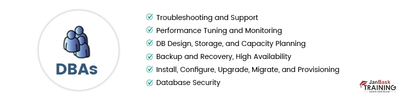
  • Find ways to store, organize and manage data in database software.
  • Be an expert in Troubleshooting.
  • Keeping databases up to date.
  • Help with the design and development of a database.
  • Managing access to a database.
  • Design maintenance practices and put them into operation.

Functions of DBA

The functions of a Database administrator are as below.

  1. Data policies, procedures, and standards.
  2. Planning- development of organization's IT strategy, enterprise model, cost/benefit model, design of database environment, and administration plan.
  3. Data conflict (ownership) resolution.
  4. Data analysis- Define and model data requirements, business rules, and operational requirements, and maintain a corporate data dictionary.
  5. Internal marketing of DA concepts.
  6. Managing the data repository.

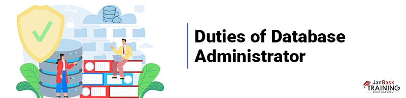
Duties of Database Administrator

The duties of a Database Administrator are as follows.

1. Selection of Hardware and Software

  • Keep up with current technological trends
  • Predict future changes
  • Emphasis on established off-the-shelf products

2. Managing Data Security and Privacy

  • Protect data against any accidental or intentional loss, destruction, or misuse
  • Firewalls
  • Establishment of user privileges
  • Complicated using distributed systems such as internet access and client/ server technology.

3. Managing Data Integrity

  • Integrity controls protect data from unauthorized use
  • Data consistency
  • Maintaining data relationship
  • Domains- sets allowable values
  • Assertions- enforce database conditions

4. Data Backup

  • We must assume that a database will eventually fail
  • Establishment procedures
  • How often should the data be back-up?
  • What data should be backed up more frequently?
  • Who is responsible for the backups?
  • Backup facilities
  • Automatic Dump- a facility that produces a backup copy of the entire database
  • Periodic Backup- done periodically, such as nightly or weekly
  • Cold Backup- during backup, the database shuts down 
  • Hot Backup- at a given time a selected part of the database is shut down and backed up 
  • Backups stored in a secure, off-site location

5. Database Recovery

  • Application of proven strategies for reinstalling the database after a crash
  • Recovery facilities include backup, journalizing, checkpoint, and recovery manager.
  • Journalizing facilities include:
  • Audit trail of transactions and database updates                   
  • Transaction log, which records essential data for each transaction processed against the database
  • The database change log shows images of updated data.  The log stores a copy of the image before and after modification.
  • Checkpoint facilities:
  • When the DBMS refuses to accept a new transaction, the system is in a quiet state
  • Database and transactions are synchronized
  • Allows the recovery manager to resume processing for a short period instead of repeating the entire day
  • Recovery and Restart Procedures
  • Switch-mirrored databases
  • Restore/rerun- reprocess transactions against the backup
  • Transaction integrity- commit or abort all transaction changes

6. Tuning Database Performance

  • Set installation parameters/ upgrade DBMS
  • Monitor memory and CPU usage
  • Input/ output contention
  • User striping
  • Distribution of heavily accessed files
  • Application tuning by modifying SQL code in applications

7. Improving Query Processing Performance

These are some of the essential responsibilities of dba in dbms. The role of data administrator in dbms cannot be taken lightly and has to be treated as a crucial part in the whole process.

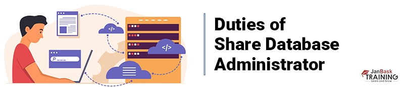
Duties of Share Database Administrator

Share database administrator functions are as below.

 1. Database Design

  • DBA is responsible for the logical design
  • DBA is responsible for the external model design (subschemas), the physical design (construction), and for designing integrity controls

2. Database Implementation

  • DBA
  • Establish security controls
  • Supervise database loading
  • Specify test procedures
  • Develop programming standards
  • Establish backup/ recovery procedures
  • Both
  • Specify access policies
  • User training

3. Operations and Maintenance

  • DBA
  • Monitor database performance
  • Tune and reorganize databases as needed
  • Enforce standards and procedures
  • Both
  • Support users

4. Growth and Change

  • Both
  • Implement change-control procedures
  • Plan for growth and change
  • Evaluate new technologies

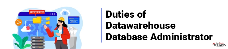
Duties of Datawarehouse Database Administrator

The duties of the Date warehouse database administrator are as below

  • New function due to the increasing use of data warehousing
  • Integrated decision support databases from various sources
  • Emphasis on integration and coordination of data and metadata from multiple databases
  • Specific functions
  • Support decision-oriented applications
  • Manage data warehouse (exponential) growth
  • Establish service level agreements

Average Salary and Compensation & Qualifications

With the proper training and experience, DBA can earn a handsome salary in their respective roles. Let's check out the salary and qualifications requirements.

  • Graduate database administrators mostly earn an Average of $94,440. 
  • With some experience, DBAs can make up to $64,999 at an entry level.
  • And with a senior-level experience, they can make over $137,215.

Qualification

  • Graduation in Computer Science or Computer Engineering
  • Advanced understanding of database theory and structure
  • Knowledge of MSSQL and MySQL

SQL Training For Administrators & Developers

  • No cost for a Demo Class
  • Industry Expert as your Trainer
  • Available as per your schedule
  • Customer Support Available
cta13 icon

Conclusion

The blog gives the reader detailed knowledge of who are DBAs and the roles of DBAs, also about different types of database administrators. You will get an excellent overview of the roles and responsibilities of different types of DBA. The blog will be an excellent read for those aspiring to become a successful DBA or those wanting to know more about the role of dba in dbms. If you aspire to pursue a career in this field, get training and become a Complete Microsoft Sql Professional.

Trending Courses

Cyber Security icon

Cyber Security

  • Introduction to cybersecurity
  • Cryptography and Secure Communication 
  • Cloud Computing Architectural Framework
  • Security Architectures and Models
Cyber Security icon1

Upcoming Class

0 day 19 Sep 2025

QA icon

QA

  • Introduction and Software Testing
  • Software Test Life Cycle
  • Automation Testing and API Testing
  • Selenium framework development using Testing
QA icon1

Upcoming Class

3 days 22 Sep 2025

Salesforce icon

Salesforce

  • Salesforce Configuration Introduction
  • Security & Automation Process
  • Sales & Service Cloud
  • Apex Programming, SOQL & SOSL
Salesforce icon1

Upcoming Class

0 day 19 Sep 2025

Business Analyst icon

Business Analyst

  • BA & Stakeholders Overview
  • BPMN, Requirement Elicitation
  • BA Tools & Design Documents
  • Enterprise Analysis, Agile & Scrum
Business Analyst icon1

Upcoming Class

0 day 19 Sep 2025

MS SQL Server icon

MS SQL Server

  • Introduction & Database Query
  • Programming, Indexes & System Functions
  • SSIS Package Development Procedures
  • SSRS Report Design
MS SQL Server icon1

Upcoming Class

0 day 19 Sep 2025

Data Science icon

Data Science

  • Data Science Introduction
  • Hadoop and Spark Overview
  • Python & Intro to R Programming
  • Machine Learning
Data Science icon1

Upcoming Class

7 days 26 Sep 2025

DevOps icon

DevOps

  • Intro to DevOps
  • GIT and Maven
  • Jenkins & Ansible
  • Docker and Cloud Computing
DevOps icon1

Upcoming Class

6 days 25 Sep 2025

Hadoop icon

Hadoop

  • Architecture, HDFS & MapReduce
  • Unix Shell & Apache Pig Installation
  • HIVE Installation & User-Defined Functions
  • SQOOP & Hbase Installation
Hadoop icon1

Upcoming Class

7 days 26 Sep 2025

Python icon

Python

  • Features of Python
  • Python Editors and IDEs
  • Data types and Variables
  • Python File Operation
Python icon1

Upcoming Class

1 day 20 Sep 2025

Artificial Intelligence icon

Artificial Intelligence

  • Components of AI
  • Categories of Machine Learning
  • Recurrent Neural Networks
  • Recurrent Neural Networks
Artificial Intelligence icon1

Upcoming Class

15 days 04 Oct 2025

Machine Learning icon

Machine Learning

  • Introduction to Machine Learning & Python
  • Machine Learning: Supervised Learning
  • Machine Learning: Unsupervised Learning
Machine Learning icon1

Upcoming Class

28 days 17 Oct 2025

 Tableau icon

Tableau

  • Introduction to Tableau Desktop
  • Data Transformation Methods
  • Configuring tableau server
  • Integration with R & Hadoop
 Tableau icon1

Upcoming Class

7 days 26 Sep 2025