23
JulInternational Womens Day : Flat 30% off on live classes + 2 free self-paced courses - SCHEDULE CALL
Since its inception, Salesforce has created a broad platform for creating on-demand applications for its users. Unlike other application development platform, Salesforce lightning platform offers specific tools for defining further details such as:
While the tools that are used to build data models and business logic for applications are considered to be the powerful solutions that run successfully on salesforce lightning platform servers. Well, the existing tools for defining User interfaces for certain limitations are as:
Salesforce has introduced Visualforce as the next-generation solution for building enlighted custom user interfaces on the Salesforce Lightning platform.
Visualforce is available for both desktop browsers and for the people who use the Salesforce mobile app.
Moreover, for desktop browsers, it is available in both the Lightning Experience and Salesforce Classic. Visualforce pages and custom iframes aren’t supported in Salesforce Lightning Experience on iPad Safari.
There are two type of VisualForce Framework such as:
There are certain rules to use visualforce tags salesforce, which are mentioned below:
You can easily create a MODEL VIEW CONTROLLER development style with HTML, CSS, AJAX, and Jquery.
We hope, till now you have an understanding of what visualforce is and what it is used for.
Now, the question arises is How to use Visualforce Tags Salesforce?
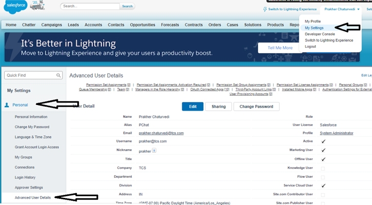
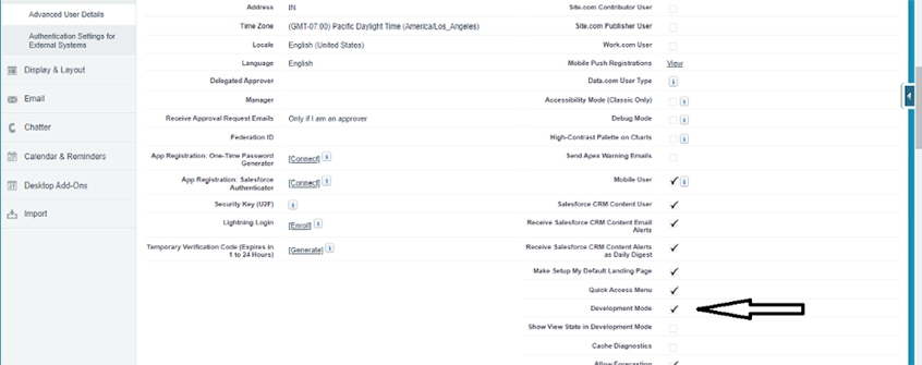
The first thing you need to know is that you are required to enable development mode by visiting My setting>Advanced User Settings.


So, now we have enabled our development mode settings and we are able to create visualforce pages, we should have a basic understanding of visual force tags is very necessary.
A single Visualforce page must be wrapped inside a single page component tag. This component supports HTML pass-through attributes using the "html-" prefix. Pass-through attributes are attached to the generated tag. Visualforce tags can be divided into different types. They are
apex:actionRegion apex:listViews

apex:actionSupport apex:message

apex:commandButton apex:pageBlockButtons

apex:commandLink apex:pageBlockSection

apex:component apex:pageBlockSectionItem

apex:dataList apex:pageMessages

apex:dataTable apex:panelBar

apex:define apex:panelBarItem

apex:detail apex:panelGrid

apex:form apex:repeat

apex:image apex:sectionHeader

apex:include apex:selectCheckboxes

apex:includeScript apex:selectList

apex:inlineEditSupport apex:selectOption

apex:inputCheckbox apex:selectOptions

apex:inputField apex:selectRadio

apex:inputFile apex:stylesheet

apex:inputHidden apex:tab

apex:inputSecret apex:tabPanel

apex:inputText apex:toolbar

apex:inputTextarea apex:toolbarGroup

apex:insert apex:variable

apex:form:
A section of a Visualforce page that allows users to enter input and then submit it with
Example
apex:page controller="MyController"
    apex:form
        apex:pageBlock title="User Input Form"
            apex:pageBlockSection columns="1"
                apex:inputText label="Name" value="{!userName}" /
                apex:inputText label="Email" value="{!userEmail}" /
            /apex:pageBlockSection

            apex:pageBlockButtons
                apex:commandButton value="Submit" action="{!submitForm}" /
                apex:commandLink value="Reset" action="{!resetForm}" /
            /apex:pageBlockButtons
        /apex:pageBlock
    /apex:form
/apex:page
apex:image:
A graphic image, rendered with the HTML > <>> <><><>
apex:include:
A component that inserts a second Visualforce page into the current page.
Example
Second page Name is include
Salesforce Training For Administrators & Developers
No cost for a Demo ClassIndustry Expert as your TrainerAvailable as per your scheduleCustomer Support Available
Salesforce Training For Administrators & Developers

apex:includeScript:
By using
[removed]
jQuery.noConflict();
jQuery(document).ready(function() {
jQuery("a").click(function() {
alert("Hello world, part 2!");
});
});
[removed]
apex:inlineEditSupport:
This component provides inline editing support to
Example
hideOnEdit="editButton" event="ondblclick"
changedStyleClass="myBoldClass" resetFunction="resetInlineEdit"/>
apex:inputCheckbox:
An HTML input element of type checkbox. Use this component to get user input for a controller method. This component supports HTML pass-through attributes using the "html-" prefix. Pass-through attributes are attached to the generated
tabstyle="opportunity">
apex:inputField:
An HTML input element for a value that corresponds to a field on a Salesforce object. The
Example
apex:inputFile:
A component that creates an input field to upload a file.
Example
Read: What Is Interesting About Salesforce Internships?
/*** Controller ***/
public class documentExt {
publicdocumentExt(ApexPages.StandardController controller) {
Document d = (Document) controller.getRecord();
d.folderid = UserInfo.getUserId(); //this puts it in My Personal Documents
}
}
apex:inputHidden:
Example
apex:inputSecret:
An HTML input element of type password. Use this component to get user input value that is masked as the user types.
Example
apex:inputText:
An HTML input element of type text. It supports only text, number values, which the user passed from the controller.
Example
apex:inputTextarea:
A text area input element. Use this component for a value that
more characters require a text area. Example
Current description: {!contract.description}
Change description to:
apex:insert:
A template component that declares a named area that must be defined by component in another Visualforce page. Use this component with the
apex:listViews:
The list view picklist for an object, including its associated list of r records for the currently selected view. In standard Salesforce applications this component d is displayed on the main tab for a particular object.
Example
Learn Salesforce in the Easiest Way
Learn from the videos Learn anytime anywhere Pocket-friendly mode of learning Complimentary eBook available
Learn Salesforce in the Easiest Way

apex:messages:
All messages that were generated for all components on the current p page. If an
Enter an alphabetic character for the "Close Date," then click Save to see what happens.
messages appear in the pageMessages component." severity="warning" strength="3" />
apex:outputField:
A read-only display of a label and value for a field on a Salesforce object. An
Example
apex:outputLabel:
A label for an input or output field. Use this component to provide a label for a controller method that does not correspond to a field on a Salesforce object.
Read: How to Learn Salesforce? Upskill in Just 15 Ways!
Example
apex:outputLink:
Itislink of a URL. Itis like HTML equivalent, the body of an
Example
apex:panelBar:
A page area that includes one or more 1,000 tags.
Example
apex:panelBarItem:
A section of an
apex:panelGrid:
Renders an HTML table element in which each component found in the body of the
Example
apex:panelGroup:
A container for multiple child components so that they can be displayed in a single panelGrid cell. An
an
apex:param:
“A parameter for the parent component. The
Example
public with sharing class test1 {
public string value { get; set;}
public void testdirect(){
system.debug(value);
}
public void testinput(){
value = apexpages.currentPage().getParameters().get('inpval');
system.debug(value);
}
}
Visualforce
[removed]
functiontestinputJS(){
varstr = document.getElementById('testinput').value;
if(str.length>4){
str= str.substring(0,4);
}
passToController(str);
}
[removed]
apex:relatedList:
A list of Salesforce records that are related to a parent record with a lookup or master-detail relationship. Example
You're looking at some related lists for {!account.name}:
apex:repeat:
An iteration component that allows you to output the contents of a collection according to a structure that you specify. The collection can include up to 1,000 items.
Example
Public with sharing class test1 {
Public List
List
returnlstAcc;
}
}
Visualforce
Account Name |
Industry |
|---|---|
{!acc.Name} |
{!acc.Industry} |
apex:selectList:
A list of options that allows users to select only one value or multiple values at a time, depending on the value of its multi-select attribute.
Example
Read: What is Salesforce Workbench? Salesforce Workbench Tutorial Guide
/* controller*/
public class picklist {
public list
public list
public string selected {set;get;}
public picklist(){
option=new list
cityNames= new list
cityNames.sort();
selectoption op= new selectoption('none','-none-');
for(string c:cityNames){
selectoption op1= new selectoption(c,c);
option.add(op1);
}
}
}
city Name :
apex:selectOption:
A possible value for an
Example
apex:selectOptions:
A collection of possible values for an An component must be a child of one of those components. It must also be bound to a collection of selectOption objects in a custom Visualforce controller.
Example
/*** Controller: ***/
public class sampleCon {
String[] countries = new String[]{};
publicPageReference test() {
return null;
}
public List
List
options.add(new SelectOption('US','US'));
options.add(new SelectOption('CANADA','Canada'));
options.add(new SelectOption('MEXICO','Mexico'));
return options;
}
public String[] getCountries() {
return countries;
}
public void setCountries(String[] countries) {
this.countries = countries;
}
}
You have selected:
apex:selectRadio:
A set of related radio button input elements, displayed in a table. Unlike checkboxes, only one radio button can ever be selected at a time.
Example
/*** Controller ***/
public class sampleCon {
String country = null;
publicPageReference test() {
return null;
}
public List
List
options.add(new SelectOption('US','US'));
options.add(new SelectOption('CANADA','Canada'));
options.add(new SelectOption('MEXICO','Mexico')); return options;
}
public String getCountry() {
return country;
}
public void setCountry(String country) { this.country = country; }
}
You have selected:
apex:stylesheet:
A link to a stylesheet that can be used to style components on the Visualforce page. When specified, this component injects the stylesheet reference into the head element of the generated HTML page.
Example
Thisbackgroud color is taken from test.css file in static resource
apex:tab:
A single tab in an
Example
apex:toolbar:
A stylized, horizontal toolbar that can contain any number of child components. By default, all child components are aligned to the left side of the toolbar. Use an
Example
salesforce
apex developer network
apex:variable:
A local variable that can be used as a replacement for a specified expression within the body of the component. Use
Example
/*--controller--*/
public with sharing class test1 {
public List
get {
if (collection == null) {
collection = new List
for (Account a : [SELECT ID, Name FROM Account LIMIT 10]) {
collection.add(a.Name);
}
}
return collection;
}
private set;
}
}
({!rowNum}){!row}
!row}
.bPageBlock .requiredInput .requiredBlock{background-color: #F6FBF6;}
.requiredInput .requiredBlock::before { display: block; content: "*"; font-size: 1.5em; font-weight: bold; color: #c00; margin-left: -4px; margin-top: -2px; }
table
{
font-family: arial, sans-serif;
border-collapse: collapse;
width: 100%;
}
td, th {
border: 1px solid #dddddd;
text-align: left;
padding: 8px;
}
Visualforce is a framework in Salesforce which includes a tag-based markup language that is used to write Visualforce pages. You may find visualforce tags in Salesforce orgs that you may come across. As you know that the page-centric is for all backend processing being done with ApexCode on the Server-side whilst lightning is considered to be App-centric along with the components themselves.
This can either have a logical process on the client-side who is using Javascript code. Or else it can be used on the server-side by the people who are using Apex code depending on what the component is designed to do.
Moreover, it's good to know about Visualforce and also efficient to understand where we come from. In case you are new to Salesforce, you should invest your time to learn lightning over Visualforce.
You must be thinking Why? It is because the lightning component Framework enhances in richness of what Visualforce can do after all, its been around since the year 2006.
However, using the above-mentioned Apex tags, you can easily write logic to your Salesforce pages. Good luck!
Feel free to Share your thoughts and experience in the below-mentioned comment section!
 Pinterest
 Email
Email
The JanBask Training Team includes certified professionals and expert writers dedicated to helping learners navigate their career journeys in QA, Cybersecurity, Salesforce, and more. Each article is carefully researched and reviewed to ensure quality and relevance.

Cyber Security

QA

Salesforce

Business Analyst

MS SQL Server

Data Science

DevOps

Hadoop

Python

Artificial Intelligence

Machine Learning

Tableau
Search Posts
Related Posts
Salesforce Admin Certification Exam Guide-How to pass it?
![]() 255.5k
255.5k
What is CRM? Salesforce CRM Tutorial Guide For Beginners
![]() 586.1k
586.1k
What Is The Best Way To Grow Your Salary In Salesforce?
![]() 5.9k
5.9k
What is Salesforce Workbench? Salesforce Workbench Tutorial Guide
![]() 297.1k
297.1k
How to Become a Salesforce Consultant: Salesforce Consultant Career Path
![]() 6.9k
6.9k
Receive Latest Materials and Offers on Salesforce Course
Interviews