
 Feb 09, 2020
  5.5k
5.5k

19
JunMonth End Offerl : Get 30% OFF + $999 Study Material FREE - SCHEDULE CALL
Here in this post, we are going to talk about the dual axis in tableau. The dual axis in the tableau is very helpful when you have the same axis for a couple of requirements. We will also see the different combinations we can apply in the dual axis.
A Dual Axis chart is an ideal way to visualize the relationship between two features. It helps us find a lot of information in the given space. It also allows us to discover insights between the different variables and the relationship between those.

Usually, the Dual Axis chart is very helpful when we have the same dimension but other measures. For example, let’s say we need to create the following charts-
Ideally, we should create two different worksheets for the above 2 requirements. But as one of the axes in both the above requirements are the same, and so can combine these two requirement single requirements. Hence, we will end up creating only one worksheet that will be called a dual Axis chart.
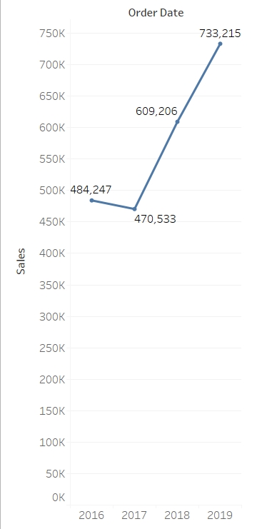
Let's say, we have to fulfill the above requirement without a dual Axis chart. So, we can create a line chart for the first requirement as below. If you don't have an idea about the line chart, I recommend you go through our previous articles to understand what is line chart and how to create a line chart in tableau.
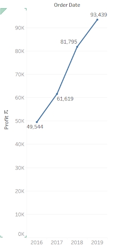
On the same line, we can also create a yearly profit trend for the second requirement. The only change that you have to make is replacing sales with profit. Again, we can create a line chart for this-
Now If a user has to see how their profit and sales are wearing as per the year, they will have to check first the sales chart and then the profit chart. This will be a tedious job. So, the alternate option is to mix up both the above chart and create a single chart which will be called a dual axis.
Here we will combine the year Axis on the x-axis and will put sales on one y-axis and profit on the secondary y-axis. This way users will be able to see both sales and profit corresponding to the year just by using a single chart. In the next section, we will see how to create that dual Axis chart to show both the measures and the dimension in the single chart.
Read: A Complete Guide to Hierarchy in Tableau
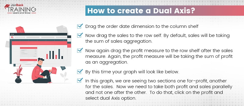
To create a Dual Axis chart, follow the below steps-
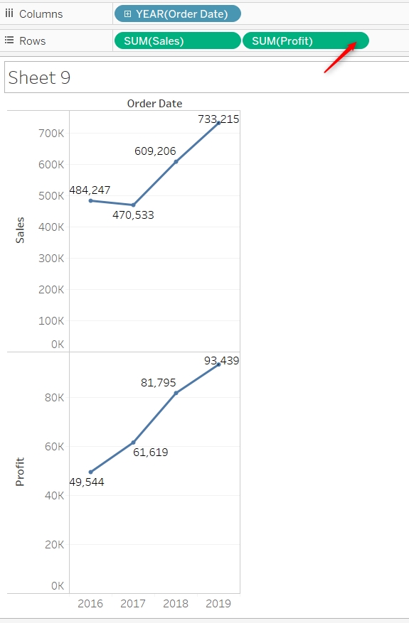
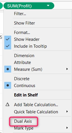
This is nothing but a dual Axis chart. You can enable the label to see what is the exact value of sales and profit. This way just by using a single chart you can find out what was the profit and sales in 2016, what were the profit and sales in 2017, 2018, and 2019. This improves the quality of the chart also, making your report crispier and easy to use.

If you look into the above chart carefully, you will find that for 2017 sales are 417K while profit Is around 61k. But both the points are almost at the same location which can be a little ambiguous to the user. Although sales are following the left axis and profit is following the right axis. Also, you can see both the axis have different intervals and size and so it was expected.
But if you want both the axis to be with the same interval you can synchronize one of the axes. It is advisable to synchronize the axis with a lower limit. So, in this case, we will synchronize the profit axis.
To synchronize the axis, right-click on it and select the synchronize axis option.
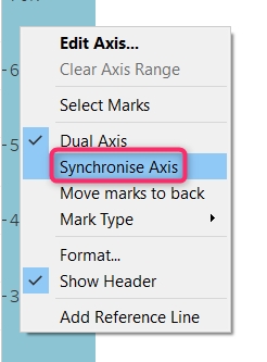
Now you will find both the axis with a similar interval. This will avoid confusion while reading the graph.
You can further format the dual Axis chart by trying the different combinations of the chart. For example, we have two charts here, one for the sales and another for the profit. Currently, both the chart is a line chart and this makes sense also as in both the requirements we had to show the trend.
Read: How and Why to Create a Pie Chart
But if you want you can change the chart type also. Let’s say, I want the sales as a bar chart and profit as a line chart. To do that, follow the marks section and select the chart type of sales as a bar.
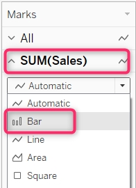
Now you will find in the dual axis, sales have been represented with a bar chart and profit has been represented by a line chart. This can be an ideal behavior for the dual Axis chart.
It completely depends on the requirements!
If you have to show two trend lines then both the line charts can work. You can also use a combination of a bar chart and a line chart. Sometimes, when you don't have to show the trend but the frequency then you may use both the charts as a bar chart also. When you are using both the charts in dual axis as bar charts, make sure to format both the chart in terms of size and color. This will help the user see the charts in both the chart clearly and make the business decision.
Tableau Online Training & Certification

You should be very careful when you are synchronizing the axis. Sometimes this may be helpful to you while the rest of the time it might not make a good impression to the user. For example, you have the below requirements-
As you might have estimated, these requirements can be from an affiliate network. The affiliate network might want to show their publisher how much they are earning on a daily basis and how much clicks they received on a daily basis. In this case, it is pretty obvious that the number of clicks will be way higher than the amount of earning. There may be a day when the number of clicks is a hundred while the earning is USD 1 and the same trend might continue.
In this case, if you will synchronize your earning axis, then it will be almost around the x-axis. And this might not be an ideal reporting behavior. So, when you have one axis with a very high range and another axis with a lower range then refrain yourself from synchronizing the axis.
When you have both the major with similar units like profit and discount. In this case, you should consider synchronizing your axis. Again, there is no hard and fast rule when to synchronize and when not to synchronize. This completely depends on your requirements.
Read: Power BI vs Tableau - Top 8 Key Differences
When you have synchronized the axis, consider changing the name of the Other axis. This will help the user not to be confused with the name. In our case, when we have synchronized both profit and sales axes, we may hide one of the axes also.
So, let’s say, we are hiding the profit axis. Then the other Axis will say sales which are not completely true as that accepts will represent both sales and profit. In such a case you might need to rename the axis. To rename the axis, right-click on it and just change the name.
Tableau Online Training & Certification

This was all about the dual axis in tableau. Where we learned about what is a dual axis when to create a dual axis chart, and how to create a Dual Axis chart. We also talked about the formatting of the chart and the synchronizing axis.
Whenever you come across a situation wherein both the requirements same dimensions are there with two different measures, try creating a dual Axis chart. This will help the user make the decision quickly and get a better Insight.
As an exercise, you may try developing the dual Axis chart for category wise number of orders and the total amount of sales done. This may help you to Grab more on the concepts.
If you face any difficulty do let us know in the comment section and will be happy to help you. Make sure you are formatting the charts well so that it will look professional.
 FaceBook
 Twitter
 LinkedIn
 Pinterest
 Email
Email
The JanBask Training Team includes certified professionals and expert writers dedicated to helping learners navigate their career journeys in QA, Cybersecurity, Salesforce, and more. Each article is carefully researched and reviewed to ensure quality and relevance.


Cyber Security

QA

Salesforce

Business Analyst

MS SQL Server

Data Science

DevOps

Hadoop

Python

Artificial Intelligence

Machine Learning

Tableau
Search Posts
Related Posts
How to Interact with the Content on the Tableau Server?
 4.8k
4.8k
Tableau Careers - Know Why & How to Make a Career in Tableau!
5.1k
Tableau Definition: What is Tableau, Careers Path in Tableau
9k
How to create a parameter and use it?
4.7k
Mastering Tableau's User Interface: A Beginner's Walkthrough
3.5k
Receive Latest Materials and Offers on Tableau Course
Interviews


 Aug 29, 2024
 4.8k
4.8k