
 Jan 11, 2020
  6.8k
6.8k

31
JulMonth End Offerl : Get 30% OFF + $999 Study Material FREE - SCHEDULE CALL
The tableau bar chart has always been one of the most common and effective charts preferred for data visualization. Be it for comparison data or for showing the frequency, the tableau bar charts have always been instrumental.
In this post, we’re going to talk about the following-
At the end of this post, you will be able to understand why bar chart is so required in the field of data visualization. And also, the do’s and don’ts of the bar chart.
If you have seen something like below-
Yes, that’s a bar chart.
Tableau bar charts are a form of data visualization chart which help us show the frequency of the data corresponding to a categorical variable.
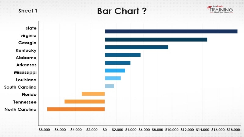
For example, if we have to show the sales in each category of the population in different states, for all such situation, a bar chart can be an ideal solution. Usually, you will find the developers using bar chart for the generic uses as well. Like they have the data and need to show that using graphs and in such cases, bar chart is the generic solution.
Although this can be somewhat true up to some extent, it cannot be the same all the time. And so, you should understand when to use the tableau bar charts and when not.
This is what tableau bar charts are!
Tableau Online Training & Certification

Bar charts are majorly created when we have-
So, usually we keep the categorical data on one axis and their corresponding frequency or values will be showing on the other axis.
As for example, in our previous section, we can make state on x-axis and population on y-axis. And the same for the other example where we can keep category on x-axis and sales values on the y-axis.
If we talk about the functional requirement then in below scenarios, we can a bar chart to represent our data-
Although these can’t be the only scenarios when we should use the bar chart. Even if we have continuous data at both the axis also, we can use but that will be either using BINS or using histogram which is similar to a bar chart.
Now as we understand, what is a bar chart and when to create it, let’s work and see how to create those.
Read: The Best of Tips on Tableau Certification
Tableau Online Training & Certification

Creating bar chart is easy and can be done by using a dimension and a measure. Although even a single measure should be sufficient to create a bar chart.
Bar charts are of two types-
Vertical bar chart is the default and when we say bar chart, that usually refers to the vertical bar chart.
Take our online Tableau training and become a Tableau pro in no time.
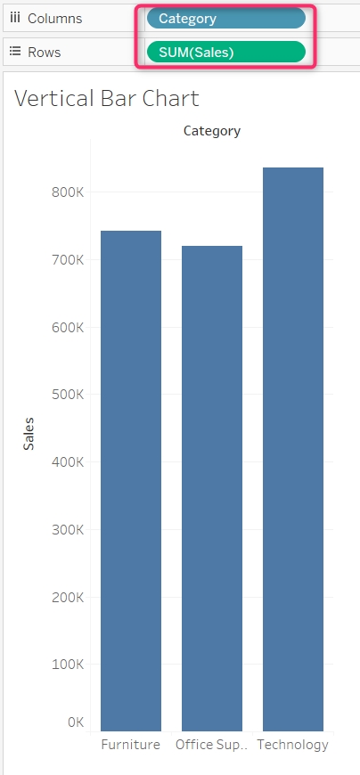
To create a vertical bar chart, we can keep a dimension to columns shelf and a measure to the rows shelf.
For example, let’s say we want to create a vertical bar chart for category vs sales.
To do that, we can drag and put category dimension to the columns shelf and drag the sales measure to the rows shelf.
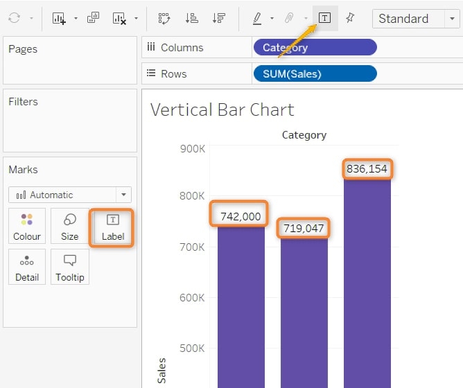
If you want to enable the text to show the sales values, just click on the text value or enable the label from the Marks shelf.
Horizontal bar chart is similar to the vertical bar chart and the difference is having the dimension to the y-axis. Usually, we create the horizontal bar chart when we have labels with more characters.
To create the horizontal bar chart, we can simply swap the rows and columns. This can be done by using the swap option or just pressing ctrl + W.
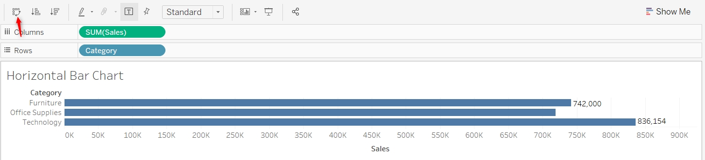
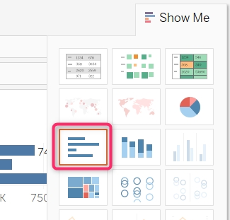
There is another option to create the horizontal bar chart as well. And that can be done using the show me tab. You can drag the required dimension and measure and then select the horizontal bar chart option from the show me tab.
Read: 6 Steps On How to Build an Impressive Tableau Developer Resumes (With Samples)
Multiple times we come across a situation when we need to go a little deeper in the bar chart. For example, let’s say we created a bar chart for category vs sales as we have done earlier. And then further we want to explore the contribution.
The contribution made by each segment in each category. This is similar like if a person earns $1000 then which field contributes how much. It can be like his salary is giving $800, a rental might be $100, and other income might be $100. Combining all these are making $1000.
Whenever we need these kind of analysis, stacked bar chart can be very helpful. Let’s see how we can create stacked bar chart in tableau.
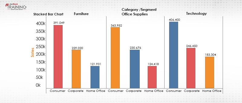
Requirement: We need to create a stacked bar chart where the bar chart is in-between category vs sales stacked on segment.
To implement this, first create a vertical bar chart for category vs sales as we have done earlier-
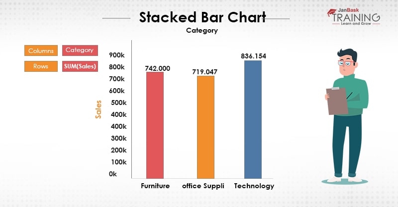
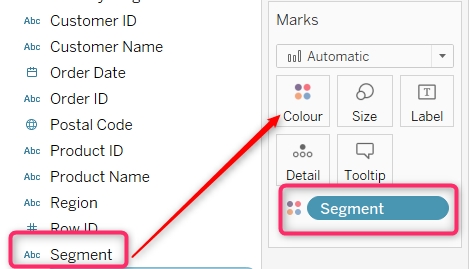
And as we need to stack this chart on the basis of segment and so, drag the segment dimension and put it in the color shelf-
Now you will find your graph has been stacked with segment and now the category has been further stacked on segment-

This is another variant of the Tableau bar charts where we need to create separate charts for all the categories. The way we have done in stacked bar chart, it will be done on similar way. In Tableau side by side bar chart is directly available in the show me options and can be created just by selecting it. This type of bar chart can be used for comparing the value corresponding to the one or more dimension. Usually, more than one dimension. For example, if we have to compare the values of state vs sales and at the same time also corresponding to the month, we can use side by side chart. Here it will be shown as we are seeing monthly sales data for each state. And this can be a good factor to find out how sales is dependent in our case.
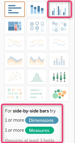
Once Tableau side by side bar chart selected in the above requirement, it will be shown like below-
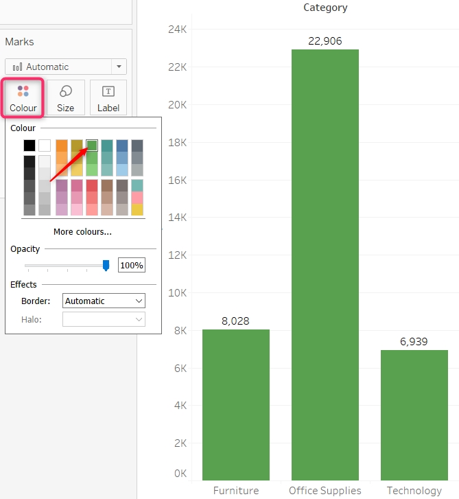
Bar chart can be formatted on the following options-
We can make changes to color to the chart just by selecting the color shelf in the Marks section. Just select the color as per your choice-
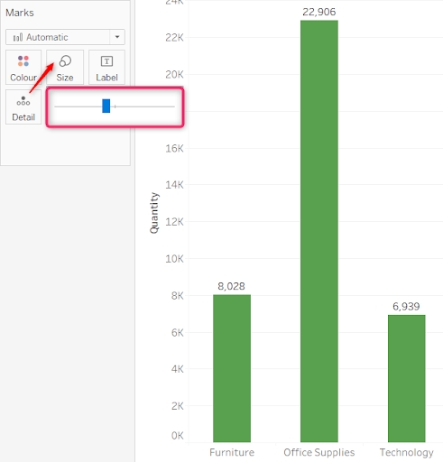
Similarly, we can make changes on the size. This can also be done from the marks shelf itself. Just resize the bar as per the requirements. Make sure, when you’re increasing the size, it should not be overlapped. Means while making the bar bigger, your bars may be overlapping each other which should not be the case. While making the size small, there may be a gap of too much which must not be the case as well.
Read: Tableau Career Path: Roles, Skills & Certifications
The alignment and text formatting can be done just by right-clicking on the bars and selecting formatting option-
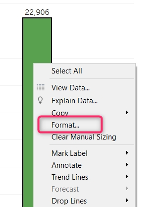
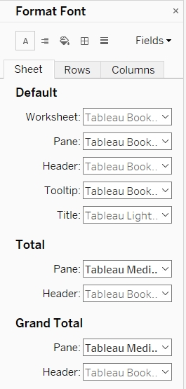
This will open a pane in the left pane and there we can make the required changes-
This way we can format the chart as required.
It is very important for you to know about tableau bar chart formatting. These days one of the most frequently asked questions of a tableau interview is “What do you know about tableau bar chart formatting?”
While doing the formatting of the bar chart, we should be taking care of the user perspective as well. For example, the selected color should be pleasant to the eye, the size should not be too big nor too small, labeling should be proper and must convey information. Also, tooltip should be aligned in a way to convey additional information.
For example, if you’re showing the numbers in the bar chart, you may show the source of those numbers, comparison, and many other information on the tool tip. Also, tooltip should be formatted properly for the users to get additional information.
As shown in the above image, you can make the changes in the formatting in accordance to the requirement. For example, for making changes to the entire worksheet, you can select the sheet tab, while making changes to the specific rows and columns, select the respective tabs of rows and columns accordingly.
Tableau Online Training & Certification

This was all about how to create a tableau bar chart where we talked about what is a bar charts, when we should use it, different forms of a bar chart and about tableau bar chart formatting those bar chart. While creating the bar chart, you must be considering why you are creating this?
Can you make any better way to visualize with other charts available? If you have got the answers to these questions then you will definitely end up creating a graph which will make more sense for sure.
Do try these different bar charts for different scenarios and let us know if you face any difficulty while creating the bar chart.
 FaceBook
 Twitter
 LinkedIn
 Pinterest
 Email
Email
The JanBask Training Team includes certified professionals and expert writers dedicated to helping learners navigate their career journeys in QA, Cybersecurity, Salesforce, and more. Each article is carefully researched and reviewed to ensure quality and relevance.


Gen AI

Agentic AI

AI in Automation Testing

Cyber Security

Data Science

QA

Salesforce Service Cloud

AWS
Search Posts
Related Posts
Receive Latest Materials and Offers on Tableau Course
Interviews


 Oct 25, 2022
 333.9k

 333.9k