Just a moment...
Just a moment...
Just a moment...
/*Responsive Media Queries Max 320px */ @media screen and (max-width: 320px) { .sed { width: 38px !important; height: 38px !important; font-size: 22px !important; line-height: 44px !important; } ul.mega-menulist li { padding: 4px 8px !important; } .td-txt .col-xs-7 { width: 78%; } #Course p.slider-cont.blue { font-size: 13px !important; } .mobilescreen span.cont { font-size: 15px !important; } .cert { font-size: 17px !important; padding-left: 0px; } .getcall-box button.buttonctadarkbtn.btn.btn-lg { width: 86% !important; } .callto { width: 48% !important; top: 16px !important; } nav.navbar .navbar-brand { left: -68px !important; top: 10px !important; } nav.navbar .navbar-brand img.logo { width: 60px !important; } .rgt-icon p.cont2.mb0 { line-height: 48px; font-size: 14px; } .jobsare p.slider-text.white { font-size: 33px !important; } .whtlogo { margin: 70px 0 5px -26px; } .half img { width: 274px; margin: 0 auto 10px auto; } .counter .col-xs-10, .counter .col-xs-9 { padding-left: 8px !important; } .headbutton { font-size: 10px !important; width: 154px !important; } .headbutton1 { font-size: 10px; } .select2-container { margin-right: 2px !important; } nav.navbar.bootsnav { margin-bottom: 0; -moz-border-radius: 0px; -webkit-border-radius: 0px; -o-border-radius: 0px; border-radius: 0px; background-color: #fff !important; border: none; border-bottom: solid 1px #e0e0e0; z-index: 9; } .modal-content { -webkit-box-shadow: 0 5px 15px rgba(0, 0, 0, 0.5); background-image: -webkit-gradient( linear, left top, right bottom, from(#02b3e4), to(#02ccba) ); background-image: linear-gradient(to bottom right, #02b3e4, #02ccba); box-shadow: 0 5px 15px rgba(0, 0, 0, 0.5); } .modal-header { border-bottom: none; color: #fff; padding-bottom: 0px; } .modal-title { color: #fff; } } /*Responsive Media Queries Max 480px */ @media screen and (max-width: 480px) { /*Blogs*/ .blogttl { font-size: 15px; padding: 10px; box-shadow: 0 5px 20px 2px rgba(0, 0, 0, 0.12); font-weight: bold; margin-bottom: 10px; } .rght.sticky { display: none; } .blogdtlright h2 { font-size: 1.2em; font-weight: 700; line-height: 26px; margin-top: 20px; margin-bottom: 8px; } .crsbox2 { box-shadow: 0 5px 20px 2px rgba(0, 0, 0, 0.12); margin-bottom: 12px; } .crsbox2 p { position: absolute; bottom: 0; right: 12%; color: #fff; font-size: 18px; text-align: center; } /*Blogs*/ /**** JT Css *****/ nav#heder { z-index: 111111 !important; } nav.navbar.bootsnav.no-full .navbar-collapse { max-height: 227px; } .navbar-brand { float: left; height: 46px !important; } nav#heder { position: fixed !important; } .btn-store, .btn-store2 { font-size: 11px !important; line-height: 15px; width: 86px; text-align: center; padding: 3px 0px !important; } .cert { font-size: 21px; padding-left: 0px; } .select2-container { margin-right: 9px; } .mobilescreen span.cont { color: #fff; font-size: 17px; margin-bottom: 16px; display: block; } .mobilescreen button { border: 2px solid #ffffff !important; color: #fff !important; } .mobilescreen button a.dark.notxtdec { color: #fff !important; } .modal-body { position: relative; padding: 6px; } #myModal3 .modal-dialog, #myModal4 .modal-dialog, #myModal5 .modal-dialog, #myModal6 .modal-dialog { width: 100% !important; top: -20px !important; } #myModal3 .modal-content, #myModal4 .modal-content, #myModal5 .modal-content, #myModal6 .modal-content { width: 96% !important; margin: 0 auto; float: none !important; } #myModal .modal-content { width: 98% !important; background: url(https://www.janbasktraining.com/assets/demo2019/img/popup-mob.webp) top center !important; background-size: cover !important; background-repeat: no-repeat !important; padding-bottom: 61px; } #myModal .modal-dialog { width: 92% !important; } #myModal2 .modal-dialog { width: 92% !important; } #myModal2 .modal-content { width: 98% !important; background: url(https://www.janbasktraining.com/assets/demo2019//img/popup-bg3.webp) top center !important; background-size: cover !important; background-repeat: no-repeat !important; } div#myModal2 .modal-body { padding-top: 144px; } nav.navbar { padding-top: 0px !important; } nav.navbar .navbar-brand { left: -80px; top: 8px; } nav.navbar.bootsnav ul.nav > li > a { padding: 10px 15px; font-size: 15px; border-bottom: 1px solid #eee !important; } ul.phone-strip { width: 64%; background: #fff; float: none; margin: 0 auto; } ul.phone-strip li { list-style: none; float: left; padding: 8px 20px; color: #000; display: table; width: 100%; text-align: center; border: 1px solid #ab2927; margin-bottom: 20px; } ul.phone-strip li:nth-child(2) { background: #ab2927; } ul.phone-strip li:nth-child(2) a { color: #fff; } .callto { width: 40%; float: right; position: absolute; right: 0px; top: 21px; } li.signline:after { content: none; } li.mob-btn { display: none; } ul.mega-menulist li { padding: 4px 12px; font-size: 13px; border-bottom: 1px solid #eee; margin-left: -14px; background: #f7f7f7; } ul.dropdown-menu.mega-menu { min-width: 100% !important; left: 0px; transform: none; background: #fff !important; background-size: contain !important; border-bottom: 4px solid #ab2927 !important; float: left !important; position: initial !important; margin: 0 auto !important; } .lead3:after { width: 3px; height: 20px; } p.course:after { width: 3px; height: 20px; } .percentage .counter p.slider-text { font-size: 28px; margin-top: 10px; color: #414a53; } .counter .col-xs-10, .counter .col-xs-9 { padding-left: 0px; } .counter .col-xs-2 { padding-right: 0px; width: 14%; } .counter .col-xs-3 { padding-right: 0px; width: 18%; } .million .counter p.slider-text.white { font-size: 26px; } .counter p.slider-text { font-size: 26px !important; margin-top: 20px !important; } .percentage img { width: 150px; } .whtlogo img { margin-left: 20px; margin-top: 0px; } .instr-bx.inst2 p.cont2.mb0 { text-align: left; padding-left: 20px; } .padding0 { padding-left: 0px; padding-right: 0px; } .container { width: 100% !important; } .mobilescreen p.form-head.mb0 { position: absolute; background: #eeb617; } .dat { font-size: 14px; font-weight: 700; margin-bottom: 0px; } .est { font-size: 10px; margin-bottom: 0px; } .week { margin-bottom: 0px; } .getcall-box button.buttonctadarkbtn.btn.btn-lg { box-shadow: 5px 4px 3px #bbb0b0; width: 61%; margin-top: 20px; font-size: 14px; } .lineon:before { position: absolute; top: 48px; background: #777; width: 1px; height: 110px; right: 14px; content: none; } #Corporate button.buttonctadarkbtn.btn.btn-lg { padding: 6px 10px; font-size: 12px; margin-bottom: 10px; width: 138px; } .still button.buttonctadarkbtn.btn.btn-lg { padding: 6px 10px; font-size: 12px; width: 138px; } .still img { width: 120px; margin: 0 auto; display: table; } .maria img { width: 120px; margin: 0 auto; float: none !important; } .still { width: 100%; text-align: center; } .tab-pane { margin-bottom: 20px; } #accordion3 .panel-title > a { font-size: 14px !important; line-height: 20px; padding: 10px; } #accordion3 .panel.panel-default { border-radius: 0px; } #accordion3 a.collapsed { border-right: 3px solid #ab2927; border-radius: 0px; } #accordion3 a.collapsed { border-right: 3px solid #ab2927; border-radius: 0px; padding: 10px; } #accordion3 .panel.panel-default { border-radius: 0px; margin-bottom: 24px; } div#accordion3:after { background: #ab2927; position: absolute; top: 0px; content: ''; width: 3px; height: 250px; left: 40px; z-index: -1; } .star-rating-review { text-align: left; } li.fb-icon { margin-right: 0px; } div#accordion3 { position: relative; } #Course p.slider-cont.blue { margin-bottom: 20px; } .fullscreen { display: none; } .mobilescreen { display: block; } #accordion2 .panel-body span { font-size: 13px !important; line-height: 18px !important; display: block; } #accordion2 .panel-body { padding: 10px; } i.fa.fa-sort-down.pull-right { font-size: 20px; line-height: 20px; color: #3598c1; } i.fa.fa-sort-down.pull-right { line-height: 14px; } #accordion2 .panel.panel-default { border-radius: 8px; } .faq-acor #accordion1 .panel-heading .panel-title > a { font-size: 13px !important; } .panel-title > a { font-size: 14px !important; line-height: 20px; } .lead3 { font-size: 16px; line-height: 18px; } .lead2 { font-size: 18px; font-weight: 700; } .wehave { margin: 14px 0 0 0px; padding: 14px 22px; } p { margin-bottom: 10px; } .section { padding: 20px 0; } .getcall-box p.cont2.dark { font-size: 13px; text-align: left; } .getcall-box h3.slider-text2.dark { margin-bottom: 4px; } .cont2 { font-size: 15px; line-height: 20px; } .getcall-box h3.slider-text2 { font-size: 16px; padding-left: 14px; } .getcall-box h3.slider-text2:after { width: 3px; height: 20px; } .instr-bx.inst2 { margin-top: 0px; padding-left: 20px; padding-top: 10px; padding-bottom: 10px; } #Course p.course.red { font-size: 18px; padding-left: 14px; text-align: left; line-height: 20px; } div.bhoechie-tab-content { box-shadow: none; padding: 10px 0px; background: #fff; } .bhoechie-tab { background: #fff; box-shadow: 1px 1px 8px 1px #c5bdbd75; padding: 0px 10px; margin-bottom: 40px; } .instr-bx i { float: left; margin-right: 8px; line-height: 24px; display: block; font-size: 14px; color: #ffc107; } .register p.lead3 { font-size: 16px; line-height: 24px; } .tab-bx:after, .register:after { position: fixed; z-index: -1; } .asper { margin: 10px 0px; } .asper p.cont.white.mb0 { margin: 0px 0px; line-height: 18px; } .jobsare p.slider-text.white { font-size: 44px; } .doyou button.buttonctadarkbtn.btn.btn-md { margin-top: 10px; font-size: 13px; } .doyou p { font-size: 18px; line-height: 24px; } .counter { padding: 0px 0px; border-radius: 5px; } .crm, .million { height: auto; padding: 24px 0px; } .million p.slider-text.white { font-size: 22px; margin-bottom: 4px; } .crm p.slider-text.white { font-size: 22px; margin-bottom: 4px; } .lead1:after { width: 3px; height: 20px; } .lead1 { font-size: 20px; padding-left: 16px; } .headbutton1 { padding: 6px 10px; border: 2px solid #ffffff; font-size: 11px; margin-bottom: 10px; width: 104px; } .headbutton { padding: 6px 10px; border: 2px solid #ffffff; font-size: 11px; margin-bottom: 10px; width: 158px; } .bannerhome p.slider-text.white:after { bottom: -104px; } .kln { } .kln p.cont.white { margin-top: 44px !important; font-size: 13px; } .slider-text { font-size: 18px; line-height: 22px; } .slider-cont { font-size: 12px; line-height: 17px; text-align: justify; } section.sticky-nav-tabs { display: none; } select.custom-select.form-control { margin-right: 14px; } .instr-bx .col-xs-12 { border-bottom: 0px; border-right: 0px !important; padding-bottom: 4px; } .instr-bx p.cont2.mb0 { padding: 4px 0px; text-align: center; } .instr-bx { position: initial; text-align: left; border-radius: 0px; width: 100%; margin: 0 auto; display: table; float: none; box-shadow: none; background: transparent; color: #fff; margin-top: -32px; } .getcall-box { width: 100%; margin-top: 0px; padding: 16px; border-radius: 6px; } /**** JT Css End *****/ .modal-content { -webkit-box-shadow: 0 5px 15px rgba(0, 0, 0, 0.5); background-image: -webkit-gradient( linear, left top, right bottom, from(#02b3e4), to(#02ccba) ); background-image: linear-gradient(to bottom right, #02b3e4, #02ccba); box-shadow: 0 5px 15px rgba(0, 0, 0, 0.5); } .modal-header { border-bottom: none; color: #fff; padding-bottom: 0px; } .modal-title { color: #fff; } .mtpm { margin-top: -40px; } .contactleft { margin-bottom: 40px; } nav.navbar.bootsnav { margin-bottom: 0; -moz-border-radius: 0px; -webkit-border-radius: 0px; -o-border-radius: 0px; border-radius: 0px; background-color: #fff !important; border: none; border-bottom: solid 1px #e0e0e0; z-index: 9; } .fancy2 span:before, .fancy span:before { width: 72px; right: 102%; margin-right: 15px; top: 16px !important; } .fancy2, .fancy { margin-left: 94px; } .nav-justified > li { float: left; width: 25%; } #nav-tabs > li > a { padding: 10px 2px !important; float: none !important; } .events-timeline .timeline-block .content-column .event-date2 { bottom: -84px; } } @media (min-width: 600px) and (max-width: 600px) { img.img-responsive.lazy.img-rounded.kln { width: 114px; } nav.navbar.bootsnav { margin-bottom: 0; -moz-border-radius: 0px; -webkit-border-radius: 0px; -o-border-radius: 0px; border-radius: 0px; background-color: #fff !important; border: none; border-bottom: solid 1px #e0e0e0; z-index: 9; } .fancy2 span:before, .fancy span:before { top: 10px !important; } .events-timeline .timeline-block .content-column .content-box { margin-bottom: 30px; } } /*Responsive Media Queries Max 767px */ @media screen and (max-width: 767px) { .postbx code { word-break: break-word; word-wrap: break-word; } .btnw1 img.img-responsive { width: 18px; float: left; vertical-align: middle; margin: 0px auto 0px auto; margin-right: 4px; } .btnw1 { color: #000 !important; background: #ffcc00; font-weight: 600; margin-top: 8px; padding: 4px 18px !important; border: 0; font-size: 11px !important; line-height: 20px; width: auto; border-radius: 28px; float: left; margin-right: 10px; margin-bottom: 20px; } /* .btnw1 img.img-responsive { width: 18px; float: left; vertical-align: middle; margin: 0px auto 0px auto; margin-right: 4px; } .btnw1 { color: #000 !important; background: #ffcc00; font-weight: 600; margin-top: 8px; padding: 5px 15px; border: 0; font-size: 11px; line-height: 20px; width: auto; border-radius: 28px; float: left; margin-right: 10px; margin-bottom: 20px; }*/ span.enrollbtn { border: 1px dashed #fff; padding: 0px 16px; font-size: 12px; display: block; width: 128px; line-height: 18px; margin-bottom: 10px; } .section.section1.bannerhome.auth { padding-top: 70px; } .rnewyear { display: none; } .content .kln p.cont.white.llt { margin: 0px !important; } .content .blogdtlright img { max-width: 100%; height: auto !important; } .sed { width: 48px; height: 48px; text-align: center; font-size: 22px; line-height: 54px; } .comment_dtl ul, .comment_dtl ol { padding-left: 0px; } .getcall-box.panel-default.cmtt { padding: 16px 0px; } li.bcp { display: none; } .viewall-bx { display: none; } .blogdtlright img { display: table; } #myModal6 .modal-content { width: 98% !important; background: url(https://www.janbasktraining.com/assets/demo2019//img/popup-5.webp) top center !important; background-size: cover !important; background-repeat: no-repeat !important; } div#myModal6 .modal-body { padding-top: 144px; } #myModal5 .modal-content { width: 98% !important; background: url(https://www.janbasktraining.com/assets/demo2019//img/popup-4.webp) top center !important; background-size: cover !important; background-repeat: no-repeat !important; } div#myModal5 .modal-body { padding-top: 144px; } .modal-body button { margin-top: 16px !important; } #myModal4 .modal-content { background: url(https://www.janbasktraining.com/assets/demo2019//img/popup-talk.webp) top center !important; background-size: cover !important; } div#myModal4 .modal-body { padding-top: 144px; } #layout62 .wehave { margin: 26px 0 0 0px; } .form-group { margin-bottom: 15px; float: left; width: 100%; } .section18 p.lead3.white { line-height: 22px; } .hlf { margin-top: 90px; color: #000 !important; } .section18 { margin-top: 30px; } .rgt-icon { width: 76%; margin: 12px auto; } .inst2 .col-xs-12 { border-right: none !important; } nav#heder { z-index: 111111 !important; } nav.navbar.bootsnav.no-full .navbar-collapse { max-height: 100%; overflow-y: auto !important; box-shadow: 1px 1px 8px 0px #eee; } .btn-store, .btn-store2 { font-size: 11px !important; line-height: 15px; width: 86px; text-align: center; padding: 3px 0px !important; } .cert { font-size: 21px; padding-left: 0px; } .select2-container { margin-right: 9px; } .mobilescreen span.cont { color: #fff; font-size: 17px; margin-bottom: 16px; display: block; } .mobilescreen button { border: 2px solid #ffffff !important; color: #fff !important; } .mobilescreen button a.dark.notxtdec { color: #fff !important; } .modal-body { position: relative; padding: 6px; } #myModal3 .modal-dialog { width: 100% !important; top: -20px !important; } #myModal3 .modal-content { width: 98% !important; } #myModal .modal-content { width: 98% !important; background: url(https://www.janbasktraining.com/assets/demo2019/img/popup-mob.webp) !important; background-size: cover !important; background-repeat: no-repeat !important; padding-bottom: 61px; } #myModal .modal-dialog { width: 92% !important; } #myModal2 .modal-dialog { width: 92% !important; } nav.navbar { padding-top: 0px !important; } nav.navbar .navbar-brand { left: -80px; top: 8px; } nav.navbar.bootsnav ul.nav > li > a { padding: 10px 15px; font-size: 15px; border-bottom: 1px solid #eee !important; } ul.phone-strip { } li.mob-btn { display: none; } ul.mega-menulist li { padding: 4px 12px; font-size: 13px; border-bottom: 1px solid #eee; margin-left: -14px; background: #f7f7f7; } ul.dropdown-menu.mega-menu { min-width: 100% !important; left: 0px; transform: none; background: #fff !important; background-size: contain !important; border-bottom: none !important; float: left !important; position: initial !important; margin: 0 auto !important; height: 300px; overflow: scroll; } .lead3:after { width: 3px; height: 20px; } p.course:after { width: 3px; height: 20px; } .percentage .counter p.slider-text { font-size: 28px; margin-top: 10px; color: #414a53; } .counter .col-xs-10, .counter .col-xs-9 { padding-left: 0px; } .counter .col-xs-2 { padding-right: 0px; width: 14%; } .counter .col-xs-3 { padding-right: 0px; width: 18%; } .million .counter p.slider-text.white { font-size: 26px; } .counter p.slider-text { font-size: 26px !important; margin-top: 20px !important; } .percentage img { width: 150px; } .whtlogo img { margin-left: 20px; margin-top: 0px; } .instr-bx.inst2 p.cont2.mb0 { text-align: left; padding-left: 20px; } .padding0 { padding-left: 0px; padding-right: 0px; } .container { width: 100% !important; } .mobilescreen p.form-head.mb0 { position: absolute; background: #eeb617; } .dat { font-size: 14px; font-weight: 700; margin-bottom: 0px; } .est { font-size: 10px; margin-bottom: 0px; } .week { margin-bottom: 0px; } .getcall-box button.buttonctadarkbtn.btn.btn-lg { box-shadow: 5px 4px 3px #bbb0b0; width: 61%; margin-top: 20px; font-size: 14px; } .lineon:before { position: absolute; top: 48px; background: #777; width: 1px; height: 110px; right: 14px; content: none; } #Corporate button.buttonctadarkbtn.btn.btn-lg { padding: 6px 10px; font-size: 12px; margin-bottom: 10px; width: 138px; } .still button.buttonctadarkbtn.btn.btn-lg { padding: 6px 10px; font-size: 12px; width: 138px; } .still img { width: 120px; margin: 0 auto; display: table; } .maria img { width: 120px; margin: 0 auto; float: none !important; } .still { width: 100%; text-align: center; float: left; } .tab-pane { margin-bottom: 20px; } #accordion3 .panel-title > a { font-size: 14px !important; line-height: 20px; padding: 10px; } #accordion3 .panel.panel-default { border-radius: 0px; } #accordion3 a.collapsed { border-right: 3px solid #ab2927; border-radius: 0px; } #accordion3 a.collapsed { border-right: 3px solid #ab2927; border-radius: 0px; padding: 10px; } #accordion3 .panel.panel-default { border-radius: 0px; margin-bottom: 24px; } div#accordion3:after { background: #ab2927; position: absolute; top: 0px; content: ''; width: 3px; height: 250px; left: 40px; z-index: -1; } .star-rating-review { text-align: left; } li.fb-icon { margin-right: 0px; } div#accordion3 { position: relative; } #Course p.slider-cont.blue { margin-bottom: 20px; } .fullscreen { display: none; } .mobilescreen { display: block; } #accordion2 .panel-body span { font-size: 13px !important; line-height: 18px !important; display: block; } #accordion2 .panel-body { padding: 10px; } i.fa.fa-sort-down.pull-right { font-size: 20px; line-height: 20px; color: #3598c1; } i.fa.fa-sort-down.pull-right { line-height: 14px; } #accordion2 .panel.panel-default { border-radius: 8px; } .faq-acor #accordion1 .panel-heading .panel-title > a { font-size: 13px !important; } .panel-title > a { font-size: 14px !important; line-height: 20px; } .lead3 { font-size: 16px; line-height: 18px; } .lead2 { font-size: 18px; font-weight: 700; } .wehave { margin: 14px 0 0 0px; padding: 14px 22px; } p { margin-bottom: 10px; } .section { padding: 20px 0; } .getcall-box p.cont2.dark { font-size: 13px; text-align: left; } .getcall-box h3.slider-text2.dark { margin-bottom: 4px; } .cont2 { font-size: 15px; line-height: 20px; } .getcall-box h3.slider-text2 { font-size: 16px; padding-left: 14px; } .getcall-box h3.slider-text2:after { width: 3px; height: 20px; } .instr-bx.inst2 { margin-top: 0px; padding-left: 20px; padding-top: 10px; padding-bottom: 10px; } .register { padding-bottom: 0px; background-size: cover !important; } #Course p.course.red { font-size: 18px; padding-left: 14px; text-align: left; line-height: 20px; } div.bhoechie-tab-content { box-shadow: none; padding: 10px 0px; background: #fff; } .bhoechie-tab { background: #fff; box-shadow: 1px 1px 8px 1px #c5bdbd75; padding: 0px 10px; margin-bottom: 40px; } .instr-bx i { float: left; margin-right: 8px; line-height: 24px; display: block; font-size: 14px; color: #ffc107; } .register p.lead3 { font-size: 16px; line-height: 24px; } .tab-bx:after, .register:after { position: fixed; z-index: -1; } .asper { margin: 10px 0px; } .asper p.cont.white.mb0 { margin: 0px 0px; line-height: 18px; } .jobsare p.slider-text.white { font-size: 44px; } .doyou button.buttonctadarkbtn.btn.btn-md { margin-top: 10px; font-size: 13px; } .doyou p { font-size: 18px; line-height: 24px; } .counter { padding: 0px 0px; border-radius: 5px; } .crm, .million { height: auto; padding: 24px 0px; } .million p.slider-text.white { font-size: 22px; margin-bottom: 4px; } .crm p.slider-text.white { font-size: 22px; margin-bottom: 4px; } .lead1:after { width: 3px; height: 20px; } .lead1 { font-size: 20px; padding-left: 16px; } .headbutton1 { padding: 6px 10px; border: 2px solid #ffffff; font-size: 11px; margin-bottom: 10px; width: 104px; } .headbutton { padding: 6px 10px; border: 2px solid #ffffff; font-size: 11px; margin-bottom: 10px; width: 158px; } .bannerhome p.slider-text.white:after { bottom: -104px; } .kln { margin-top: 70px; } .kln p.cont.white { margin-top: 44px !important; font-size: 13px; } .slider-text { font-size: 18px; line-height: 22px; } .slider-cont { font-size: 12px; line-height: 17px; text-align: justify; } section.sticky-nav-tabs { display: none; } select.custom-select.form-control { margin-right: 14px; } .instr-bx .col-xs-12 { border-bottom: 0px; border-right: 0px !important; padding-bottom: 4px; } .instr-bx p.cont2.mb0 { padding: 4px 0px; text-align: center; } .instr-bx { position: initial; text-align: left; border-radius: 0px; width: 100%; margin: 0 auto; display: table; float: none; box-shadow: none; background: transparent; color: #fff; margin-top: -32px; } .section.section1.bannerhome { background: linear-gradient( 135deg, rgba(82, 62, 232, 0.92), rgba(0, 220, 175, 0.92) ) !important; } .getcall-box { width: 100%; margin-top: 0px; padding: 16px; border-radius: 6px; } /**** JT Css End *****/ .modal-content { -webkit-box-shadow: 0 5px 15px rgba(0, 0, 0, 0.5); background-image: -webkit-gradient( linear, left top, right bottom, from(#02b3e4), to(#02ccba) ); background-image: linear-gradient(to bottom right, #02b3e4, #02ccba); box-shadow: 0 5px 15px rgba(0, 0, 0, 0.5); } .modal-header { border-bottom: none; color: #fff; padding-bottom: 0px; } .modal-title { color: #fff; } .mtpm { margin-top: -40px; } .contactleft { margin-bottom: 40px; } nav.navbar.bootsnav { margin-bottom: 0; -moz-border-radius: 0px; -webkit-border-radius: 0px; -o-border-radius: 0px; border-radius: 0px; background-color: #fff !important; border: none; border-bottom: solid 1px #e0e0e0; z-index: 9; } .fancy2 span:before, .fancy span:before { width: 72px; right: 102%; margin-right: 15px; top: 16px !important; } .fancy2, .fancy { margin-left: 94px; } .nav-justified > li { float: left; width: 25%; } #nav-tabs > li > a { padding: 10px 2px !important; float: none !important; } .events-timeline .timeline-block .content-column .event-date2 { bottom: -84px; } .fullscreen { display: none; } .mobilescreen { display: block; } .nav-justified > li { float: left; width: 25%; } #nav-tabs > li > a { padding: 10px 2px !important; float: none !important; } } /*Responsive Media Queries Only for 800px to 800px */ @media (min-width: 800px) and (max-width: 800px) { } /*Responsive Media Queries 768px to 991px */ @media (min-width: 768px) and (max-width: 991px) { .section.section1.bannerhome.auth { padding-top: 110px; } .heder2 { top: 28px !important; } .comment_dtl ul, ol { padding-left: 0px; } .getcall-box.panel-default.cmtt { padding: 16px 0px; } nav.navbar.bootsnav ul.nav > li > a { padding: 12px 15px; } nav.navbar.bootsnav .navbar-nav > li { border-top: 1px solid #eee; } ul.dropdown-menu.mega-menu { background: #f7f7f7 !important; background-size: contain !important; border-bottom: 4px solid #ab2927 !important; float: left !important; } li.mob-btn, li.bcp { display: none; } .blogttl { margin-bottom: 18px; } .section.section1.bannerhome { background: linear-gradient( 135deg, rgba(82, 62, 232, 0.92), rgba(0, 220, 175, 0.92) ) !important; } .blogdtlright img { margin: 0 auto 10px auto; display: table; max-width: 100%; } .rght.sticky { display: none; } .rght { width: 100%; } nav.navbar.bootsnav .navbar-nav > li { width: 100%; } .crsbox2 { box-shadow: 0 5px 20px 2px rgba(0, 0, 0, 0.12); margin-bottom: 12px; } .crsbox2 p { position: absolute; bottom: 0; right: 12%; color: #fff; font-size: 18px; text-align: center; } #layout62 .wehave { margin: 26px 0 0 0px; } doyou button.buttonctadarkbtn.btn.btn-md { margin-top: 8px; } .doyou { padding: 14px 10px; } #layout62 .crm, #layout62 .million { height: 170px; } #layout62 .instr-bx { bottom: -79px; } .getcall-box input.form-control.mo-pt { width: 62% !important; } .select2-container { width: 30% !important; margin-right: 12px !important; } .inst2 i.fa { float: none; } .rgt-icon { width: 100%; margin: 0 auto; } nav#heder { z-index: 111111 !important; position: fixed !important; background: #fff; } nav.navbar.bootsnav .navbar-header { padding-left: 0px; padding-right: 0px; } nav.navbar .navbar-brand { left: -196px; } .callto { width: 40%; float: right; position: absolute; right: 0px; top: 21px; } #myModal3 .modal-content .close, #myModal4 .modal-content .close { margin-top: -30px !important; } .grace img { border-radius: 50%; box-shadow: 1px 1px 8px 1px #afafaf; width: 74px; height: 74px; } #Course p.slider-cont.blue { margin-bottom: 24px; } #myModal .modal-dialog { width: 94% !important; margin: 0px auto !important; display: table; } #myModal2 .modal-dialog, #myModal3 .modal-dialog, #myModal4 .modal-dialog, #myModal5 .modal-dialog, #myModal6 .modal-dialog { width: 74% !important; margin: 0px auto !important; display: table; } .modal { z-index: 1111111 !important; } .grace-bx { margin-top: 0px; } p.nophone { font-size: 24px; margin-top: 14px; } .still.maria p.slider-text.dark { margin-bottom: 0px; } .still img { width: 72px; } .still { width: 48%; float: left; margin-right: 12px; } .wehave { padding: 23px 40px; width: 100%; margin: -23px auto 0 auto; float: none; display: table; } #Course { padding-bottom: 0px; } .tab-img { width: 60%; } #accordion3 .panel-title > a { font-size: 14px !important; line-height: 20px; padding: 10px; } #accordion3 .panel.panel-default { border-radius: 0px; } #accordion3 a.collapsed { border-right: 3px solid #ab2927; border-radius: 0px; } #accordion3 a.collapsed { border-right: 3px solid #ab2927; border-radius: 0px; padding: 10px; } #accordion3 .panel.panel-default { border-radius: 0px; margin-bottom: 28px; } div#accordion3:after { background: #ab2927; position: absolute; top: 100px; content: ''; width: 3px; height: 350px; left: 40px; z-index: -1; } .form-head { margin-top: -25px; width: 114px; background: #eeb617; } #Course .row.fullscreen { display: none; } #Course .row.mobilescreen { display: block; } #Course p.course.red { font-size: 22px; padding-left: 20px; } p.course:after { height: 24px; } .register .instr-bx.inst2 { bottom: -70px !important; } .fullscreen { margin-bottom: 20px; } .register { background-size: cover !important; } .cert { font-size: 28px; line-height: 38px; } .asper p.cont.white.mb0 { margin: 0px 0px 18px 0px; line-height: 22px; padding: 0 0 21px 0; } .jobsare img { width: 73px; } .doyou p { font-size: 17px; line-height: 23px; } .opt { width: 334px; height: 394px; } .crm, .million { height: auto; } .padding0 { padding-left: 0px; padding-right: 0px; } .lead1:after { width: 4px; height: 22px; } .lead1 { font-size: 22px; padding-left: 20px; } section.sticky-nav-tabs { display: none; } .headbutton { width: 258px; } .headbutton1 { width: 258px; margin-top: 14px; } .instr-bx p.cont3.mb0 { font-size: 13px; line-height: 20px; } .instr-bx { width: 684px; float: left; border-radius: 44px; padding: 18px 0px; bottom: -78px; } .bannerhome p.slider-text.white:after { bottom: -108px; } .kln p.cont.white { margin-top: 32px !important; } select.custom-select.form-control { margin-right: 12px; } .getcall-box h3.slider-text2 { margin-bottom: 0px; } .getcall-box h3.slider-text2:after { width: 4px; height: 20px; } .getcall-box { width: 100%; float: right; padding: 16px; margin-top: 14px; } .getcall-box p.cont2.dark { font-size: 13px; text-align: left; } .slider-text { font-size: 22px; font-weight: 700; line-height: 24px; } .slider-cont { font-size: 14px; line-height: 20px; } } /*Responsive Media Queries 992px to 1024px */ @media (min-width: 992px) and (max-width: 1024px) { .temp-2-custom-bx .affix { width: 210px !important; } .temp-2-custom-bx .affix { width: 146.66px; } .heder2 { top: 28px !important; } .section.section1.bannerhome.auth .kln { padding: 20px; } .section.section1.bannerhome.auth { background-size: cover !important; padding-top: 50px !important; padding-bottom: 0px !important; background-position: bottom center !important; } .whtlogo img { margin-top: 20px; width: 108px; } .rght.sticky { width: 200px !important; } .blogttl { font-size: 12px; padding: 10px; line-height: 18px; box-shadow: 0 5px 20px 2px rgba(0, 0, 0, 0.12); font-weight: bold; } .tpl { padding-bottom: 0px !important; } .getcall-box.panel.panel-default .form-group { margin-bottom: 0px !important; } #layout63 .jobsare { padding: 21px 0px; } #layout63 .asper p.cont.white.mb0 { margin: 0px 0px; line-height: 18px; font-size: 12px; } #layout63 .jobsare p.slider-text.white { font-size: 22px; } #layout63 img.img-responsive.opt { height: 298px; } #layout63 .counter { padding: 0px 0; } #layout63 .crm { height: 145px; } #layout63 .million { height: 144px; } .sticky-nav-tab h2 { color: #000; font-size: 12px; font-weight: 700; line-height: 20px; display: flex; -webkit-box-pack: center; -ms-flex-pack: center; justify-content: center; -webkit-box-align: center; -ms-flex-align: center; align-items: center; -webkit-box-flex: 1; -ms-flex: 1; padding: 0px; margin: 0px; letter-spacing: 0px; } #layout62 .wehave p.slider-text.dark { font-size: 22px; font-weight: 700; line-height: 28px; } .asper p.cont.white.mb0 { margin: 0px 0px; line-height: 22px; } .tab-content .lead3 { font-size: 16px; padding-left: 12px; } #layout62 .instr-bx { bottom: -116px; } .half { padding: 76px 0px; } .half img { width: 254px; } .doyou { padding: 10px 10px; } nav.navbar.bootsnav ul.nav > li > a { padding: 18px 10px; font-size: 16px; } li.fb-icon { margin-right: 0px; } button.buttonctadarkbtn.btn { font-size: 16px; } .still button.buttonctadarkbtn.btn.btn-lg { padding: 8px 20px; } .list-group p.cont2.mb0 { font-size: 14px; } #Course p.course.red { font-size: 20px; padding-left: 18px; } div#Corporate { padding-top: 0px; } .wehave { margin: 18px 0 0 -50px; padding: 24px; } div.bhoechie-tab-content li.cont3 { font-size: 12px; line-height: 20px; } #Course p.slider-cont.blue { margin-bottom: 20px; font-size: 11.8px; margin-top: -8px; } div.bhoechie-tab-content p.lead2.dark { font-size: 18px; margin-bottom: 4px; } .register .instr-bx.inst2 { width: 100%; } .rgt-icon { width: 86%; margin: 0 auto; } .lead1 { font-size: 20px; padding-left: 20px; } .sticky-nav-tab { font-size: 13px !important; font-weight: 700; } .counter p.slider-text { margin-bottom: 4px; } img.img-responsive.opt { height: 315px; } .percentage .counter p.slider-text { font-size: 54px !important; margin-top: 0px !important; color: #414a53; } .crm p.slider-text.white, .million p.slider-text.white { margin-bottom: 0px; } .crm { padding: 14px 10px; height: auto; } .million { padding: 14px 10px; height: auto; } .jobsare { padding: 24px 0px; } .asper p.cont.white.mb0 { font-size: 16px; } .jobsare p.slider-text.white { font-size: 25px; text-align: left; } .jobsare img { width: 74px; margin-left: -12px; } .sticky-nav-tabs { height: 11vh !important; } .instr-bx { width: 718px; bottom: -102px; } .kln { margin-top: 54px; } .getcall-box { width: 100%; margin-top: 0px; } .container { width: 94%; } input.form-control.sidemob { width: 58% !important; } span.select2.select2-container.select2-container--default { width: 58px !important; } .getcall-box input.form-control { font-size: 12px; } } /*Responsive Media Queries 992px to 1024px */ @media (min-width: 1025px) and (max-width: 1200px) { .tpl { padding-bottom: 0px !important; } .rght.sticky { width: 200px !important; } .rght .getcall-box.panel-default { margin-top: 0px !important; } .sticky-nav-tab h2 { color: #000; font-size: 12px; font-weight: 700; line-height: 20px; display: flex; -webkit-box-pack: center; -ms-flex-pack: center; justify-content: center; -webkit-box-align: center; -ms-flex-align: center; align-items: center; -webkit-box-flex: 1; -ms-flex: 1; padding: 0px; margin: 0px; letter-spacing: 0px; } li.fb-icon { margin-right: 0px; } button.buttonctadarkbtn.btn { font-size: 16px; } .still button.buttonctadarkbtn.btn.btn-lg { padding: 8px 20px; } .list-group p.cont2.mb0 { font-size: 14px; } #Course p.course.red { font-size: 24px; padding-left: 24px; } div#Corporate { padding-top: 0px; } .wehave { margin: 18px 0 0 -50px; padding: 24px; } div.bhoechie-tab-content li.cont3 { font-size: 12px; line-height: 20px; } #Course p.slider-cont.blue { margin-bottom: 20px; } div.bhoechie-tab-content p.lead2.dark { font-size: 18px; margin-bottom: 4px; } .register .instr-bx.inst2 { width: 100%; } .rgt-icon { width: 82%; margin: 0 auto; } .lead1 { font-size: 24px; padding-left: 20px; } .sticky-nav-tab { font-size: 13px !important; font-weight: 700; } .counter p.slider-text { margin-bottom: 4px; } img.img-responsive.opt { height: 315px; } .percentage .counter p.slider-text { font-size: 54px !important; margin-top: 0px !important; color: #414a53; } .crm p.slider-text.white, .million p.slider-text.white { margin-bottom: 0px; } .crm { padding: 14px 10px; height: auto; } .million { padding: 14px 10px; height: auto; } .jobsare { padding-top: 26px; } .asper p.cont.white.mb0 { font-size: 16px; } .jobsare p.slider-text.white { font-size: 28px; } .jobsare img { width: 106px; margin-left: -12px; } .sticky-nav-tabs { height: 11vh !important; } .instr-bx { width: 718px; } .getcall-box { width: 100%; } } @media (min-width: 1201px) and (max-width: 1280px) { .pre23.nav.nav-pills.nav-stacked.affix { width: 249.73px !important; } button.buttonctadarkbtn.btn { background: #ab2927; font-size: 12px; } .new-blog-ak p { margin-bottom: 10px; } .browsecate ul li { font-size: 12px; } .trend-course .courseinfo ul.Real { margin: 0px; padding: 0px 14px; min-height: 56px; } .rghtsideblg p { margin-bottom: 0 !important; } .temp-2-custom-bx .rght { padding: 10px 14px; } .affix .rght-new-x2, .affix .rght-new-x3 { display: none; } .rghtsideblg-new-x { background: transparent !important; display: block; float: left; padding: 0 !important; border: 1px solid #e8e8e8; /* border-bottom: 4px solid #1289ee; */ overflow: auto; margin-bottom: 10px; height: 189px; } .rghtsideblg-new-x { background: transparent !important; display: block; float: left; padding: 0 !important; border: 1px solid #e8e8e8; /* border-bottom: 4px solid #1289ee; */ overflow: auto; margin-bottom: 10px; height: 190px; } .scroll-x li a { padding: 8px 5px; font-size: 12px; line-height: 17px; } .rght-new-x .lead1 { font-size: 0.99em; padding: 8px 15px; } .temp-2-custom-bx .rght .lead5 span { font-size: 0.99em; padding: 8px 15px; } .rghtsideblg-new-x p a { padding: 8px 5px; font-size: 12px; line-height: 17px; display: block; } .temp-2-custom-bx .affix { position: fixed; width: 183.33px !important; } .rght-new-x.sticky { width: 183.33px !important; } .pre1 h4 { position: absolute; left: 40%; top: -18px; font-size: 17px; } .scroll-x { height: 70vh; overflow: auto; } .select2-container--default .select2-selection--single .select2-selection__arrow b { margin-left: 9px !important; margin-top: -3px !important; } .getcall-box.panel.panel-default .form-group { } #layout63 .counter { padding: 4px 0; } #layout63 .percentage .counter p.slider-text { font-size: 70px !important; margin-top: 20px; color: #414a53; } #layout63 h4.lead3.white.hlf { font-size: 17px; } #layout63 .asper p.cont.white.mb0 { margin: 4px 0px; line-height: 20px; font-size: 14px; } .jobsare img { width: 88px; } .sticky-nav-tab h2 { color: #000; font-size: 16px; font-weight: normal; line-height: 20px; display: flex; -webkit-box-pack: center; -ms-flex-pack: center; justify-content: center; -webkit-box-align: center; -ms-flex-align: center; align-items: center; -webkit-box-flex: 1; -ms-flex: 1; padding: 0px; margin: 0px; letter-spacing: 0px; } #layout63 .instr-bx { width: 773px; } #layout62 .instr-bx { bottom: -122px; } #Course p.course.red { padding-left: 18px; } .sticky-nav-tabs-container { bottom: -22px !important; } .getcall-box { width: 100%; margin: 0 auto; float: left; } #Corporate { padding-top: 0px; } .wehave { margin: 26px 0 0 -50px; } .tab-img { padding: 36px 0; } div.bhoechie-tab-content::-webkit-scrollbar { width: 4px; height: 8px; } div.bhoechie-tab-content { height: 428px; overflow: scroll; } div.bhoechie-tab-content::-webkit-scrollbar-thumb { border-radius: 0px; background-color: rgb(171, 41, 39); } #Course p.slider-cont.blue { font-size: 15px; } .half button { margin-top: 28px !important; } .half { padding-bottom: 20px; } .best p.lead3 { font-size: 18px; } .rgt-icon { width: 70%; } .instr-bx.inst2 { width: 100%; } .doyou p { font-size: 18px; } .counter { padding: 18px 0; } section.sticky-nav-tabs { height: 16vh; } .headbutton { padding: 8px 13px; } .instr-bx { width: 758px; } .million, .crm { height: 180px; } } @media screen and (min-width: 1200px) { } @media (min-width: 1200px) and (max-width: 1280px) { .sedtxt h3 { font-size: 16px; line-height: 24px; margin-bottom: 4px; text-transform: capitalize; } .sedtxt p { font-size: 12px; line-height: 20px; color: #656565; } } @media (min-width: 1366px) and (max-width: 1366px) { .sedtxt h3 { font-size: 16px; line-height: 24px; margin-bottom: 4px; text-transform: capitalize; } .sedtxt p { font-size: 12px; line-height: 20px; color: #656565; } .pre23.nav.nav-pills.nav-stacked.affix { width: 249.73px !important; } .new-blog-ak p { margin-bottom: 10px; } .browsecate ul li { font-size: 12px; } .trend-course .courseinfo ul.Real { margin: 0px; padding: 0px 14px; min-height: 56px; } .rghtsideblg p { margin-bottom: 0 !important; } .rghtsideblg-new-x { background: transparent !important; display: block; float: left; padding: 0 !important; border: 1px solid #e8e8e8; /* border-bottom: 4px solid #1289ee; */ overflow: auto; margin-bottom: 10px; height: 270px; } .scroll-x li a { padding: 8px 5px; font-size: 12px; line-height: 17px; } .rght-new-x .lead1 { font-size: 0.99em; padding: 8px 15px; } .rghtsideblg-new-x p a { padding: 8px 5px; font-size: 12px; line-height: 17px; display: block; } .temp-2-custom-bx .affix { position: fixed; width: 197.66px !important; } .rght-new-x.sticky { width: 197.66px !important; } .pre1 h4 { position: absolute; left: 40%; top: -18px; font-size: 17px; } .scroll-x { height: 75vh; overflow: auto; } } /*Responsive Media Queries only for 1440px */ @media (min-width: 1440px) and (max-width: 1440px) { .pre23.nav.nav-pills.nav-stacked.affix { position: fixed !important; top: 110px !important; width: 233.73px!important; margin: 0; box-shadow: none !important; } .rght-new-x.sticky { width: 210px !important; } .temp-2-custom-bx .affix { position: fixed; width: 210px !important; } .pre1 h4 { position: absolute; left: 40%; top: -18px; font-size: 17px; } .scroll-x { height: 75vh; overflow: auto; } .rght { background: #f7f7f7; display: inline-block; padding: 20px 14px; box-shadow: 3px 3px 0px #00000024; } .sticky-nav-tabs-container { bottom: -22px !important; } .affix .rght-new-x2, .affix .rght-new-x3, .affix .rght-new-x4 { display: none !important; } } @media (min-width: 1600px) and (max-width: 1678px) { .sedtxt .comment-para { font-size: 15px !important; line-height: 22px !important; color: #656565; } .sedtxt a { font-size: 21px !important; font-weight: 400 !important; } div#style-2 ul li p { font-size: 15px; } .temp-2-custom-bx .affix { top: 120px !important; } .rght-new-x.sticky { width: 236.66px !important; } .temp-2-custom-bx .affix { position: fixed; width: 236.66px !important; } .pre1 h4 { position: absolute; left: 40%; top: -18px; font-size: 17px; } .scroll-x { height: 80vh; overflow: auto; } .rght.sticky { min-width: 325px !important; } .blogttl { font-size: 15px; padding: 10px; box-shadow: 0 5px 20px 2px rgba(0, 0, 0, 0.12); font-weight: bold; min-height: 125px !important; } div#batches { background-size: cover !important; } div.bhoechie-tab-content { box-shadow: 1px 1px 8px 1px #eee; padding: 16px 20px; height: 460px; overflow: scroll; } div.bhoechie-tab-content li.cont3 { font-size: 18px; } div.bhoechie-tab-menu div.list-group > a p.cont2.mb0 { font-size: 17px; line-height: 22px; } .sticky-nav-tabs-container { bottom: -22px !important; } .bannerhome p.slider-text.white:after { bottom: -98px; } .instr-bx { bottom: -95px; } .counter { padding: 20px 0 4px 0px; } .sticky-nav-tabs, .spa-slide { height: 14vh !important; } img.img-responsive.opt { height: 394px; width: 100%; } .tab-img { padding: 0px 0px 20px 0; } } @media (min-width: 1679px) and (max-width: 1680px) { .sedtxt .comment-para { font-size: 15px !important; line-height: 22px !important; color: #656565; } .sedtxt a { font-size: 22px !important; font-weight: 400 !important; } div#style-2 ul li p { font-size: 14px !important; line-height: 22px; } div#mainNav .temp-2-custom-bx .affix { position: fixed; width: 318.98px !important; } div#style-2 ul li p { font-size: 15px; } .rght-new-x.sticky { width: 249.98px !important; } .temp-2-custom-bx .affix { position: fixed; width: 249.98px !important; } .pre1 h4 { position: absolute; left: 40%; top: -18px; font-size: 17px; } .scroll-x { height: 80vh; overflow: auto; } .blog-img-width, .feat img { width: 100%; height: 170px; } a.crtfdbutton { line-height: 30px !important; margin-top: 22px; } .blogttl { font-size: 18px; } .rghtsideblg p { line-height: 24px; } .rght { margin-top: 10px; } a.crtfdbutton { margin: 22px 0px 22px 14px; padding: 6px 14px !important; font-size: 19px !important; border-radius: 48px; } a.crtfdbutton:hover { margin: 22px 0px 22px 14px; padding: 6px 14px !important; font-size: 19px !important; border-radius: 48px; } .rght.sticky { width: 319px !important; } #layout63 .instr-bx { width: 998px; padding: 28px 0px; } div#why-Salesforce .padding0 { padding-left: 15px; padding-right: 15px; } .tab-img img { width: 95%; } .tab-img { height: 581px; } div.bhoechie-tab-content { box-shadow: 1px 1px 8px 1px #eee; padding: 16px 20px; height: 582px; overflow: scroll; } div.bhoechie-tab-content li.cont3 { font-size: 18px; } div.bhoechie-tab-menu div.list-group > a p.cont2.mb0 { font-size: 17px; line-height: 22px; } .sticky-nav-tabs-container { bottom: -22px !important; } .bannerhome p.slider-text.white:after { width: 170px; bottom: -172px; } div#Corporate { padding-top: 0px; } .rgt-icon { width: 77%; margin: 0 auto; } .instr-bx.inst2 { width: 100%; bottom: -108px !important; } img.img-responsive.opt { height: 454px; width: 328px; margin: 0 auto; } .instr-bx { background: #f7f7f7; width: 940px; bottom: -122px !important; } .getcall-box { border: 0px; border-radius: 0px; text-align: center; padding: 26px 23px; width: 100%; float: right; margin-top: 0px; } .kln .col-sm-12.col-lg-4 { width: 34%; } .tab-img { padding: 14px 0px 80px 0; } div#batches { background-size: cover !important; } } @media screen and (min-width: 1601px) { .blogdtlright h3 { font-size: 24px; padding: 20px 0 0 0; } body { font-family: 'Roboto', sans-serif; /* font-family: 'Open Sans', sans-serif;*/ position: relative; font-size: 18px; line-height: 26px; color: #222; } a { color: #222; } a, a:active, a:focus, a:hover { outline: none; -webkit-transition: all 0.3s ease-in-out; -moz-transition: all 0.3s ease-in-out; -o-transition: all 0.3s ease-in-out; -ms-transition: all 0.3s ease-in-out; transition: all 0.3s ease-in-out; } a:hover { text-decoration: none; } .container { width: 84% !important; } ul.survive li { font-size: 18px; } .blogdtlright h1 { font-size: 1.6em; } .blogdtlright h2 { font-size: 30px; } .blogdtlright h3 { font-size: 24px; } .blogdtlright h4 { font-size: 20px; } .blogdtlright h6 { font-size: 16px; } .blogdtlright h5 { font-size: 13px; } .cont2 { font-size: 22px; line-height: 30px; } .cont3 { font-size: 18px; line-height: 24px; } .dropdown-menu { font-size: 18px; } .slider-text { font-size: 40px; font-weight: 700; line-height: 40px; } .slider-cont { font-size: 22px; line-height: 34px; } .section { padding: 70px 0px; } .slider-text2 { font-size: 34px; color: #1b87cb; letter-spacing: 0; line-height: 44px; } .slider-texthome { font-size: 42px; color: #1b87cb; letter-spacing: 0; line-height: 54px; } .lead1 { font-size: 1.3em; padding-left: 28px; } .lead2 { font-size: 24px; } .getcall-box h3.slider-text2 { font-size: 34px; font-weight: bold; } .getcall-box p.cont2.dark { font-size: 20px; text-align: left; } .headbutton { font-size: 17px; font-weight: normal; } .instr-bx p.cont3.mb0 { font-size: 18px; } .blogdtlright pre { font-size: 18px; } .form-control { font-size: 17px; } .sticky-nav-tabs-container { height: 88px; } .sticky-nav-tab { font-size: 24px !important; height: 7vh !important; } .sticky-nav-tabs { height: 14vh !important; } ul.mega-menulist li { padding: 4px 12px; font-size: 16px; } div#why-Salesforce { padding-top: 88px; padding-bottom: 70px !important; } .crm p.slider-text.white, .million .counter p.slider-text.white { font-size: 44px; } .cont { font-size: 20px; line-height: 28px; } .crm, .million { height: 222px; } .padding0 { padding-left: 0px; padding-right: 0px; } .doyou p { font-size: 25px; line-height: 28px; } .counter .col-lg-4 { width: 23%; } .counter .col-lg-3 { width: 20%; } .crm p.slider-text.white, .million p.slider-text.white { font-size: 48px; } .doyou { background: #f7f7f7; color: #360d0e; padding: 22px 10px; box-shadow: 1px 1px 8px 1px #c5bdbd75; width: 100%; float: left; } .td-start { font-size: 20px !important; padding: 20px 0px; } .td-txt { font-size: 20px; } .dat { font-size: 17px; } .kln { margin-top: 102px; } .est { font-size: 14px; margin-bottom: 0px; } .btn-store, .btn-store2 { font-size: 15px !important; padding: 6px 14px; } .btn-store1 { padding: 6px 16px !important; } .headbutton1 { font-size: 17px; } .percentage { height: 453px; } .asper p.cont.white.mb0 { line-height: 28px; font-size: 21px; } .jobsare { padding: 8px 10px; } .cert { font-size: 40px; text-align: center; font-weight: 700; } .td-txt { padding: 16px 0px; } .half img { width: 406px; margin: 20px auto 10px auto; } .lead3 { font-size: 27px; padding-bottom: 20px; } .inst2 i.fa { font-size: 20px; } div#batches { background-size: cover !important; } #Course p.course.red { font-size: 34px; } div.bhoechie-tab-menu div.list-group > a.active p.form-head { background: #eda900; font-weight: bold; color: #000; font-size: 16px; } div.bhoechie-tab-menu div.list-group > a.active, div.bhoechie-tab-menu div.list-group > a.active .glyphicon, div.bhoechie-tab-menu div.list-group > a.active .fa { padding: 20px 10px; } div.bhoechie-tab-menu div.list-group > a { padding: 20px 10px; } .lead2 { font-size: 28px; } div.bhoechie-tab-content ul li { font-size: 21px; line-height: 32px; } div.bhoechie-tab-content::-webkit-scrollbar { width: 4px; height: 8px; } div.bhoechie-tab-content::-webkit-scrollbar-thumb { border-radius: 0px; background-color: rgb(171, 41, 39); } .tab-img img { width: 79%; margin: 14px auto 14px auto; } .tab-img { padding: 20px 0; } #Corporate img { width: 872px; } .wehave p.lead3.red { line-height: 34px; font-size: 30px; } .wehave .lead3:after { top: 32%; } .wehave { margin: 54px 0 0 -160px; padding: 54px 70px; } .wehave .slider-text { font-size: 48px; line-height: 58px; } .grace p.lead2.dark { font-size: 26px; margin-bottom: 8px; } .faq-acor .panel-title > a { padding: 12px 15px; font-size: 20px; } .still p.slider-text.dark { font-size: 34px; } .still.maria p.slider-text.dark { font-size: 36px; font-weight: normal; } .still.maria span.red { font-size: 30px; font-weight: bold; } p.nophone { font-size: 34px; margin-top: 0px; } .grace p.lead4.red.mb0 { line-height: 54px; font-size: 28px; } .lineon { position: relative; line-height: 46px; font-size: 28px; } .footlnk li a { font-size: 20px; line-height: 36px; } .lead3:after { top: 32%; } #resp-tab1 span.cont { font-size: 24px; line-height: 28px; } nav.navbar .navbar-brand img.logo { margin: 6px 0 0; width: auto; } nav.navbar.bootsnav ul.nav > li > a { padding: 33px 20px; font-size: 22px; } ul.phone-strip { padding: 26px 0px; font-size: 22px; } li.mob-btn { border-radius: 48px; line-height: 40px; width: 194px; margin: 22px 0px 22px 14px; } nav.navbar .navbar-brand img.logo { margin-top: 14px; } .modal { z-index: 1111111 !important; } .half { padding: 46px 0px; } .grace-bx { height: 440px; } .blogdtlright td { padding: 5px 14px; font-size: 16px; } } @media (min-width: 1900px) and (max-width: 1920px) { .sedtxt .comment-para { font-size: 15px !important; line-height: 22px !important; color: #656565; } .sedtxt a { font-size: 22px !important; font-weight: 400 !important; } .temp-2-custom-bx .affix { width: 303.73px; } div#mainNav .temp-2-custom-bx .affix { width: 306.16px !important; } .scroll-x li { border-bottom: 0px; padding: 2px 0px; } div#style-2 ul li p { font-size: 16px !important; } .scroll-x li a { padding: 10px 10px; color: #323232; font-size: 14px; line-height: 20px; } .rght-new-x.sticky { width: 287.16px !important; } .blogdtlright li { font-size: 1em; line-height: 1.5em; text-align: left; padding-bottom: 10px; } .blogdtlright p { font-size: 1em; line-height: 1.5em; text-align: justify; margin-bottom: 10px; } .temp-2-custom-bx .affix { position: fixed; top: 140px !important; width: 287.16px; margin: 0; } nav.navbar .navbar-brand { padding: 11px 0; float: left; } .blog-img-width, .feat img { width: 100%; height: 196px; } a.crtfdbutton { margin: 22px 0px 22px 14px; padding: 10px 14px !important; font-size: 19px !important; border-radius: 48px; } a.crtfdbutton:hover { margin: 22px 0px 22px 14px; padding: 10px 14px !important; font-size: 19px !important; border-radius: 48px; } .blogttl { font-size: 18px; } .rghtsideblg p { line-height: 24px; } .rght { margin-top: 10px; } a.crtfdbutton:hover .blogttl { font-size: 15px; padding: 10px; box-shadow: 0 5px 20px 2px rgba(0, 0, 0, 0.12); font-weight: bold; min-height: 130px; } .rght.sticky { width: 369px !important; background: #f7f7f7 !important; } div#batches { background-size: cover !important; } .sticky-nav-tabs-container { bottom: -22px !important; } .bannerhome p.slider-text.white:after { width: 170px; bottom: -172px; } img.img-responsive.opt { height: 454px; width: 392px; } .instr-bx { border-radius: 62px; padding: 30px 0px; font-size: 18px; bottom: -122px; } .getcall-box { padding: 28px 28px; width: 100%; } .headbutton { font-size: 17px; font-weight: normal; } .kln .col-sm-12.col-lg-4 { width: 30%; } img.img-responsive.opt { height: 454px; width: 377px; } .whtlogo { width: 100%; float: left; } .instr-bx.inst2 { position: initial; } .instr-bx.inst2 .cont2 { font-size: 21px; line-height: 30px; } div#why-Salesforce { padding-top: 88px; padding-bottom: 70px !important; } .iconav { width: 40px; height: 40px; } img.img-responsive.opt { height: 454px; width: 378px; } ul.phone-strip { padding: 30px 0px; font-size: 22px; } .sticky-nav-tab-slider { bottom: -1px !important; } .tab-img { padding: 50px 0px 80px 0; } .instr-bx p.cont3.mb0 { font-size: 18px !important; } div.bhoechie-tab-content { height: 608px; } .tab-img img { width: 79%; margin: 14px auto 14px auto; } .best p.lead3 { margin-bottom: 0px; font-size: 25px; } .best { margin-top: 0px; margin-bottom: 40px; font-size: 30px; } .panel-title > a { font-size: 22px !important; text-decoration: none; } } /*css*/ .content .header { display: none; } .blog-img-width, .feat img { width: 100%; } Just a moment...

International Womens Day : Flat 30% off on live classes + 2 free self-paced courses - SCHEDULE CALL

- Data Science Blogs -

An Easy To Understand Approach For K-Nearest Neighbor Algorithm

In the domain of data science, most of the models being built are usually classification model. Reason for the same being that most of the time we are trying to recommend stuff or place a new entry in it’s more legit place. This happens in real word more as compared to forecasting something. Thus, it remains the same for the domain of artificial intelligence. In this blog, a classification algorithm named as K-nearest neighbor is being discussed.

K-nearest neighbor is a typical example of a non-parametric classification and regression model. Primarily, it had found more use as a classification technique as compared to regression. Whatever the use may be, the input for this algorithm consists of training samples from the feature space.  The output is specified for training varies as to whether it is being used for classification or regression. In the case of classification, the output is the class membership whereas in regression, the output is the value.

Working of K-nearest neighbor:

K-nearest neighbor is a lazy learner i.e. it delays the classification until a query is made. K-nearest neighbor is a type of supervised learner stating this we mean that the dataset is prepared as (x, y) where x happens to be the input vector and y is the output class or value as per the case.

Working of K-nearest neighbor:

It also belongs to a type of learning known as instance-based learning which is also called non-generalizing learning. This is so because K-nearest neighbor never constructs any weight matrix or internal model but it only keeps instances of the training data with it. Classification in algorithms with instance-based learning is done by simply using the majority vote of the nearest neighbors. In other words, the query instance is assigned the class whose most components are found in its vicinity.

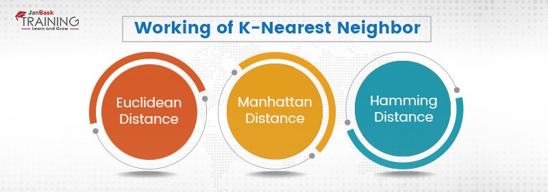
To check for the components in the vicinity, various mathematical models known as distances are used. Actually, when we query the K nearest neighbor for any new data point, it calculates the distance of each training point from the new point. This computation of distance is done primarily using Euclidian distance but there are other methods as well which are stated below:

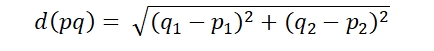
1). Euclidean Distance:

The Euclidean distance the length of the ordinary straight line between two points as shown in the figure below. Mathematically,

Euclidean Distance

  • Where d represents the distance between p and q.
  • Point p is represented by (p1, p2) in the Cartesian coordinates.
  • And point 1 is represented by (q1,q2) in the Cartesian coordinates.

For n points gr

Euclidean Distance

Read: How to Work with Regression based Models?

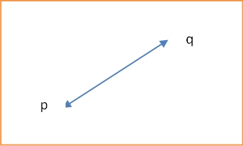
2). Manhattan Distance:

Unlike Euclidean distance, which is a point-to-point line segment, Manhattan distance also points to point but not through a line segment. It follows a type of geometry known as taxicab geometry. This term, Manhattan distance originated from the grid layout in the Manhattan island where the shortest path between two points is through the intersection. A Manhattan distance between two points looks as shown in the figure below:

Euclidean Distance

Mathematically,

Euclidean Distance

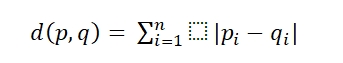
Where d(p,q) is the distance between p and q

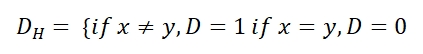
3). Hamming Distance:

This is used when under consideration variables are categorical. Hamming distance is defined as

Euclidean Distance

The next step is to measure the distance of the point from the points in the training data set. Once this is done, we pick the closest point. The number of points at any point under consideration defines the value of k.

Defining the hyperparameter K:

Till this point in this blog, we are discussing the k-nearest neighbor and have over and again stated that the choice K remains an important parameter in finding the optimum K as it can have diverse effects on the classifier. As we know that in all the machine learning algorithms there is a hyperparameter that is chosen by the architect of the algorithm to make the best fit. In the case of K-nearest neighbor, the K controls the shape of the decision boundary. Being a hyperparameter to be chosen by the architect, the range of K lies from [0,∞]. This leads to a scenario where most of the time, global maxima is neither important nor viable to find.

Read: Difference Between Data Scientist and Data Analyst

Adding to this, if k is too small, the classifier will be limited in its classification power and will overlook the overall distribution of the inheriting dataset. In other words, a small value of K goes for a more flexible approach that decreases the bias and introduces high variance. The other side of this approach is that if the value of k is large the decision boundary will be much more smooth that will introduce smoother boundaries with low variance and increased bias.

 Training and querying the KNN in sklearn:

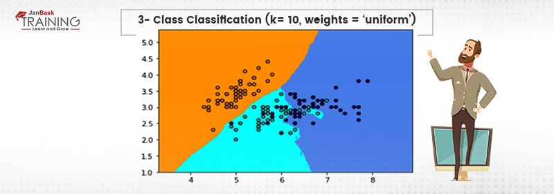
Designing a K-nearest neighbor based classifier is can be done by using a number of libraries available. In this example, sklearn is utilized for training the k-nearest neighbor and matplotlib is used for plotting the decision boundaries. Iris flower dataset which is provided in sklearn.datasets will be used for training and demonstration purposes. {IRIS flower dataset is a classical dataset detail about which can be found here.}

First, import all the libraries required as:

import numpy as np
import matplotlib.pyplot as plt
from matplotlib.colors import ListedColormap
from sklearn import neighbors, datasets

Now, defining hyperparameter is important which can be done as

#k can be initialized/used as per the discretion. ( local minima k can be found using the elbow method. Here, we take a number of values for k and plot the accuracy for all of them. The point where we find a reduction in the value of accuracy, we assume that that’s a local maxima and stop there. IT shows up as a bent elbow on the graph. Hence, the name)
K = 10 

Load the dataset:

iris = datasets.load_iris()

Initialize the input vector and target values:

input_vector = iris.data[:, :2]
target = iris.target

Define the step size:

Step = 0.3

Now, as this is a classifier whose hyper parameter named as k can vary, we’ll have to use decision boundaries with multiple colors for visualization purpose. So, Create the color maps:

cmap_light = ListedColormap(['orange', 'cyan', 'cornflowerblue'])
cmap_bold = ListedColormap(['darkorange', 'c', 'darkblue'])

Finally, train the classifier and plot the results as:

for weights in ['uniform', 'distance']:
       clf = neighbors.KNeighborsClassifier(K, weights=weights)
       clf.fit(input_vector, target)
   # Assign color and plot the decision boundaries
    input_vector_min, input_vector_max = input_vector[:, 0].min() - 1, input_vector[:, 0].max() + 1
    target_min, target_max = input_vector[:, 1].min() - 1, input_vector[:, 1].max() + 1
    xx, yy = np.meshgrid(np.arange(input_vector_min, input_vector_max, step),
                         np.arange(target_min, target_max, step))
    predict = clf.predict(np.c_[xx.ravel(), yy.ravel()])

    # Showing results in color plot
    predict = predict.reshape(xx.shape)
    plt.figure()
    plt.pcolormesh(xx, yy, Z, cmap=cmap_light)

    # Plotting the training data points
    plt.scatter(X[:, 0], X[:, 1], c=y, cmap=cmap_bold,
                edgecolor='k', s=20)
    plt.xlim(xx.min(), xx.max())
    plt.ylim(yy.min(), yy.max())
    plt.title("3-Class classification (k = %i, weights = '%s')"
              % (K, weights))

The output of the above will be shown as:

 Training and querying the KNN in sklearn

Read: Job Description & All Key Responsibilities of a Data Scientist

We can visualize the decision boundaries of the classifier. The above code can be deployed using flask and other allied technologies. They can be queried as an API call or as per requirement.

KNN-why and why not:

Advantages:

The biggest advantage of k-nearest neighbor is that is quite simple to implement as well as understand. This algorithm takes an extremely small amount of time to implement and thus, can be used as an analysis tool for complex datasets. Also, the non-parametric nature of this algorithm gives it an advantage as compared to other parametric models.

Disadvantages:

As can be seen from the blog that k-nearest neighbor is extremely computationally expensive during its testing phase as it makes no weight matrix which makes it quite costly to use in a fast-moving industrial setting. Also, K-nearest neighbor will not work well in skewed class distribution.

Final Words:

K-nearest neighbor is an extremely simple and easy to understand algorithm with its uses in recommendation engines, client labeling, and allied stuff. In the above blog, we have gone through the KNN algorithm, its use as well as advantages and disadvantages. As can be seen, because of its inherent simplicity which comes at a cost of storage, the KNN is still widely used.

Please leave the query and comments in the comment section.


fbicons FaceBook twitterTwitter lingedinLinkedIn pinterest Pinterest emailEmail

     Logo

    JanBask Training

    A dynamic, highly professional, and a global online training course provider committed to propelling the next generation of technology learners with a whole new way of training experience.


Comments

Trending Courses

Cyber Security Course

Cyber Security

  • Introduction to cybersecurity
  • Cryptography and Secure Communication 
  • Cloud Computing Architectural Framework
  • Security Architectures and Models
Cyber Security Course

Upcoming Class

1 day 16 Jun 2025

QA Course

QA

  • Introduction and Software Testing
  • Software Test Life Cycle
  • Automation Testing and API Testing
  • Selenium framework development using Testing
QA Course

Upcoming Class

-1 day 14 Jun 2025

Salesforce Course

Salesforce

  • Salesforce Configuration Introduction
  • Security & Automation Process
  • Sales & Service Cloud
  • Apex Programming, SOQL & SOSL
Salesforce Course

Upcoming Class

6 days 21 Jun 2025

Business Analyst Course

Business Analyst

  • BA & Stakeholders Overview
  • BPMN, Requirement Elicitation
  • BA Tools & Design Documents
  • Enterprise Analysis, Agile & Scrum
Business Analyst Course

Upcoming Class

6 days 21 Jun 2025

MS SQL Server Course

MS SQL Server

  • Introduction & Database Query
  • Programming, Indexes & System Functions
  • SSIS Package Development Procedures
  • SSRS Report Design
MS SQL Server Course

Upcoming Class

6 days 21 Jun 2025

Data Science Course

Data Science

  • Data Science Introduction
  • Hadoop and Spark Overview
  • Python & Intro to R Programming
  • Machine Learning
Data Science Course

Upcoming Class

5 days 20 Jun 2025

DevOps Course

DevOps

  • Intro to DevOps
  • GIT and Maven
  • Jenkins & Ansible
  • Docker and Cloud Computing
DevOps Course

Upcoming Class

5 days 20 Jun 2025

Hadoop Course

Hadoop

  • Architecture, HDFS & MapReduce
  • Unix Shell & Apache Pig Installation
  • HIVE Installation & User-Defined Functions
  • SQOOP & Hbase Installation
Hadoop Course

Upcoming Class

-1 day 14 Jun 2025

Python Course

Python

  • Features of Python
  • Python Editors and IDEs
  • Data types and Variables
  • Python File Operation
Python Course

Upcoming Class

13 days 28 Jun 2025

Artificial Intelligence Course

Artificial Intelligence

  • Components of AI
  • Categories of Machine Learning
  • Recurrent Neural Networks
  • Recurrent Neural Networks
Artificial Intelligence Course

Upcoming Class

6 days 21 Jun 2025

Machine Learning Course

Machine Learning

  • Introduction to Machine Learning & Python
  • Machine Learning: Supervised Learning
  • Machine Learning: Unsupervised Learning
Machine Learning Course

Upcoming Class

40 days 25 Jul 2025

 Tableau Course

Tableau

  • Introduction to Tableau Desktop
  • Data Transformation Methods
  • Configuring tableau server
  • Integration with R & Hadoop
 Tableau Course

Upcoming Class

-1 day 14 Jun 2025

Search Posts

Reset

Receive Latest Materials and Offers on Data Science Course

Interviews