Jan 13, 2020
  5.4k
5.4k

03
JulMonth End Offerl : Get 30% OFF + $999 Study Material FREE - SCHEDULE CALL
In this article, we are going to talk about what is a line chart, how to create a line chart, and formatting the line chart. Along with these, we will also talk about when to use the line chart and alternatives available for the line chart.
The line chart is one of the most used charts in visualization. Majorly we use the line chart to show the trend also. Along with that, if you have a lot of bars in the bar chart then you may try the line chart also. A line chart can also be used when one of your axes is a function of time.
For example, let’s say you want to create a yearly sales trend, monthly profit trend, profit/sales ratio for the function of time. In all such cases, you can create a line chart.
The best thing about Tableau is, when you drag dimensions or measures, Tableau automatically suggest you the best chart available. For example, if you will use a date field and a measure then there are high chances that the suggested chart will be a line chart.
A line chart can be created in the following scenarios-
Let’s create a line chart for the following requirements-
We need to create a monthly sales report. As we need the monthly report and so, you need to use the order date dimension which will be auto aggregated on the year. But as we need the monthly data and so you need to change the year to month so that you will be getting something like Jan 2018, Feb 2019, etc.
To do that, just click on it and you will find many formats of the date. If you are not satisfied with the format given, you may select more and can select from other formatting options available.
Once done, just drag the sales measure to the row field and you will see the line chart getting created automatically.
Read: Power BI vs Tableau - Top 8 Key Differences

As you can see in the above image, both the date field and the sales field is continuous. This is just because while converting the date in a different format, we selected it to be continuous. It’s up to you how you want to keep it.
We can talk about the difference between continuous and discrete data in some other post. For a basic brief, in Tableau, data can be either continuous or discrete. The continuous data will be shown with the green color and discrete data will be shown with the blue color.
If you have created such charts earlier, you may find that when the date field is discrete then the label will be at the top. While in the case of the continuous data, it is showing you at the bottom. So, depending on what is your requirement, you may select it to be either a continuous field or a discrete field.
In the previous section, we simply created a line chart without much thinking on user behavior like how user-friendly it, how it can produce insight to the user, etc. But these are an important factor while developing the reports and dashboards.
In this formatting section, we will talk about all these. First of all, we can start by renaming the worksheet title and the name of the worksheet. We have discussed these earlier also while creating the worksheet like how to rename the worksheet and provide meaningful information.
To rename the worksheet name, simply double click on it and change the name as a requirement. Or right-click on it and select rename and then type the new name as required. As you can see I have changed the name of the worksheet to the sales trend.
Now to change the worksheet title, again you may double click on it which will give you a pop-up where you can type your required name. Or you can click on the icon and select to change the name. Both works for the same purpose. I have changed the name to the monthly sales trend.
Currently, as you can see we don’t have the value of the sales written on any line. And when you hover your mouse the respective sales values are shown to you. To show the label of those lines directly, you need to enable the label to these charts. To do that, just click on the T icon showing you at the top.
Read: Tableau Tutorial for Beginners: A Complete Guide
You can also enable the label of the data by clicking on the label option from the marks shelf and then enabling the checkbox. Both will enable the label to your report. The difference is, from the marks card, you will be also able to customize and format the label as per your requirement.

Now let's say the x-axis of this chart is already showing you the month and the below to it, it is also showing the month of the order date. If you don’t want to show that, simply right-click on it and select the option edit axis. From here you can simply remove the name month of the order date. This will now only keep the month and year and the remaining title will no longer be available.
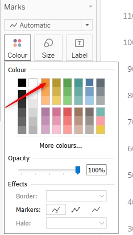
You can also change the color of this line chart. To change the color of the line chart, just click on the color option from the marks and select the color of your choice. Make sure to select the color which should be pleasant to the eye. And also it should make sense. For example, if you’re showing profit and loss as a function of the time. Then in such a case, it is the normal expectation that the profit will be shown with the green color and loss with red color. But if you will do the reverse, it won’t work and can give ambiguous results to the user.
Along with all these if you want to play around more formatting options, just right-click on the line chart and select the formatting option. This will open a complete set of formatting options for you. Here you can make a change to the axis, the label like you may represent it to the unit of thousands, millions, and more. Also, you may add currency at the start as well. You can also control the decimal point while showing the values.
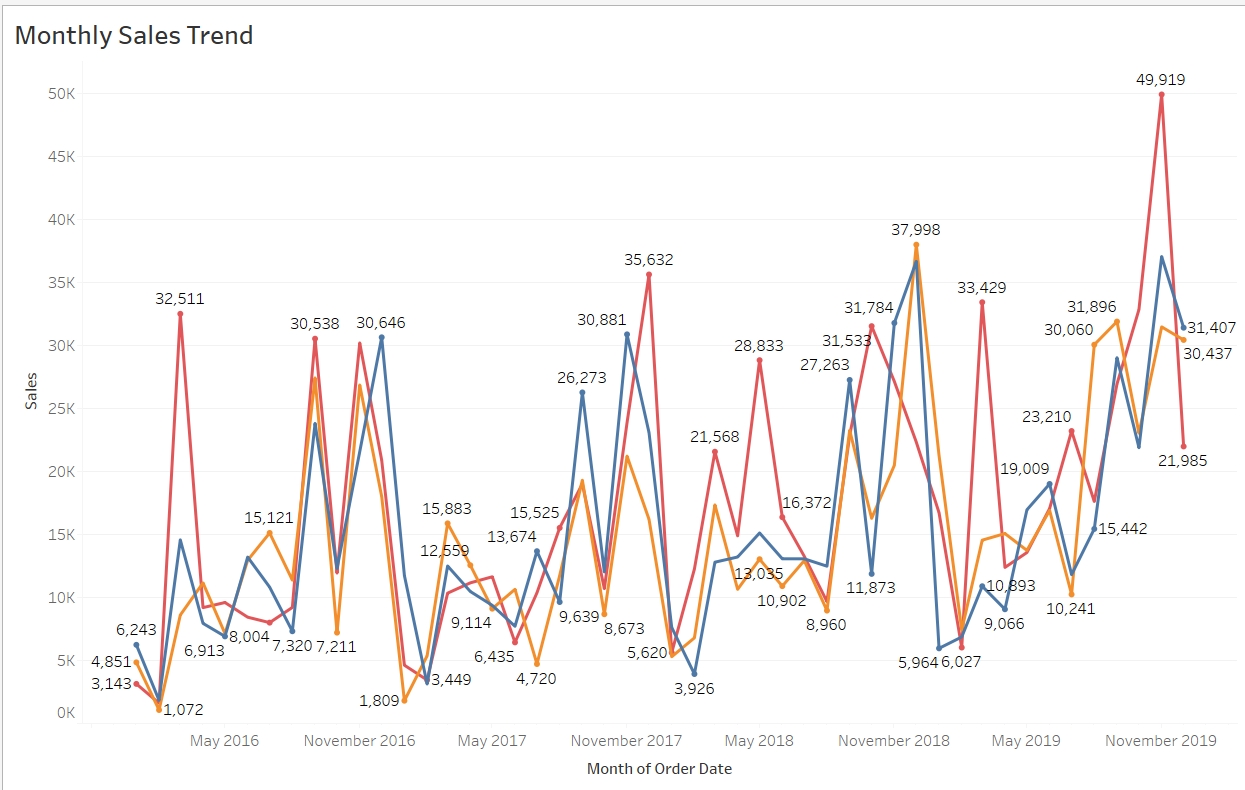
So far, we have seen a single line in the line chart. Now just consider that in the same example, you need to show the sales done by the different categories. Means now we just not need the total monthly sales but also the individual sales are done by each category in different months.
This can also be achieved just by dragging the dimension category to the color shelf. This will create multiple lines in the same chart and now you will find the monthly sales trend for each category.
Read: A Guide to Dashboard Interaction in Tableau
As we have the 3 options in the category dimension and so you are seeing three lines here. There are more options as well to make this in other formats. For example, let’s say you want to create separate sections for these categories. To do that, you can remove the category dimension from the color shelf and add that to the row shelf. Just ensure that it is at the beginning of the row shelf and now you will find in the same graph, 3 separate sections have been created.

These are some of the variations of the line chart which you can also use as and when required. It is advisable to keep your graph as simple as possible so that all kinds of users will be able to read and act on it.
You may also filter the line chart the way we have filtered the other chart. In our prior articles, we have talked about filters a lot. The same you can also apply in the line chart. For example, if you have to filter this report on the state then simply drag the dimension state to the filter shelf and then enable the show filter option so that the users will be able to filter the report as per the requirements.
This was all about the line chart in Tableau. Here we talked about what is a line chart, when to create it, how to create it, formatting options for the line chart and more. Now go ahead and try creating the line chart and format it properly.
The JanBask Training Team includes certified professionals and expert writers dedicated to helping learners navigate their career journeys in QA, Cybersecurity, Salesforce, and more. Each article is carefully researched and reviewed to ensure quality and relevance.


Gen AI

Agentic AI

AI in Automation Testing

Cyber Security

Data Science

QA

Salesforce Service Cloud

AWS
Interviews


 Feb 19, 2020
 6.8k
6.8k